library(shiny)
library(TidyDensity)
library(tidyverse)
library(DT)

# Define UI
ui <- fluidPage(
  titlePanel("TidyDensity App"),
  sidebarLayout(
    sidebarPanel(
      radioButtons(inputId = "data_input_type",
                   label = "Data Input Type:",
                   choices = c("Select Function", "Enter Data"),
                   selected = "Select Function"),
      conditionalPanel(
        condition = "input.data_input_type == 'Enter Data'",
        textInput(inputId = "data",
                  label = "Enter data as a comma-separated list of numeric values")
      ),
      conditionalPanel(
        condition = "input.data_input_type == 'Select Function'",
        selectInput(inputId = "functions",
                    label = "Select Function",
                    choices = c(
                      "tidy_normal",
                      "tidy_bernoulli",
                      "tidy_beta",
                      "tidy_gamma"
                    )
        )
      ),
      numericInput(inputId = "num_sims",
                   label = "Number of simulations:",
                   value = 1,
                   min = 1,
                   max = 15),
      numericInput(inputId = "n",
                   label = "Sample size:",
                   value = 50,
                   min = 30,
                   max = 200),
      selectInput(inputId = "plot_type",
                  label = "Select plot type",
                  choices = c(
                    "density",
                    "quantile",
                    "probability",
                    "qq",
                    "mcmc"
                  )
      ),
      downloadButton(outputId = "download_data", label = "Download Data")
    ),
    mainPanel(
      plotOutput("density_plot"),
      DT::dataTableOutput("data_table")
    )
  )
)Introduction
If you’re new to data science or statistics, you may have heard about probability distributions. Probability distributions are mathematical functions that help us understand the probability of a random variable taking on a certain value. For example, if we’re rolling a fair six-sided die, we know that each number has an equal chance of being rolled (1/6 or about 17% chance). We can represent this using a probability distribution, specifically a discrete uniform distribution.
However, not all probability distributions are as simple as a uniform distribution. Many real-world phenomena, such as the heights of people, the number of cars passing through a toll booth in a day, or the amount of rainfall in a particular area, are continuous and can’t be represented using a discrete distribution. Instead, we use continuous probability distributions, which describe the probability of a continuous variable taking on a range of values.
There are many different types of continuous probability distributions, each with their own properties and use cases. For example, the normal distribution, also known as the bell curve, is commonly used to model many natural phenomena, such as human heights and weights. The beta distribution is used to model proportions or percentages, such as the proportion of voters who support a particular candidate. The gamma distribution is used to model the time between events in a Poisson process, such as the time between customers arriving at a store.
The sample TidyDensity App is a tool that helps us explore and visualize these different types of probability distributions. It’s a web application built using the R programming language and the Shiny framework, which allows us to create interactive web applications with R.
Let’s break down the different components of the TidyDensity App.
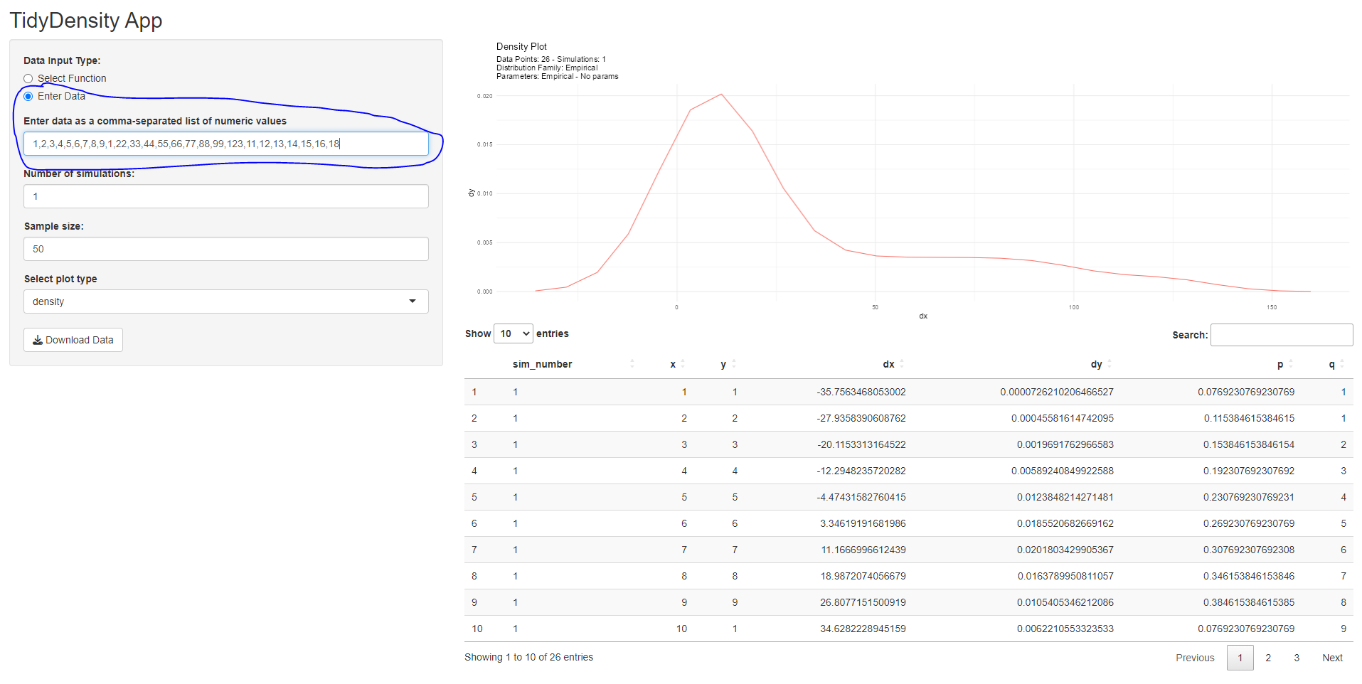
User Interface
The user interface, or UI for short, is what the user sees and interacts with when they use the app. It’s built using HTML, CSS, and JavaScript, and it’s the first thing the user sees when they open the app.
The TidyDensity App has a simple UI that allows the user to select from four different probability distributions: normal, Bernoulli, beta, and gamma. Each of these distributions has its own properties and use cases, and the user can select which one they want to explore using a dropdown menu.
In addition, the user can specify the number of simulations they want to run, which determines how many times the probability distribution is sampled to generate data. They can also specify the sample size, which determines how many data points are generated in each simulation.
Finally, the user can select which type of plot they want to see, such as a density plot, a quantile plot, a probability plot, or a QQ plot. Each of these plots shows a different aspect of the data generated from the probability distribution, and the user can choose which one to explore.
Here is the code:
Server
The server is the back-end of the TidyDensity App. It’s responsible for generating the data based on the user’s inputs, and for creating the plots and tables that the user sees on the UI.
The server is written in R, and it uses several R packages to generate the data and create the plots. For example, the TidyDensity package is used to generate data from the selected probability distribution, and the ggplot2 package is used to create the plots.
The server is also responsible for handling user inputs, such as which probability distribution to use, how many simulations to run, and which plot type to show. It then generates the appropriate data and plot based on these inputs and sends them back to the UI for display.
The first thing we do is create a reactive variable data that will store the output of the match.fun() function, which is called with the arguments .num_sims and .n obtained from the user interface. We use the reactive variable because it will update automatically whenever the inputs are changed.
The output$density_plot object is created with renderPlot(), which takes the reactive variable data() and passes it to tidy_autoplot() with the plot type selected by the user in the input$plot_type object. The resulting plot is then printed to the user interface.
The output$data_table object is created with DT::renderDataTable(), which takes the reactive variable data() and returns a table to the user interface using the DT::datatable() function.
Finally, the output$download_data object is created using downloadHandler(), which creates a download button for the user to download a .csv file of the data. The filename argument specifies the name of the file, and the content argument writes the data to a .csv file.
Here is the code:
# Define server
server <- function(input, output) {

  # Create reactive data
  data <- reactive({
    # Call selected function with user input or tidy_empirical if user entered data
    if (input$data_input_type == "Enter Data") {
      data <- input$data
      if (is.null(data) || data == "") {
        return(NULL)
      }
      data <- as.numeric(strsplit(data, ",")[[1]])
      tidy_empirical(data)
    } else {
      match.fun(input$functions)(.num_sims = input$num_sims, .n = input$n)
    }
  })

  # Create density plot
  output$density_plot <- renderPlot({
    # Call autoplot on reactive data
    if (!is.null(data())) {
      p <- data() |>
        tidy_autoplot(.plot_type = input$plot_type)

      print(p)
    }
  })

  # Create data table
  output$data_table <- DT::renderDataTable({
    # Return reactive data as a data table
    if (!is.null(data())) {
      DT::datatable(data())
    }
  })

  # Download data handler
  output$download_data <- downloadHandler(
    filename = function() {
      if (input$data_input_type == "Enter Data") {
        paste0("tidy_empirical.csv")
      } else {
        paste0(input$functions, ".csv")
      }
    },
    content = function(file) {
      write.csv(data(), file, row.names = FALSE)
    }
  )

}
Data Table
The data table is a table that shows the data generated from the probability distribution. It’s displayed on.
Overall, this app is designed to allow users to generate various types of probability density plots and accompanying data tables based on user input. By allowing users to select different functions, sample sizes, and plot types, this app provides a flexible and customizable tool for exploring and visualizing probability distributions.
Full Shiny App
Here is the full script:
library(shiny)
library(TidyDensity)
library(tidyverse)
library(DT)

# Define UI
ui <- fluidPage(
  titlePanel("TidyDensity App"),
  sidebarLayout(
    sidebarPanel(
      radioButtons(inputId = "data_input_type",
                   label = "Data Input Type:",
                   choices = c("Select Function", "Enter Data"),
                   selected = "Select Function"),
      conditionalPanel(
        condition = "input.data_input_type == 'Enter Data'",
        textInput(inputId = "data",
                  label = "Enter data as a comma-separated list of numeric values")
      ),
      conditionalPanel(
        condition = "input.data_input_type == 'Select Function'",
        selectInput(inputId = "functions",
                    label = "Select Function",
                    choices = c(
                      "tidy_normal",
                      "tidy_bernoulli",
                      "tidy_beta",
                      "tidy_gamma"
                    )
        )
      ),
      numericInput(inputId = "num_sims",
                   label = "Number of simulations:",
                   value = 1,
                   min = 1,
                   max = 15),
      numericInput(inputId = "n",
                   label = "Sample size:",
                   value = 50,
                   min = 30,
                   max = 200),
      selectInput(inputId = "plot_type",
                  label = "Select plot type",
                  choices = c(
                    "density",
                    "quantile",
                    "probability",
                    "qq",
                    "mcmc"
                  )
      ),
      downloadButton(outputId = "download_data", label = "Download Data")
    ),
    mainPanel(
      plotOutput("density_plot"),
      DT::dataTableOutput("data_table")
    )
  )
)

# Define server
server <- function(input, output) {

  # Create reactive data
  data <- reactive({
    # Call selected function with user input or tidy_empirical if user entered data
    if (input$data_input_type == "Enter Data") {
      data <- input$data
      if (is.null(data) || data == "") {
        return(NULL)
      }
      data <- as.numeric(strsplit(data, ",")[[1]])
      tidy_empirical(data)
    } else {
      match.fun(input$functions)(.num_sims = input$num_sims, .n = input$n)
    }
  })

  # Create density plot
  output$density_plot <- renderPlot({
    # Call autoplot on reactive data
    if (!is.null(data())) {
      p <- data() |>
        tidy_autoplot(.plot_type = input$plot_type)

      print(p)
    }
  })

  # Create data table
  output$data_table <- DT::renderDataTable({
    # Return reactive data as a data table
    if (!is.null(data())) {
      DT::datatable(data())
    }
  })

  # Download data handler
  output$download_data <- downloadHandler(
    filename = function() {
      if (input$data_input_type == "Enter Data") {
        paste0("tidy_empirical.csv")
      } else {
        paste0(input$functions, ".csv")
      }
    },
    content = function(file) {
      write.csv(data(), file, row.names = FALSE)
    }
  )

}

# Run the app
shinyApp(ui = ui, server = server)
Voila!