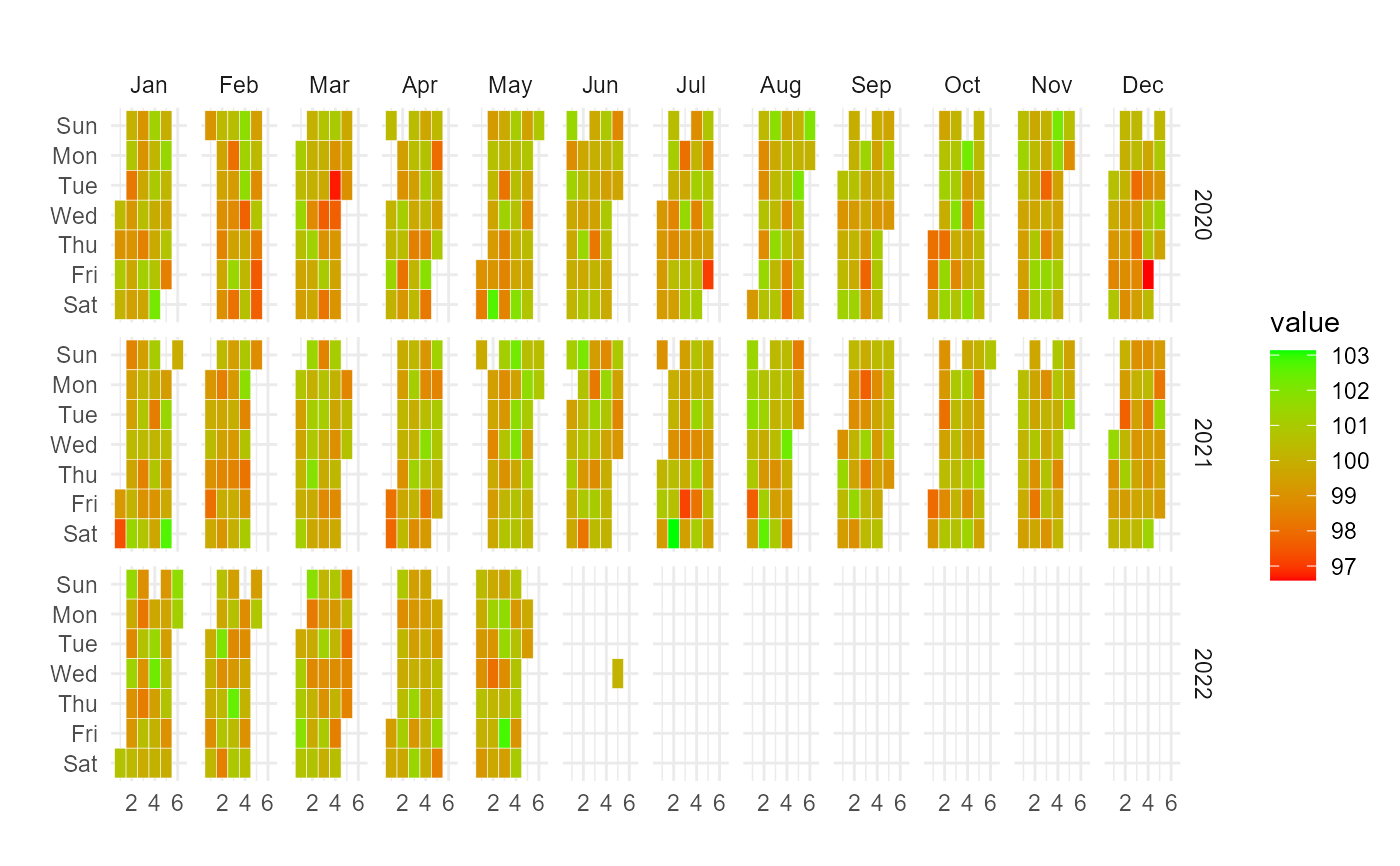
Takes in data that has been aggregated to the day level and makes a calendar heatmap.
Usage
ts_calendar_heatmap_plot(
  .data,
  .date_col,
  .value_col,
  .low = "red",
  .high = "green",
  .plt_title = "",
  .interactive = TRUE
)
Arguments
- .data
The time-series data with a date column and value column.
- .date_col
The column that has the datetime values
- .value_col
The column that has the values
- .low
The color for the low value, must be quoted like "red". The default is "red"
- .high
The color for the high value, must be quoted like "green". The default is "green"
- .plt_title
The title of the plot
- .interactive
Default is TRUE to get an interactive plot using
plotly::ggplotly(). It can be set to FALSE to get a ggplot plot.
Details
The data provided must have been aggregated to the day level, if not funky output could result and it is possible nothing will be output but errors. There must be a date column and a value column, those are the only items required for this function to work.
This function is intentionally inflexible, it complains more and does less in order to force the user to supply a clean data-set.
Examples
data_tbl <- data.frame(
  date_col = seq.Date(
    from = as.Date("2020-01-01"),
    to   = as.Date("2022-06-01"),
    length.out = 365*2 + 180
    ),
  value = rnorm(365*2+180, mean = 100)
)

ts_calendar_heatmap_plot(
  .data          = data_tbl
  , .date_col    = date_col
  , .value_col   = value
  , .interactive = FALSE
)