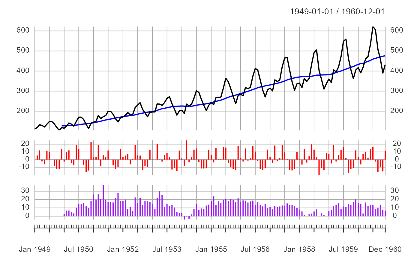
This function will produce a ggplot2 plot with facet wrapping. The plot
contains three moving average panels stacked on top of each other using
facet_wrap. The panels show the main time series with moving average, and
two difference calculations: Diff A shows sequential period-over-period percentage changes (e.g., month-over-month or week-over-week), and Diff B shows year-over-year percentage changes.
Usage
ts_ma_plot(
  .data,
  .date_col,
  .value_col,
  .ts_frequency = "monthly",
  .main_title = NULL,
  .secondary_title = NULL,
  .tertiary_title = NULL
)
Arguments
- .data
The data you want to visualize. This should be pre-processed and the aggregation should match the
.frequencyargument.- .date_col
The data column from the
.dataargument.- .value_col
The value column from the
.dataargument- .ts_frequency
The frequency of the aggregation, quoted, ie. "monthly", anything else will default to weekly, so it is very important that the data passed to this function be in either a weekly or monthly aggregation.
- .main_title
The title of the main plot.
- .secondary_title
The title of the second plot.
- .tertiary_title
The title of the third plot.
Details
This function expects to take in a data.frame/tibble. It will return a list object so it is a good idea to save the output to a variable and extract from there.
Examples
suppressPackageStartupMessages(library(dplyr))
data_tbl <- ts_to_tbl(AirPassengers) %>%
select(-index)
output <- ts_ma_plot(
.data = data_tbl,
.date_col = date_col,
.value_col = value
)
#> Warning: Removed 11 rows containing missing values or values outside the scale range
#> (`geom_line()`).
output$pgrid
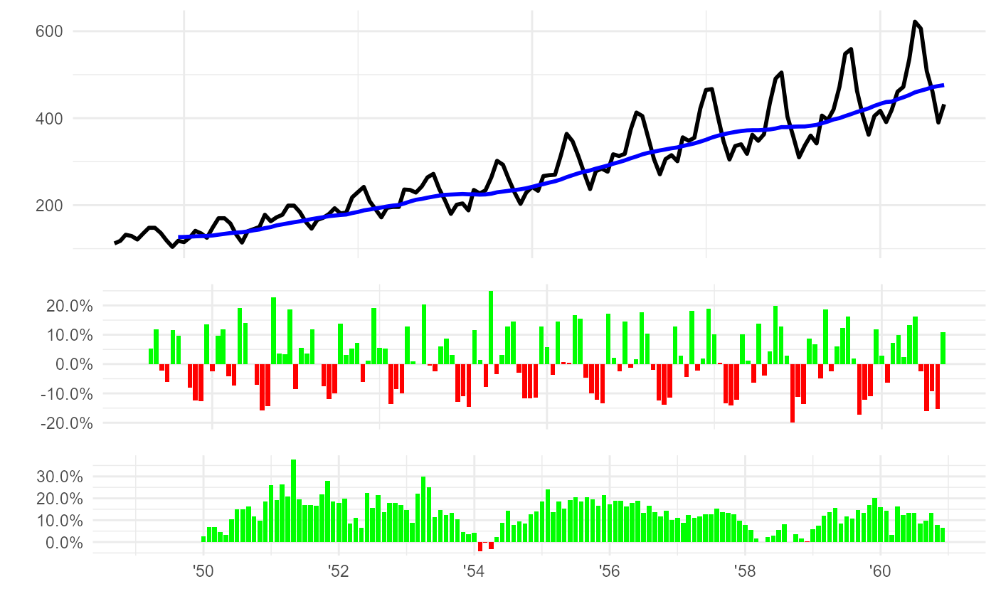 output$data_summary_tbl %>% tail()
#> # A tibble: 6 × 5
#> date_col value ma12 diff_a diff_b
#> <date> <dbl> <dbl> <dbl> <dbl>
#> 1 1960-07-01 622 459. 16.3 13.5
#> 2 1960-08-01 606 463. -2.57 8.41
#> 3 1960-09-01 508 467. -16.2 9.72
#> 4 1960-10-01 461 472. -9.25 13.3
#> 5 1960-11-01 390 474. -15.4 7.73
#> 6 1960-12-01 432 476. 10.8 6.67
output <- ts_ma_plot(
.data = data_tbl,
.date_col = date_col,
.value_col = value,
.ts_frequency = "month"
)
#> Warning: Removed 51 rows containing missing values or values outside the scale range
#> (`geom_line()`).
output$pgrid
output$data_summary_tbl %>% tail()
#> # A tibble: 6 × 5
#> date_col value ma12 diff_a diff_b
#> <date> <dbl> <dbl> <dbl> <dbl>
#> 1 1960-07-01 622 459. 16.3 13.5
#> 2 1960-08-01 606 463. -2.57 8.41
#> 3 1960-09-01 508 467. -16.2 9.72
#> 4 1960-10-01 461 472. -9.25 13.3
#> 5 1960-11-01 390 474. -15.4 7.73
#> 6 1960-12-01 432 476. 10.8 6.67
output <- ts_ma_plot(
.data = data_tbl,
.date_col = date_col,
.value_col = value,
.ts_frequency = "month"
)
#> Warning: Removed 51 rows containing missing values or values outside the scale range
#> (`geom_line()`).
output$pgrid
 output$data_summary_tbl %>% tail()
#> # A tibble: 6 × 5
#> date_col value ma12 diff_a diff_b
#> <date> <dbl> <dbl> <dbl> <dbl>
#> 1 1960-07-01 622 394. 16.3 96.2
#> 2 1960-08-01 606 400. -2.57 93.6
#> 3 1960-09-01 508 404. -16.2 59.7
#> 4 1960-10-01 461 405. -9.25 23.3
#> 5 1960-11-01 390 405. -15.4 -5.57
#> 6 1960-12-01 432 405. 10.8 6.67
output$data_summary_tbl %>% tail()
#> # A tibble: 6 × 5
#> date_col value ma12 diff_a diff_b
#> <date> <dbl> <dbl> <dbl> <dbl>
#> 1 1960-07-01 622 394. 16.3 96.2
#> 2 1960-08-01 606 400. -2.57 93.6
#> 3 1960-09-01 508 404. -16.2 59.7
#> 4 1960-10-01 461 405. -9.25 23.3
#> 5 1960-11-01 390 405. -15.4 -5.57
#> 6 1960-12-01 432 405. 10.8 6.67