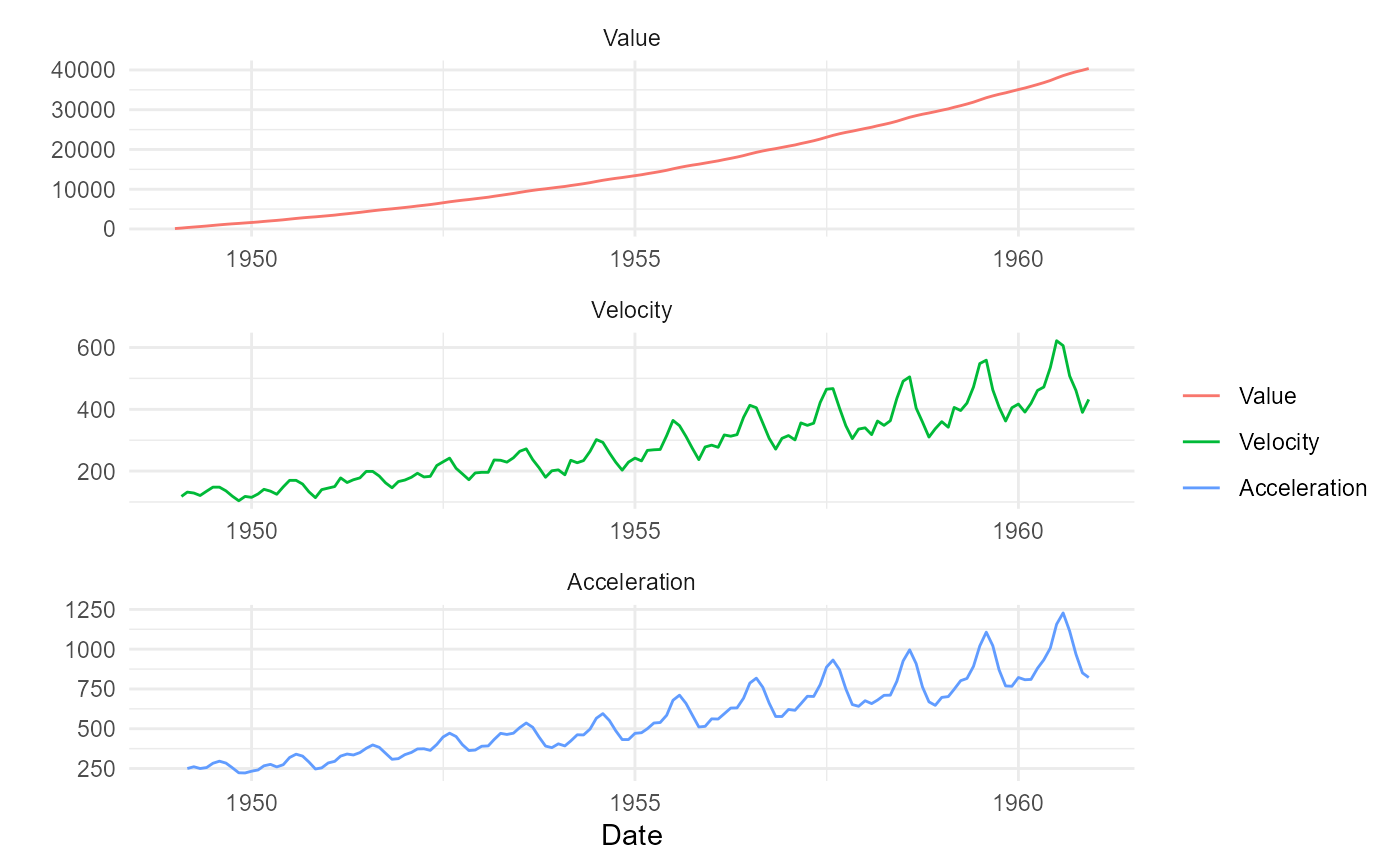
This function will produce three plots faceted on a single graph. The three graphs are the following:
Value Plot (Actual values)
Value Velocity Plot
Value Acceleration Plot
Value
The original time series augmented with the differenced data, a static plot and a plotly plot of the ggplot object. The output is a list that gets returned invisibly.
Details
This function expects to take in a data.frame/tibble. It will return
a list object that contains the augmented data along with a static plot and
an interactive plotly plot. It is important that the data be prepared and have
at minimum a date column and the value column as they need to be supplied to
the function. If your data is a ts, xts, zoo or mts then use ts_to_tbl() to
convert it to a tibble.