# Create sample data
x <- c(1, 2, 3, 4, 5)
y <- c(5, 9, 6, 8, 12)
plot(x, y, main = "Scatter Plot Example")

# Add text annotation
text(3, 8, "Key Point", col = "blue", cex = 1.2)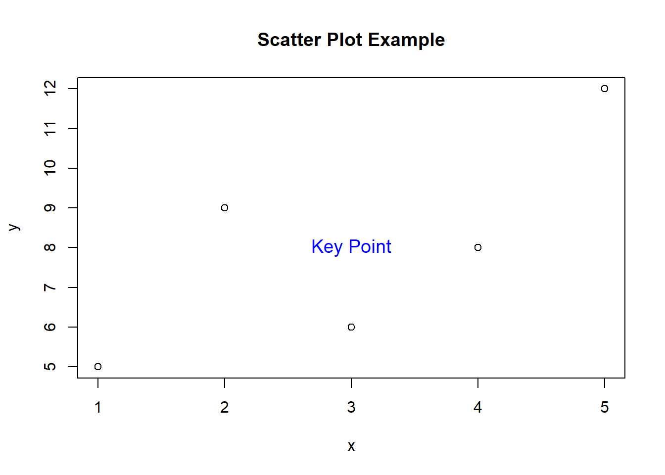
As a programmer, you’re well aware of the importance of data visualization. A well-crafted plot can convey complex information with clarity and impact. In R, creating stunning plots is a breeze, especially when you’re armed with the versatile text() function. This little gem allows you to add custom text to your plots, enabling you to annotate and highlight essential details. Let’s dive into the world of text() and uncover its syntax and potential through some hands-on examples.
The text() function in R is used to add text to a plot. It follows a simple syntax:
text(x, y, labels, cex = 1, adj = 0.5, ...)x and y are the coordinates where the text should be placed.labels is the text that should be displayed.cex is the character expansion factor. This controls the size of the text.adj is the justification of the text. This can be a number between 0 and 1, where 0 represents left justification, 1 represents right justification, and 0.5 represents center justification.... are additional arguments that can be used to customize the appearance of the text, such as the color, font, and linetype.Now that we have the basics down, let’s explore some practical examples.
Let’s start with a basic scatter plot representing the relationship between two variables.
# Create sample data
x <- c(1, 2, 3, 4, 5)
y <- c(5, 9, 6, 8, 12)
plot(x, y, main = "Scatter Plot Example")
# Add text annotation
text(3, 8, "Key Point", col = "blue", cex = 1.2)
In this example, we’ve created a scatter plot and used text() to add an annotation (“Key Point”) at the coordinates (3, 8). We’ve also adjusted the text color and size for emphasis.
What if you want to annotate multiple points on your plot? No worries, the text() function can handle that too!
# Continue from previous example
points <- c("A", "B", "C", "D", "E")
plot(x, y)
text(x, y, labels = points, pos = 3, col = "green")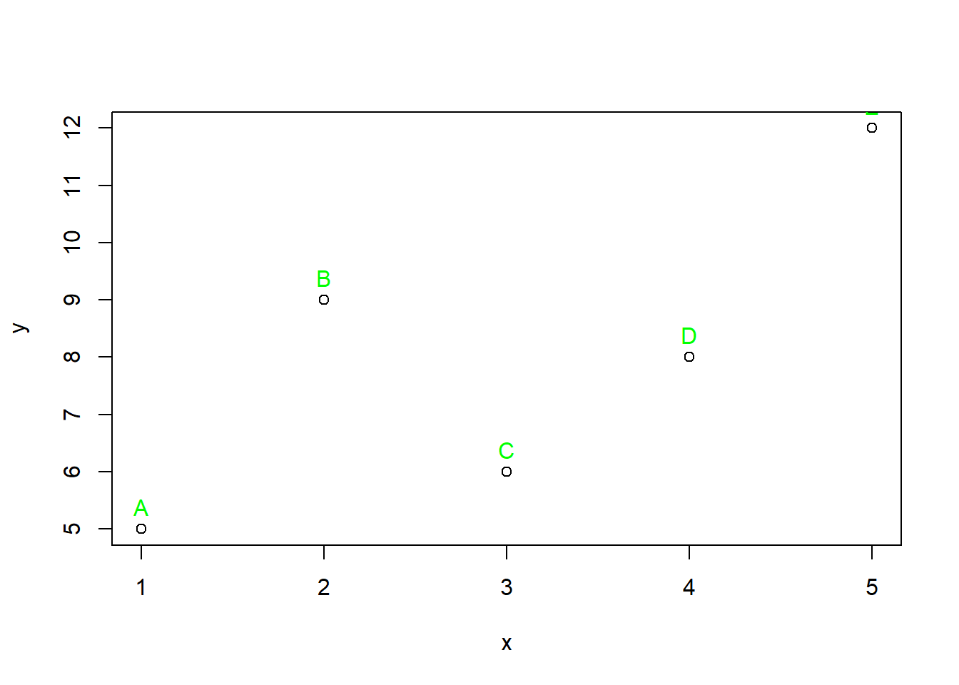
Here, we’ve added labels “A” through “E” to their respective data points. The pos parameter ensures that the text appears above the points, making the plot more informative.
Mathematical annotations can elevate your plots, making them more informative.
# Create a sine wave plot
x <- seq(0, 2 * pi, length.out = 100)
y <- sin(x)
plot(x, y, type = "l", col = "red")

# Add equation using mathematical notation
text(pi/2, 1, expression(sin(theta)), col = "purple", cex = 1.2)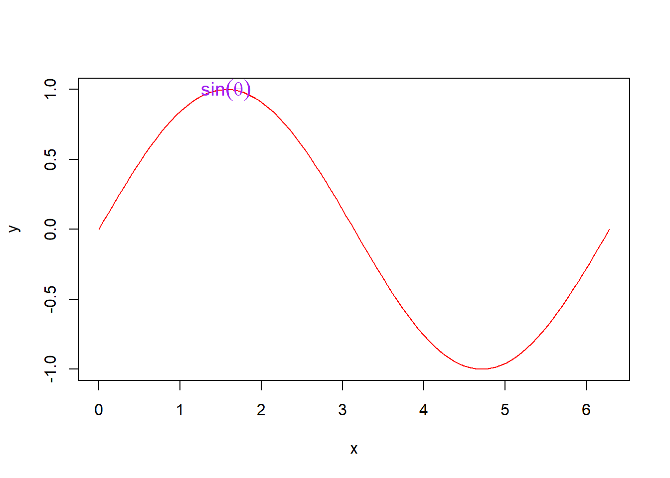
In this case, we’ve drawn a sine wave and used an expression to annotate the maximum point with the equation “sin(θ)”.
The text() function is a powerful tool that allows you to customize your plots with informative labels. These examples only scratch the surface of what you can achieve. Don’t hesitate to explore the various formatting options and try the function on different types of plots.
So, fellow programmers, go ahead and dive into the world of text(). Create stunning visualizations that not only captivate your audience but also convey your data’s story effectively. Your plots will thank you for it!