Unveiling Data Distribution Patterns with stripchart() in R
rtip
viz
Author
Steven P. Sanderson II, MPH
Published
August 22, 2023
Introdution
Data visualization is a powerful tool that allows us to uncover patterns and insights within datasets. One such tool in the R programming arsenal is the stripchart() function. If you’re looking to reveal distribution patterns in your data with style and simplicity, then this function might just become your new best friend. In this blog post, we’ll dive into the world of stripchart(), exploring its syntax, uses, and providing you with hands-on examples to master its application.
Understanding the Syntax
The syntax of the stripchart() function is quite straightforward. Here’s the basic structure:
x: This is the input data that you want to visualize. It can be a vector, a numeric matrix, or a data frame.
method: Specifies how the data points are plotted along the y-axis. Options include "stack" (default), "jitter", "overplot", and "overplot".
vertical: If set to TRUE (default), the chart will be vertical; if set to FALSE, it will be horizontal.
...: Additional graphical parameters that can be passed to customize the appearance of the chart.
Examples
The stripchart() function finds its utility in various scenarios, including:
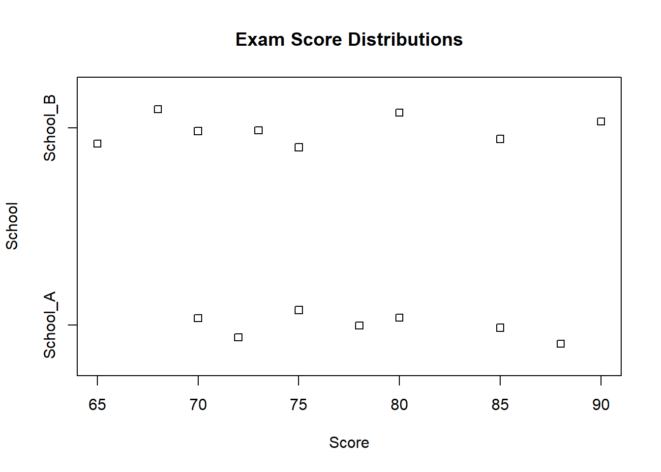
Example 1. Comparing Distributions
Let’s say you have two datasets containing exam scores of students from different schools. You can use stripchart() to visually compare their distributions:
In this case, the "overplot" method allows us to see individual data points that might overlap.
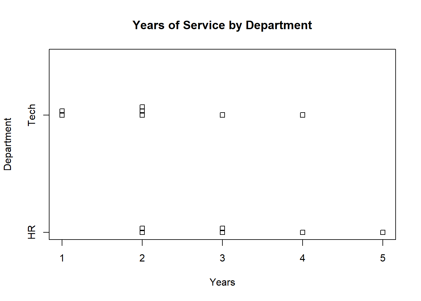
Example 3. Categorical Data Comparison
Suppose you have a dataset of employees’ years of service. You can use stripchart() to compare the years of service among different departments:
# Sample datahr_dept <-c(2, 3, 4, 2, 5, 3)tech_dept <-c(1, 2, 1, 3, 2, 4, 2)# Create a stripchartstripchart(list(HR = hr_dept, Tech = tech_dept),vertical =FALSE, method ="stack",main ="Years of Service by Department",xlab ="Years", ylab ="Department")
The "divide" method segments data points based on the provided categories.
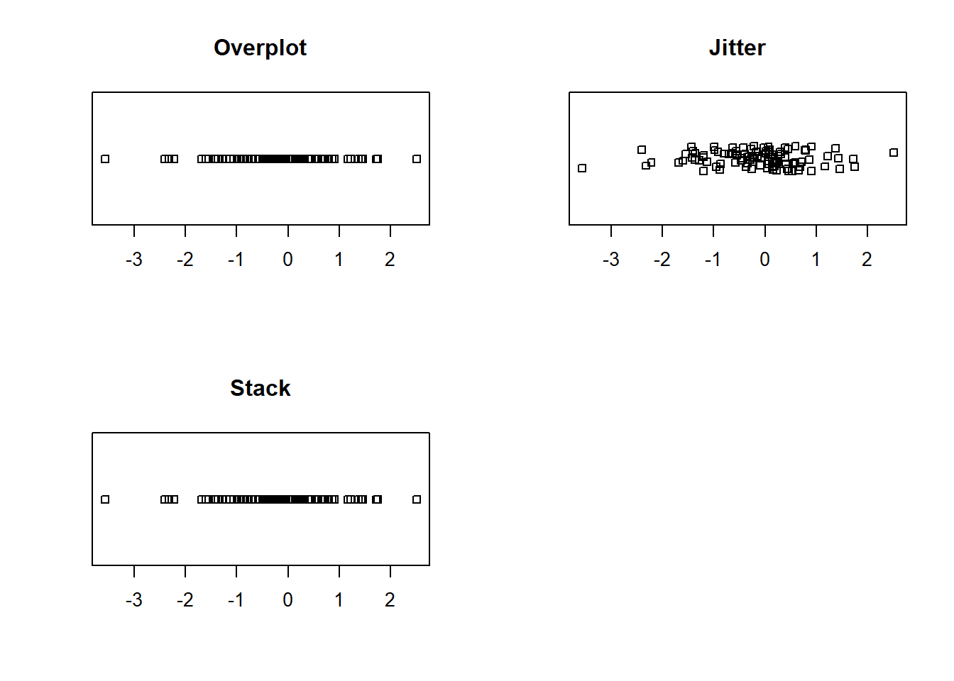
Example 4. All three methods in one
Now let’s see what all three methods show for the same data set. We will place them all on one plot.
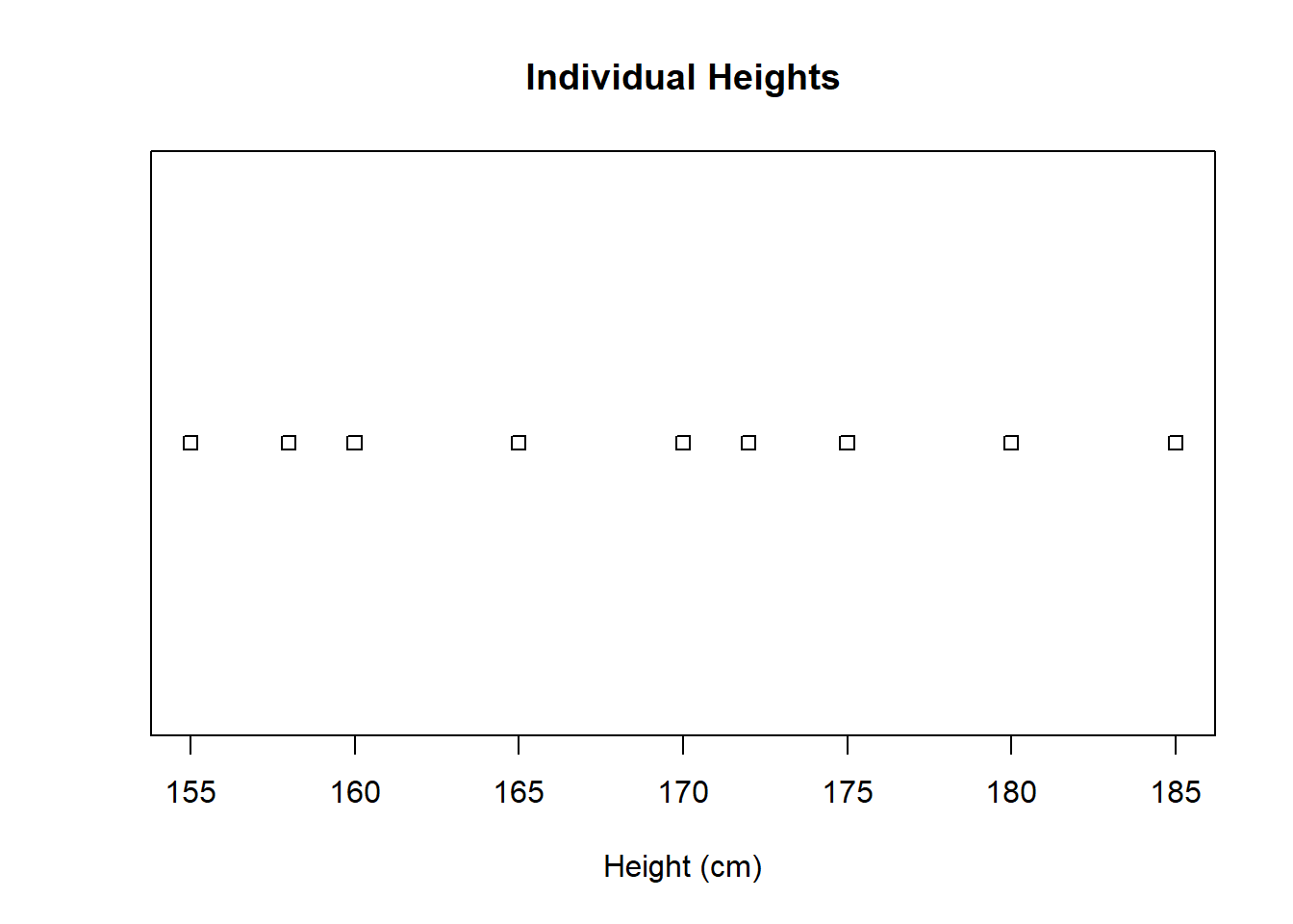
x <-rnorm(100)par(mfrow =c(2, 2))# Create a stripchart of the heights of 100 randomly generated peoplestripchart(x, method ="overplot", main ="Overplot")# Create a stripchart of the heights of 100 people, jittering the points to prevent overlappingstripchart(x, method ="jitter", main ="Jitter")# Create a stripchart of the heights of 100 people, stacking the points on top of each otherstripchart(x, method ="stack", main ="Stack")par(mfrow =c(1, 1))
Empower Yourself with stripchart()
The stripchart() function is a fantastic tool for visualizing data distributions, making comparisons, and spotting patterns. It’s a simple yet effective way to represent your data graphically. So, don’t hesitate to roll up your sleeves and give it a try. The world of data visualization is at your fingertips, waiting for you to unveil its secrets with the power of R’s stripchart() function. Happy coding!
Remember, the examples we’ve explored here are just the beginning. Feel free to experiment, tweak parameters, and adapt the function to your specific needs. The more you practice, the more confident you’ll become in using this powerful visualization tool. Your data has stories to tell, and stripchart() is here to help you tell them vividly and creatively. Enjoy your data exploration journey!