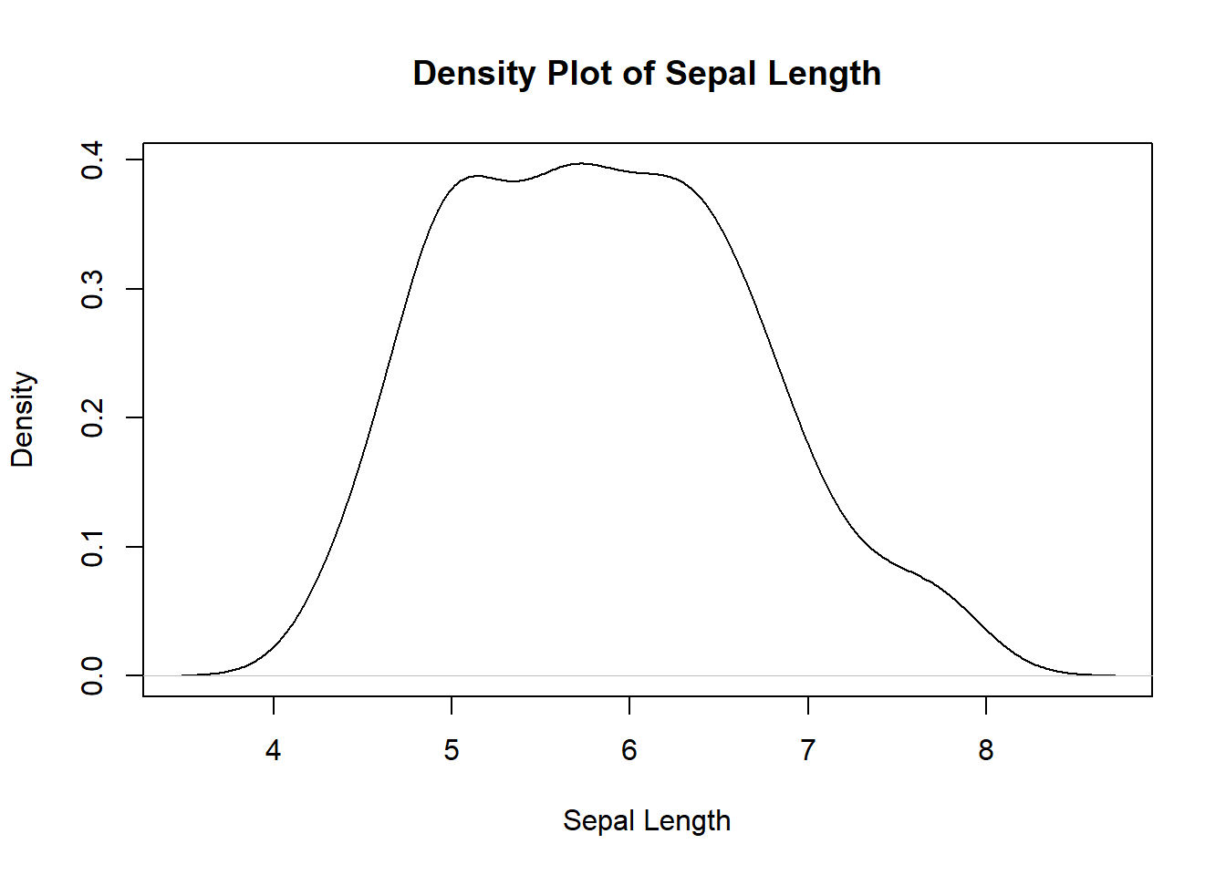
# Plot the density distribution of Sepal Length
plot(
  density(iris$Sepal.Length),
  main="Density Plot of Sepal Length",
  xlab="Sepal Length", ylab="Density"
  )
Understanding the distribution of your data is a fundamental step in any data analysis process. It gives you insights into the spread, central tendency, and overall shape of your data. In this blog post, we’ll explore two popular functions in R for visualizing data distribution: density() and hist(). We’ll use the classic Iris dataset for our examples. Additionally, we will introduce the {TidyDensity} library and show how it can be used to create distribution plots.
The density() function in R is used to estimate the probability density function of a continuous random variable. This function calculates density curve, allowing us to see the underlying distribution of the data with the plot() function.
density(x, ...)Where x is the numeric vector for which the density will be estimated.
# Plot the density distribution of Sepal Length
plot(
density(iris$Sepal.Length),
main="Density Plot of Sepal Length",
xlab="Sepal Length", ylab="Density"
)
In this example, we load the Iris dataset and plot the density distribution of Sepal Length. The main, xlab, and ylab arguments are used to provide titles and labels to the plot.
The hist() function is another powerful tool for visualizing the distribution of data. It creates a histogram, which is a graphical representation of the frequency distribution of a dataset.
hist(x, ...)Where x is the numeric vector for which the histogram will be created.
# Create a histogram of Petal Width
hist(iris$Petal.Width, main="Histogram of Petal Width",
     xlab="Petal Width", ylab="Frequency", col="skyblue")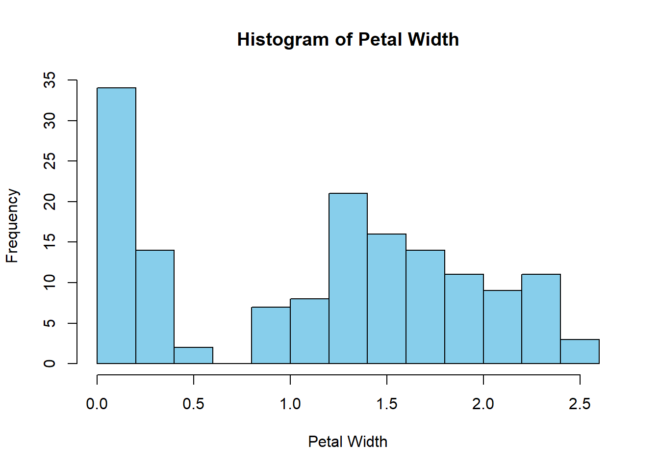
Here, we create a histogram of the Petal Width from the Iris dataset. The main, xlab, ylab, and col arguments allow customization of the plot’s appearance.
Here we will combine the density plot and the histogram together. Sometimes this helps.
x <- iris$Sepal.Length

hist(x, prob = TRUE)
lines(density(x))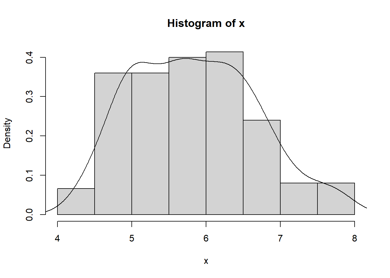
The TidyDensity library is a convenient way to visualize data distributions with a modern and tidy approach. Let’s take a look at how it works.
# Load the required library
library(TidyDensity)

# Extract the 'mpg' column
x <- mtcars$mpg

# Use TidyDensity functions to visualize data distribution
tidy_empirical(x) |> tidy_autoplot()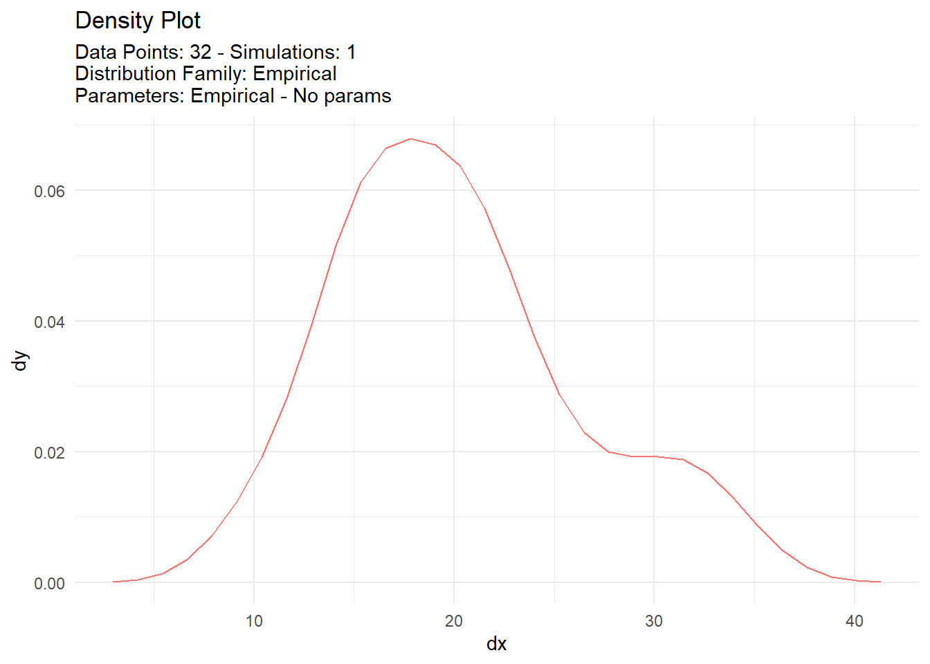
In this example, we load the TidyDensity library and the mtcars dataset. We extract the ‘mpg’ column and then utilize the tidy_empirical() function to compute the empirical density. The tidy_autoplot() function creates a visually appealing distribution plot.
In conclusion, visualizing data distribution is crucial for understanding the characteristics of your dataset. R provides various functions like density() and hist() to help you with this task. Additionally, the TidyDensity library offers a modern approach to visualizing data distributions. With these tools at your disposal, you can gain valuable insights from your data and make informed decisions in your analysis.