How to Plot Multiple Histograms with Base R and ggplot2
rtip
viz
Author
Steven P. Sanderson II, MPH
Published
August 25, 2023
Introduction
Histograms are a powerful tool for visualizing the distribution of numerical data. They allow us to quickly understand the frequency distribution of values within a dataset. In this tutorial, we’ll explore how to create multiple histograms using two popular R packages: base R and ggplot2. By the end of this guide, you’ll be able to confidently display multiple histograms on a single graph using both methods.
Using Base R to Plot Multiple Histograms
Base R provides a simple yet effective way to create histograms. Let’s dive into the syntax and examples.
Syntax for Creating a Histogram in Base R
To create a histogram using base R, you can use the hist() function. The basic syntax is as follows:
hist(x, main ="Histogram Title", xlab ="X-axis Label", ylab ="Frequency")
x: The numeric vector of values for which you want to create a histogram.
main: The title for the histogram.
xlab: The label for the x-axis.
ylab: The label for the y-axis.
Examples
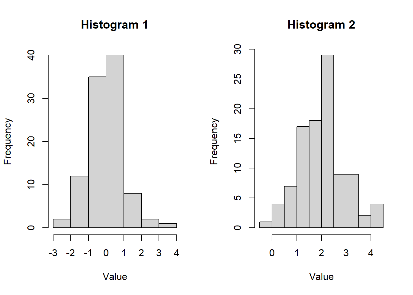
Example 1: Creating Side-by-Side Histograms
To plot multiple histograms side by side using base R, you can make use of the par(mfrow) function. This function allows you to specify the number of rows and columns for your layout. Here’s an example:
# Create two example datasetsdata1 <-rnorm(100, mean =0, sd =1)data2 <-rnorm(100, mean =2, sd =1)# Set up a side-by-side layoutpar(mfrow =c(1, 2))# Create the first histogramhist(data1, main ="Histogram 1", xlab ="Value", ylab ="Frequency")# Create the second histogramhist(data2, main ="Histogram 2", xlab ="Value", ylab ="Frequency")
par(mfrow =c(1, 1))
In this example, we first generate two example datasets (data1 and data2). Then, we use par(mfrow = c(1, 2)) to set up a side-by-side layout. Finally, we create the histograms for each dataset using the hist() function.
Now, let’s plot them on the same graph.
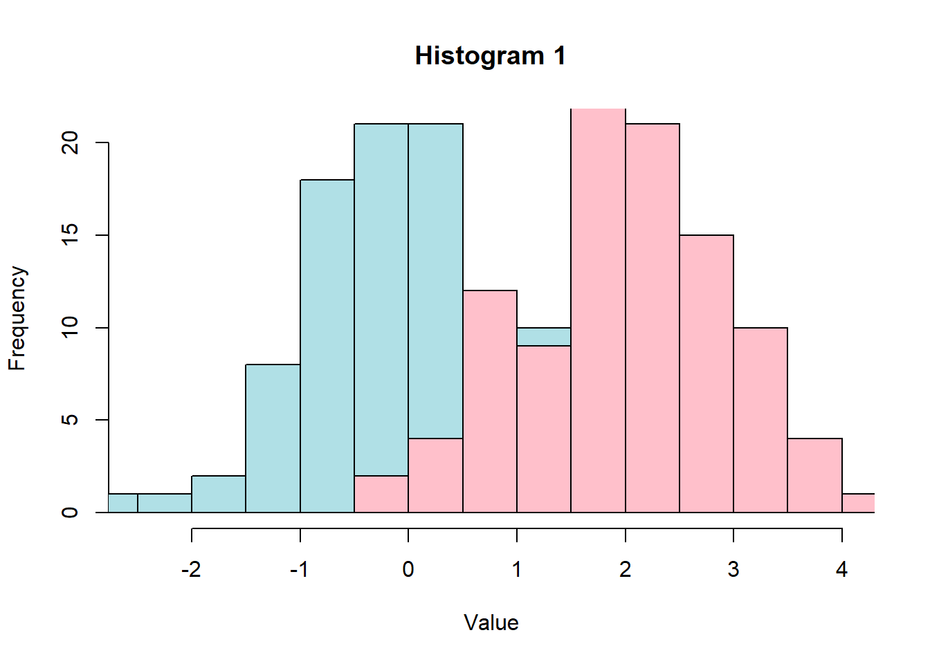
Example 2: Creating Histograms on the same graph
# Create two example datasetsdata1 <-rnorm(100, mean =0, sd =1)data2 <-rnorm(100, mean =2, sd =1)xmin <-min(data1, data2)xmax <-max(data1, data2)# Create the first histogramhist(data1, main ="Histogram 1", xlab ="Value", ylab ="Frequency",col ="powderblue", xlim =c(xmin, xmax))# Create the second histogramhist(data2, main ="Histogram 2", xlab ="Value", ylab ="Frequency",col ="pink", add =TRUE, xlim =c(xmin, xmax))
Example 3: Using ggplot2 to Plot Multiple Histograms
ggplot2 is a highly customizable and versatile package for creating complex visualizations. Let’s see how to use ggplot2 to create multiple histograms.
Syntax for Creating a Histogram in ggplot2
To create a histogram using ggplot2, you use the ggplot() function and the geom_histogram() layer. The basic syntax is as follows:
library(ggplot2)ggplot(data, aes(x = variable)) +geom_histogram(binwidth = width, fill ="color") +labs(title ="Histogram Title", x ="X-axis Label", y ="Frequency")
data: The dataset containing the variable you want to plot.
variable: The variable for which you want to create a histogram.
binwidth: The width of the histogram bins.
color: The fill color of the bars.
Example 1: Creating Multiple Histograms
To create multiple histograms using ggplot2, you can utilize facets. Facets allow you to split your data into subsets and create separate histograms for each subset. Here’s an example:
library(ggplot2)# Create an example datasetdata <-data.frame(group =rep(c("Group A", "Group B"), each =100),value =c(rnorm(100, mean =0, sd =1), rnorm(100, mean =2, sd =1)))# Create multiple histograms using facetsggplot(data, aes(x = value)) +geom_histogram(binwidth =0.5, fill ="steelblue") +labs(title ="Multiple Histograms", x ="Value", y ="Frequency") +facet_wrap(~ group, nrow =1) +theme_minimal()
In this example, we first create an example dataset with two groups (Group A and Group B). Then, we use the facet_wrap() function to create separate histograms for each group.
Get Hands-On!
Now that you have a grasp of how to create multiple histograms using both base R and ggplot2, it’s time to put your skills to the test. Pick a dataset you’re interested in, import it into R, and start creating engaging histograms. Experiment with different bin widths, colors, and layouts to find the visualizations that best convey your data’s story.
Remember, practice makes perfect! The more you experiment and create histograms, the more comfortable you’ll become with the syntax and options offered by both base R and ggplot2. Happy plotting!