# Generate data
set.seed(1234)
x <- rnorm(500)

# Estimate density
dens <- density(x)

# Plot density
plot(dens)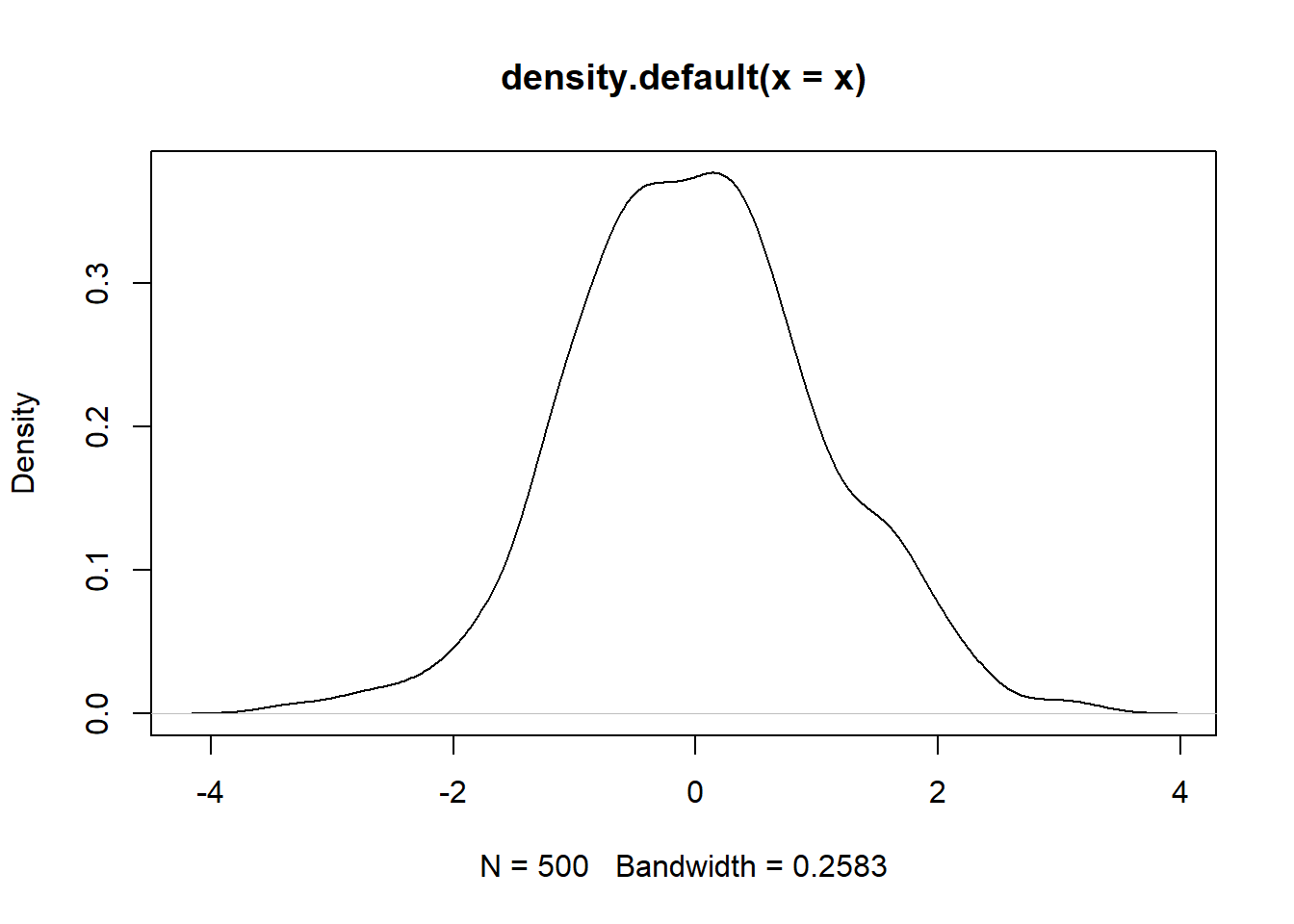
Kernel Density Plots are a type of plot that displays the distribution of values in a dataset using one continuous curve. They are similar to histograms, but they are even better at displaying the shape of a distribution since they aren’t affected by the number of bins used in the histogram. In this blog post, we will discuss what Kernel Density Plots are in simple terms, what they are useful for, and show several examples using both base R and ggplot2.
Kernel Density Plots are a way to estimate the probability density function of a continuous random variable. They are sometimes referred to as a kernel density plot or kernel density estimation plot. The probability density function (PDF) is estimated using the observed data points in the theory underlying a density plot. Each data point is the center of a kernel function, usually a Gaussian (normal) kernel. The density estimate’s shape and width are determined by the kernel function.
Kernel Density Plots are useful for visualizing the distribution of a dataset. They can be used to identify the shape of the distribution, including whether it is symmetric or skewed, and whether it has one or more peaks. They can also be used to compare the distributions of two or more datasets.
To create a Kernel Density Plot in base R, we can use the density() function to estimate the density and the plot() function to plot it. Here’s an example:
# Generate data
set.seed(1234)
x <- rnorm(500)
# Estimate density
dens <- density(x)
# Plot density
plot(dens)
This will generate a Kernel Density Plot of the x dataset.
We can also overlay the density curve over a histogram using the lines() function. Here’s an example:
# Generate data
set.seed(1234)
x <- rnorm(500)

# Plot histogram
hist(x, freq = FALSE)

# Estimate density
dens <- density(x)

# Overlay density curve
lines(dens, col = "red")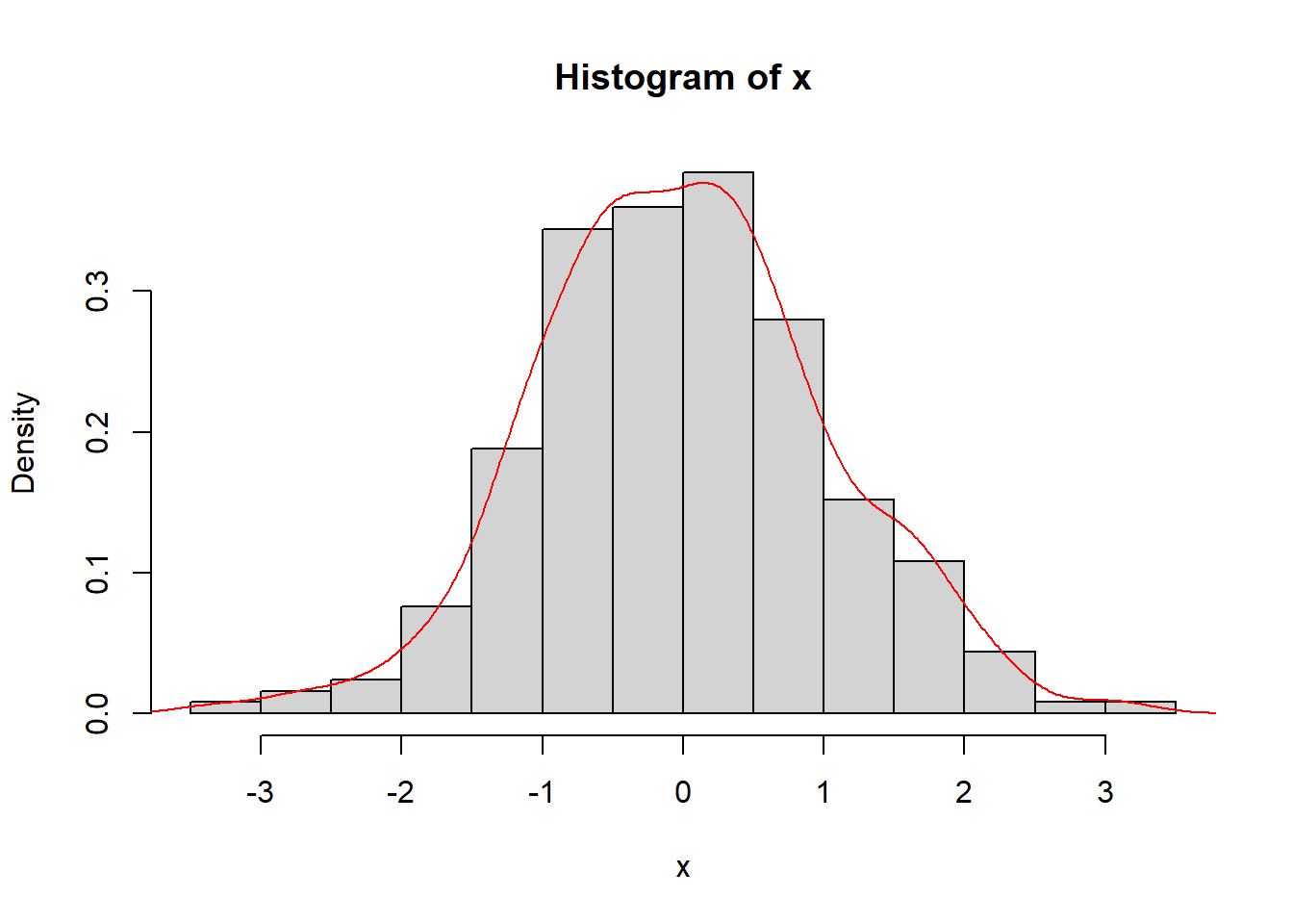
This will generate a histogram with a Kernel Density Plot overlaid on top.
To create a Kernel Density Plot in ggplot2, we can use the geom_density() function. Here’s an example:
# Load ggplot2 package
library(ggplot2)

# Generate data
set.seed(1234)
x <- rnorm(500)

# Create data frame
df <- data.frame(x = x)

# Plot density
ggplot(df, aes(x = x)) +
  geom_density() +
  theme_minimal()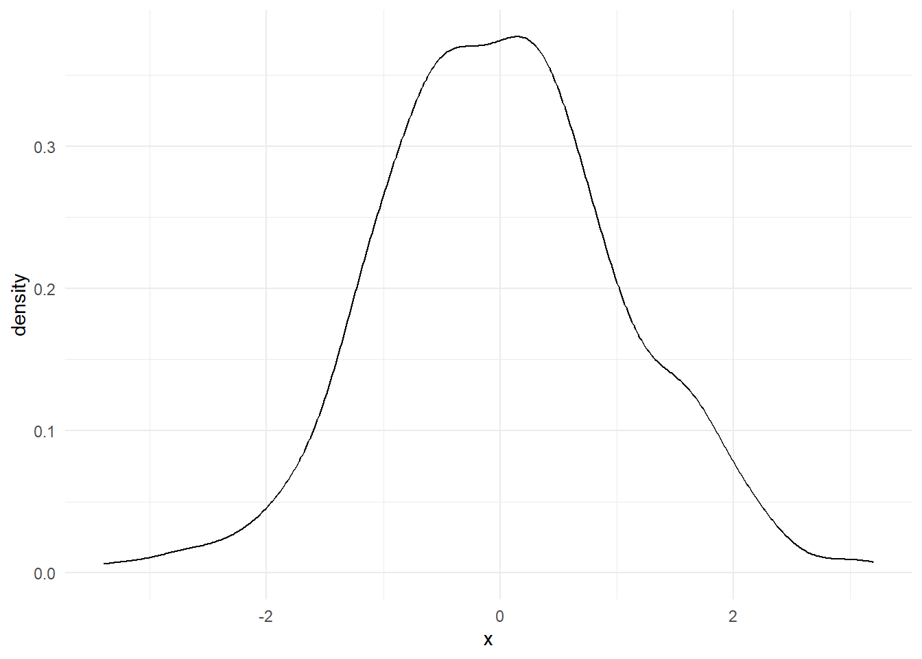
This will generate a Kernel Density Plot of the x dataset using ggplot2.
We can also customize the plot by changing the color and fill of the density curve. Here’s an example:
# Generate data
set.seed(1234)
x <- rnorm(500)

# Create data frame
df <- data.frame(x = x)

# Plot density
ggplot(df, aes(x = x)) +
  geom_density(color = "red", fill = "blue", alpha = 0.328) +
  theme_minimal()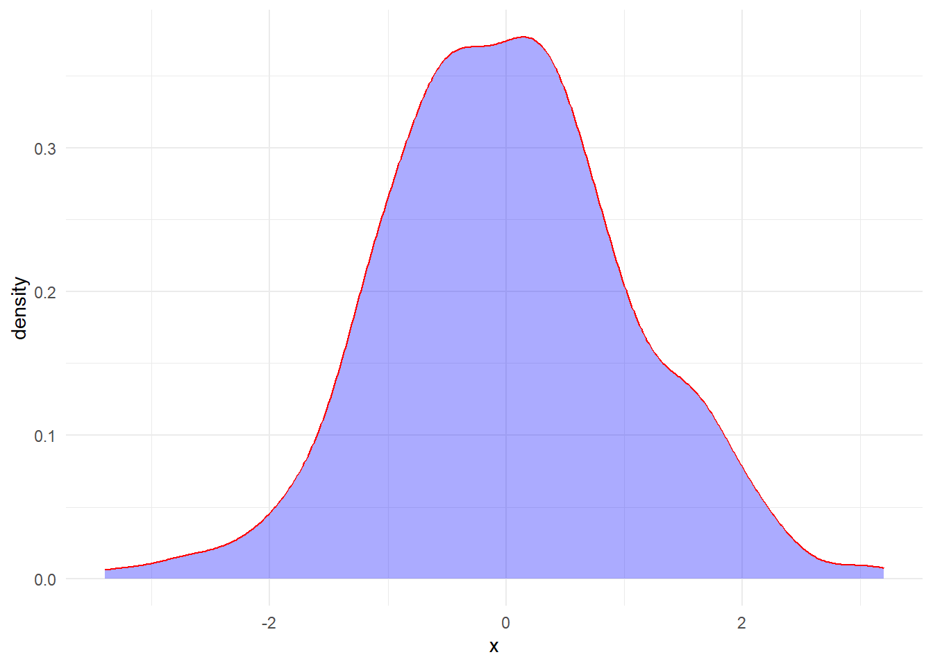
This will generate a Kernel Density Plot of the x dataset using ggplot2 with a red line, blue fill, and 33% transparency.
I have posted on it before but TidyDensity can also help in creating density plots for data that use the tidy_ distribution functions with its own autoplot function. Let’s take a look at an example using the same data as above.
library(TidyDensity)

set.seed(1234)

tn <- tidy_normal(.n = 500)

tn |> tidy_autoplot()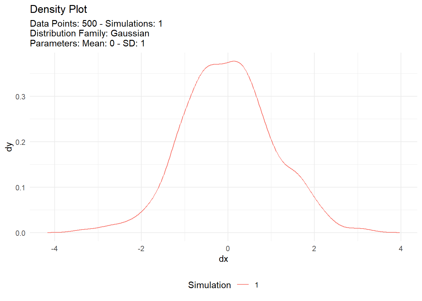
Now let’s see it with different means on the same chart.
set.seed(1234)

tidy_multi_single_dist(
  .tidy_dist = "tidy_normal",
  .param_list = list(
    .n = 500,
    .mean = c(-2, 0, 2),
    .sd = 1,
    .num_sims = 1
  )
) |>
  tidy_multi_dist_autoplot()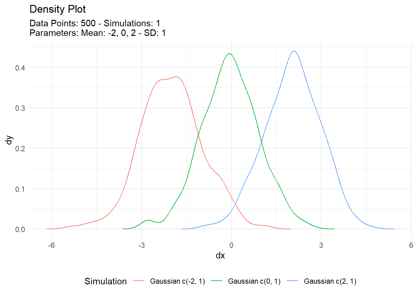
And one final one with multiple simulations of each distribution.
set.seed(1234)

tidy_multi_single_dist(
  .tidy_dist = "tidy_normal",
  .param_list = list(
    .n = 500,
    .mean = c(-2,0,2),
    .sd = 1,
    .num_sims = 5
  )
) |>
  tidy_multi_dist_autoplot()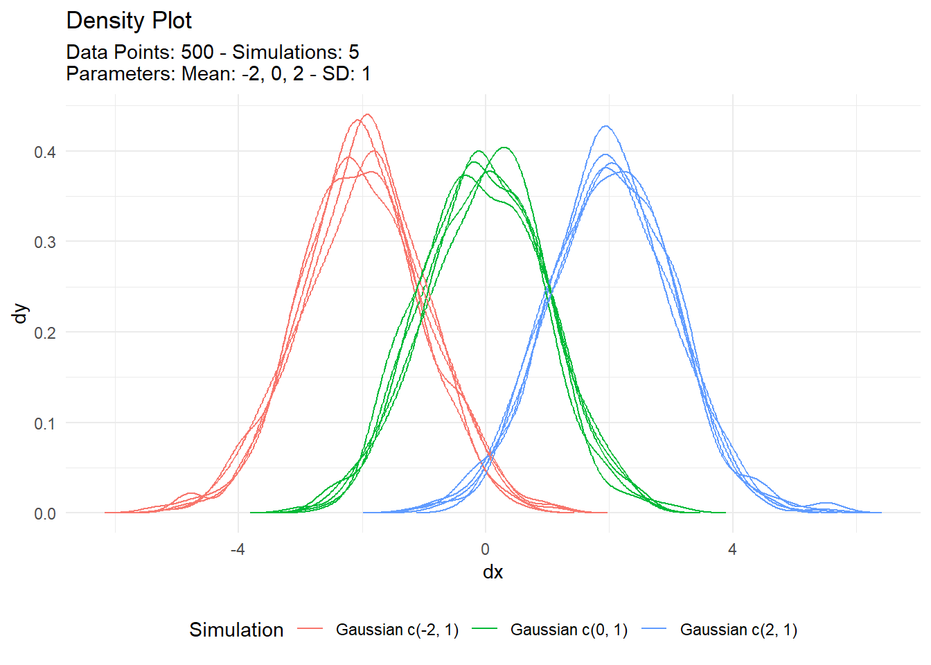
Kernel Density Plots are a useful tool for visualizing the distribution of a dataset. They are easy to create in both base R and ggplot2, and can be customized to fit your needs. We encourage readers to try creating their own Kernel Density Plots using the examples provided in this blog post.