x = runif(100, 150, 250)
y = (x/3) + rnorm(100)
data <- data.frame(x, y)
plot(data$x, data$y, pch = 16, col = 'steelblue')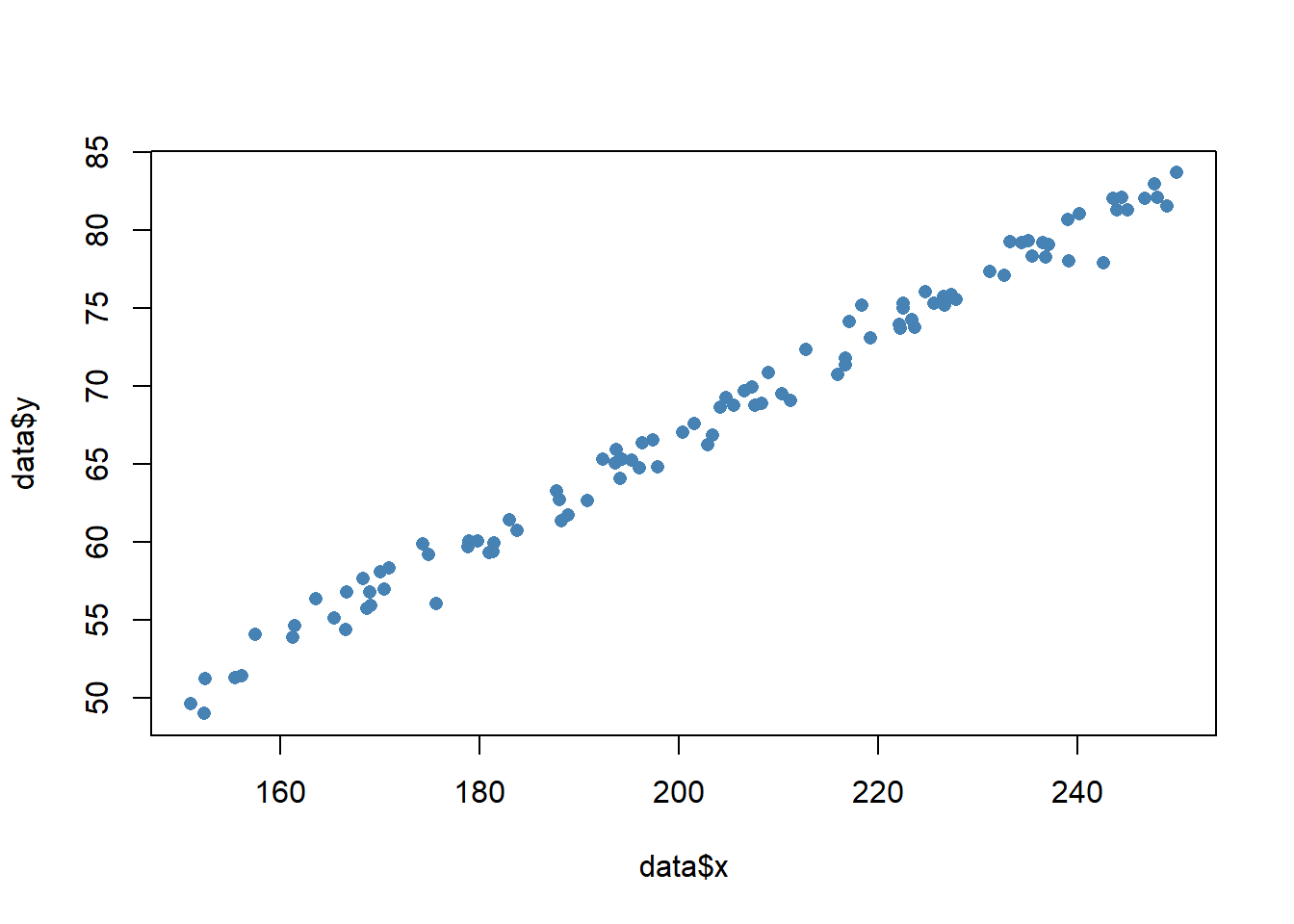
As an R programmer, one of the most useful functions to know is the jitter function. The jitter function is used to add random noise to a numeric vector, which can be helpful when visualizing data in a scatterplot. By using the jitter function, we can get a better picture of the true underlying relationship between two variables in a dataset.
Scatterplots are excellent for visualizing the relationship between two continuous variables. For example, let’s say we have a dataset of 100 points on the x and y coordinate plane and we want to visualize the relationship between their x and y. We can create a scatterplot using the plot function in R:
x = runif(100, 150, 250)
y = (x/3) + rnorm(100)
data <- data.frame(x, y)
plot(data$x, data$y, pch = 16, col = 'steelblue')
However, if we have a lot of data points that are clustered together, it can be difficult to see the true density of the data. This is where the jitter function comes in. We can add some random noise to the data using the jitter function:
x <- sample(1:10, 200, TRUE)
y <- 3*x + rnorm(200)
data <- data.frame(x, y)
plot(jitter(data$x, 0.1), jitter(data$y, 0.1), pch = 16, col = 'steelblue')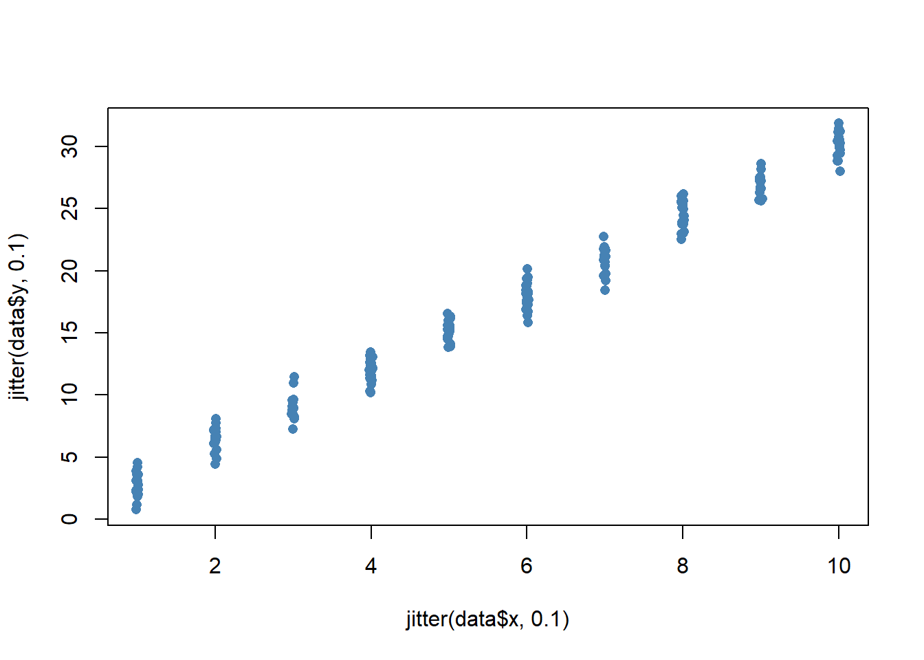
We can optionally add a numeric argument to jitter to add even more noise to the data:
plot(jitter(data$x, 0.2), jitter(data$y, 0.2), pch = 16, col = 'steelblue')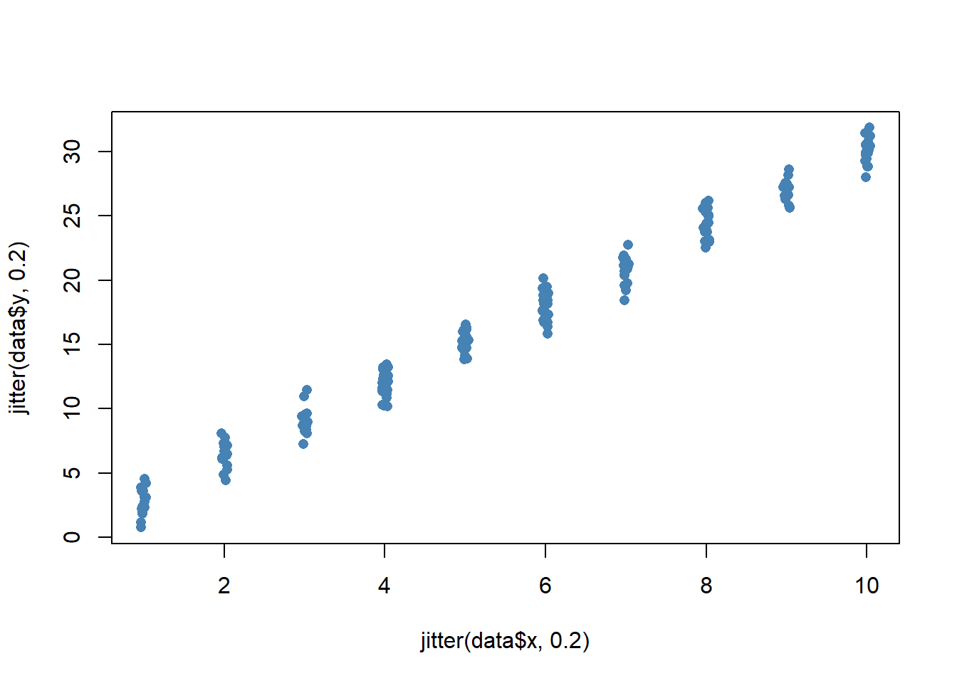
We should be careful not to add too much jitter, though, as this can distort the original data too much:
plot(jitter(data$x, 1), jitter(data$y, 1), pch = 16, col = 'steelblue')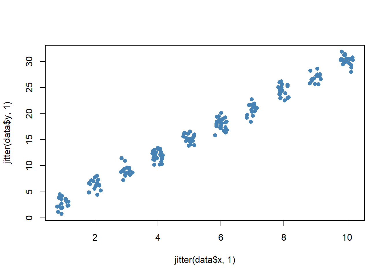
As mentioned before, jittering adds some random noise to data, which can be beneficial when we want to visualize data in a scatterplot. By using the jitter function, we can get a better picture of the true underlying relationship between two variables in a dataset.
Let’s look at some example data (where the predictor variable is discrete and the outcome is continuous), look at the problems with plotting these kinds of data using R’s defaults, and then look at the jitter function to draw a better scatterplot.
set.seed(1)
x <- sample(1:10, 200, TRUE)
y <- 3 * x + rnorm(200, 0, 5)
Here’s what a standard scatterplot of these data looks like:
plot(y ~ x, pch = 15)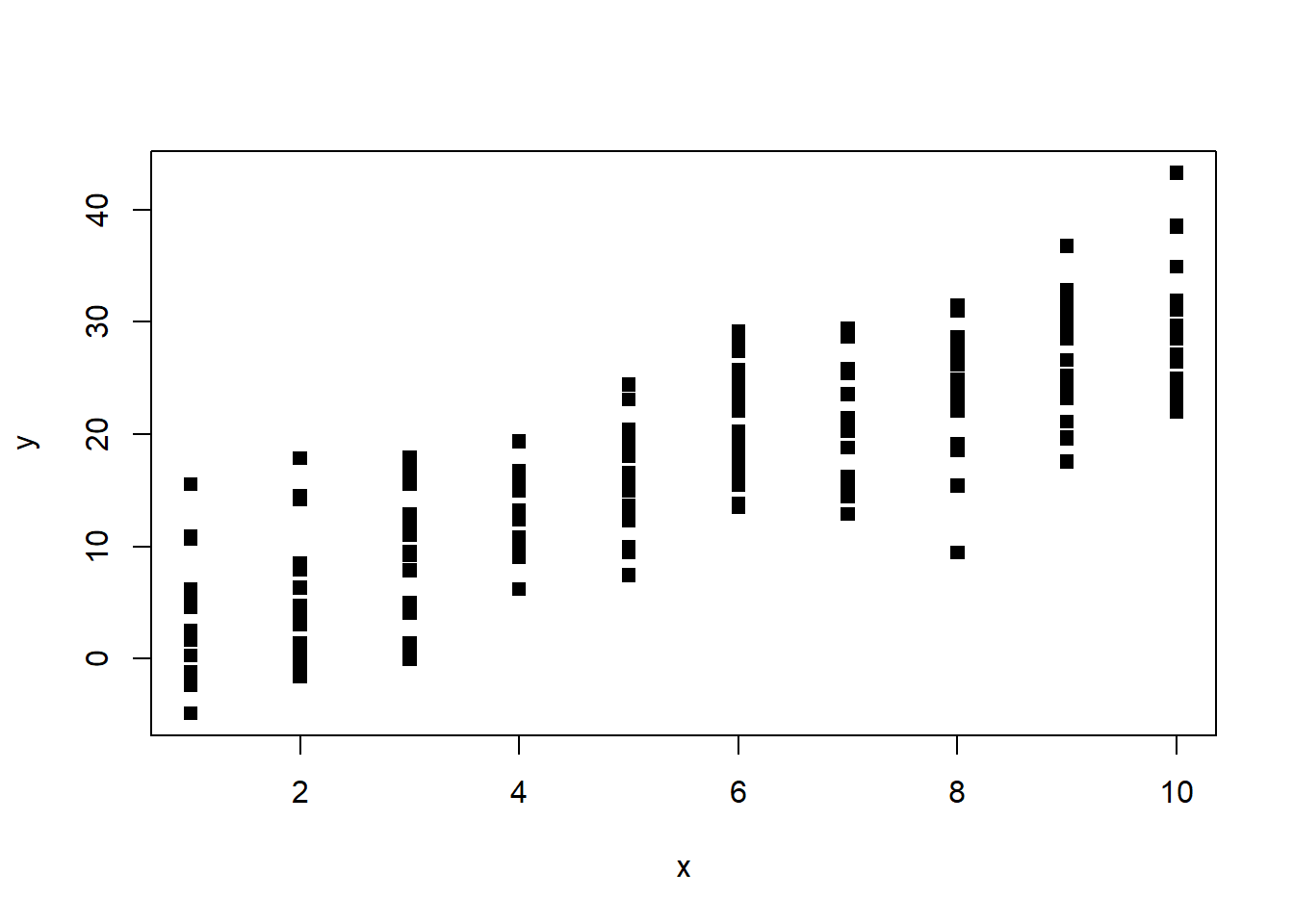
scatterplot without jitter
As you can see, the data points are stacked on top of each other, making it difficult to see the true density of the data. This is where the jitter function comes in. Let’s add some jitter to the x variable:
plot(y ~ jitter(x), pch = 15)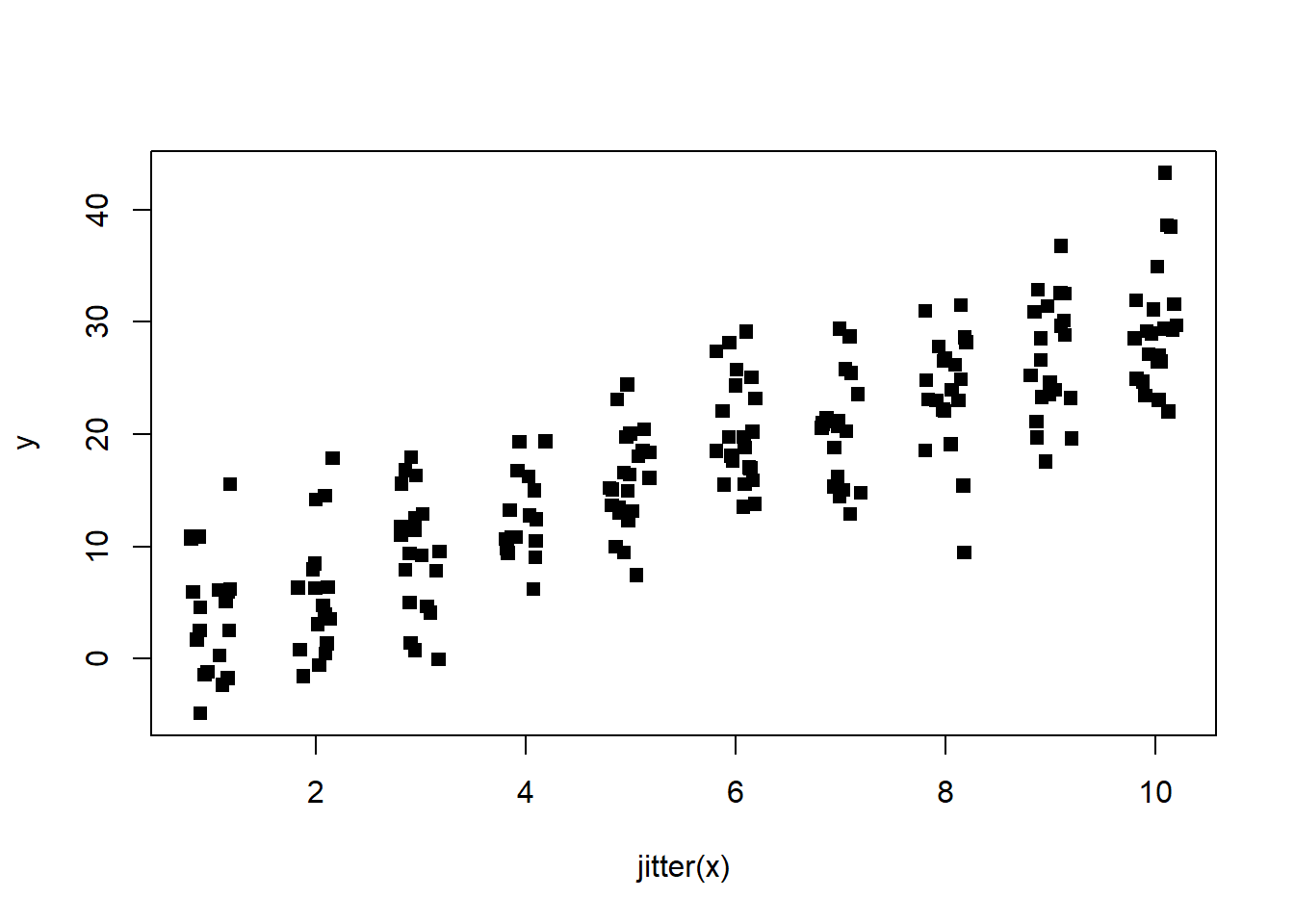
scatterplot with jitter on x variable
This is better, but we can still see some stacking of the data points. Let’s try adding jitter to the y variable:
plot(jitter(y) ~ jitter(x), pch = 15)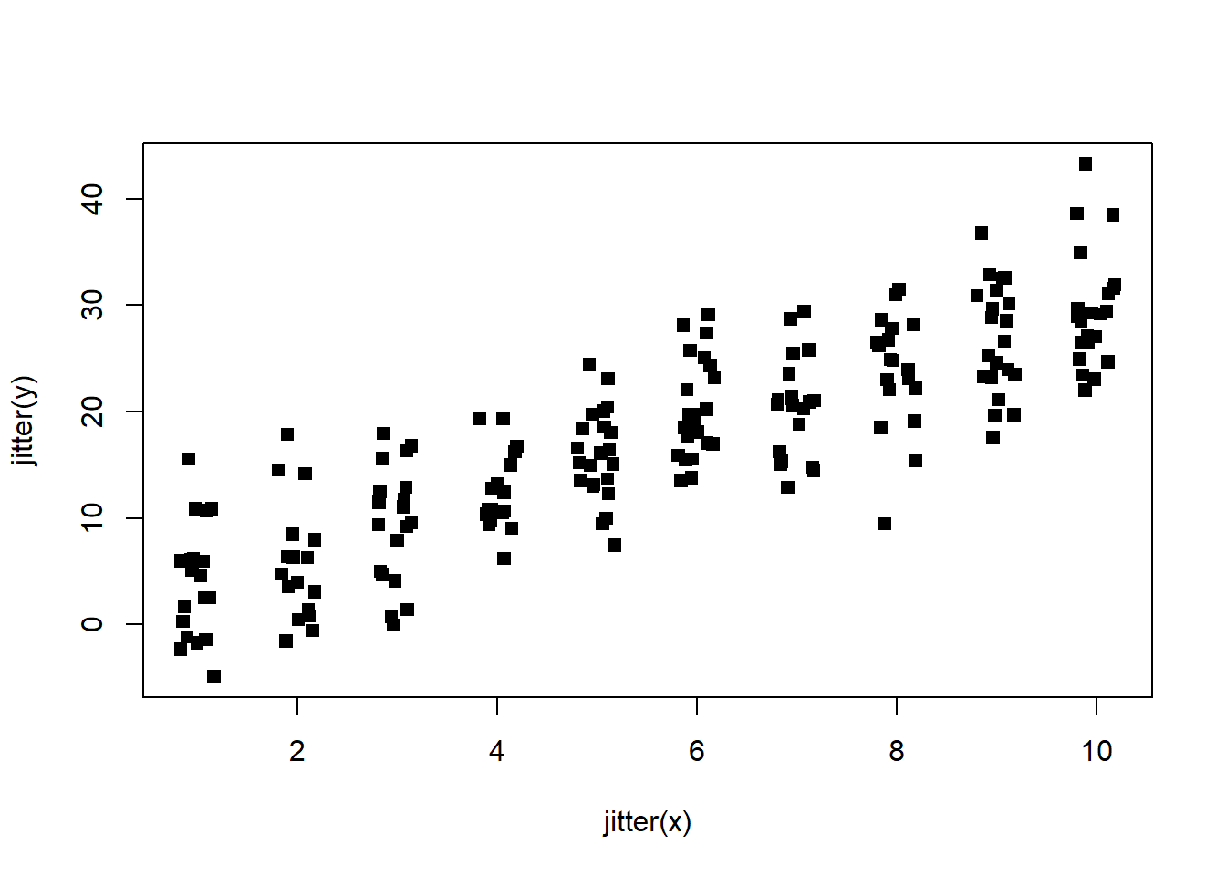
scatterplot with jitter on both variables
This is much better! We can now see the true density of the data and the underlying relationship between the predictor and outcome variables.
The jitter function is a useful tool for visualizing data in a scatterplot. By adding some random noise to the data, we can get a better picture of the true underlying relationship between two variables in a dataset. However, we should be careful not to add too much jitter, as this can distort the original data too much. I encourage readers to try using the jitter function in their own scatterplots to see how it can improve their visualizations.