# Load the required libraries
library(ggplot2)Introduction
Are you interested in visualizing demographic data in a unique and insightful way? Population pyramids are a fantastic tool for this purpose! They allow you to compare the distribution of populations across age groups for different genders or time periods. In this blog post, we’ll explore how to create population pyramid plots in R using the powerful ggplot2 library. Don’t worry if you’re new to R or ggplot2; we’ll walk you through the process step by step.
Getting Started
Before we dive into creating population pyramids, make sure you have R and ggplot2 installed. You can install ggplot2 by running the following command if you haven’t already:
install.packages("ggplot2")Now that you’re set up let’s start by loading the necessary libraries and preparing our data.
Loading Libraries
Preparing Data
For this example, we’ll use a hypothetical dataset that represents the population distribution by age and gender. You can replace this dataset with your own data, but for now, let’s create a sample dataset:
# Creating a sample dataset
data <- data.frame(
  Age = c(0:9, 0:9),
  Gender = c(rep("Male", 10), rep("Female", 10)),
  Population = c(200, 250, 300, 350, 400, 450, 500, 550, 600, 650,
                  190, 240, 290, 330, 380, 430, 480, 530, 580, 630)
)
Constructing the Population Pyramid
Now that we have our data, let’s create the population pyramid plot step by step using ggplot2.
Step 1: Create a Basic Bar Chart
Start by creating a basic bar chart representing the population distribution for one gender. We’ll use the geom_bar function to do this.
# Create a basic bar chart for one gender
basic_plot <-  ggplot(
    data,
    aes(
        x = Age,
        fill = Gender,
        y = ifelse(
            test = Gender == "Male",
            yes = -Population,
            no = Population
            )
        )
    ) +
geom_bar(stat = "identity")
In this code:
- We filter the data to include only one gender (Male) using
subset. - We use
aesto specify the aesthetic mappings. We mapAgeto the x-axis,-Populationto the y-axis (note the negative sign to flip the bars), andAgeto the fill color. geom_baris used to create the bar chart, andstat = "identity"ensures that the heights of the bars are determined by thePopulationvariable.- Finally,
coord_flip()is applied to flip the chart horizontally, making it look like a pyramid.
Step 2: Combine Both Genders
To create a population pyramid, we need to combine both male and female data. We’ll create two separate plots for each gender and then combine them using the + operator.
# Create population pyramids for both genders and combine them
population_pyramid <- basic_plot +
  scale_y_continuous(
    labels = abs,
    limits = max(data$Population) * c(-1,1)
  ) +
  coord_flip() +
  theme_minimal() +
  labs(
    x = "Age",
    y = "Population",
    fill = "Age",
    title = "Population Pyramid"
  )
In this step:
- scale_y_continuous(labels = abs, limits = max(data$Population) * c(-1,1)):
- This part adjusts the y-axis (vertical axis) of the plot.
- labels = abs means that the labels on the y-axis will show the absolute values (positive numbers) rather than negative values.
- limits = max(data$Population) * c(-1,1) sets the limits of the y-axis. It ensures that the y-axis extends from the maximum population value (positive) to the minimum (negative) value, creating a symmetrical pyramid shape.
- coord_flip(): This function flips the coordinate system of the plot. By default, the x-axis (horizontal) represents age, and the y-axis (vertical) represents population. coord_flip() swaps them so that the x-axis represents population and the y-axis represents age, creating the pyramid effect.
- theme_minimal(): This sets the overall visual theme of the plot to a minimalistic style. It adjusts the background, gridlines, and other visual elements to a simple and clean appearance.
- labs(x = “Age”, y = “Population”, fill = “Age”, title = “Population Pyramid”): This part labels various elements of the plot:
- x = “Age” labels the x-axis as “Age.”
- y = “Population” labels the y-axis as “Population.”
- fill = “Age” specifies that the “Age” variable will be used to fill the bars in the plot.
- title = “Population Pyramid” sets the title of the plot as “Population Pyramid.”
Step 3: Customize Your Plot
Feel free to customize your plot further by adding labels, adjusting colors, or modifying other aesthetics to match your preferences. The ggplot2 library provides extensive customization options.
Step 4: Visualize Your Population Pyramid
To visualize your population pyramid, simply print the population_pyramid object:
population_pyramid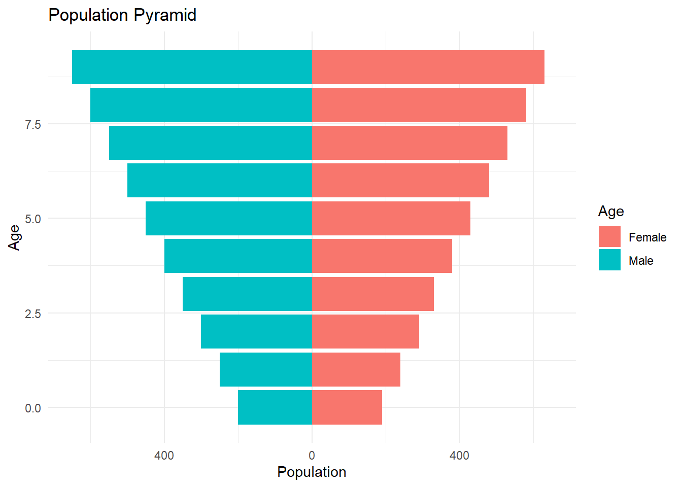
This will display the population pyramid plot in your R graphics window.
Conclusion
Creating population pyramid plots in R using ggplot2 can be a powerful way to visualize demographic data. In this blog post, we walked through the process step by step, from loading libraries and preparing data to constructing and customizing the pyramid plot. Now it’s your turn to give it a try with your own data or explore additional features and customization options in ggplot2. Happy plotting!