Histograms are powerful tools for visualizing the distribution of a single variable, but what if you want to compare the distributions of two variables side by side? In this blog post, we’ll explore how to create a histogram of two variables in R, a popular programming language for data analysis and visualization.
We’ll cover various scenarios, from basic histograms to more advanced techniques, and explain the code step by step in simple terms. So, grab your favorite dataset or generate some random data, and let’s dive into the world of dual-variable histograms!
Prerequisites
Before we start, ensure you have R installed on your computer. You can download it from R’s official website. Additionally, you might find it helpful to have RStudio, an integrated development environment for R.
Examples
Basic Dual-Variable Histogram
Let’s begin with the most straightforward scenario: creating a histogram of two variables using the hist() function. We’ll use the built-in mtcars dataset, which contains information about various car models.
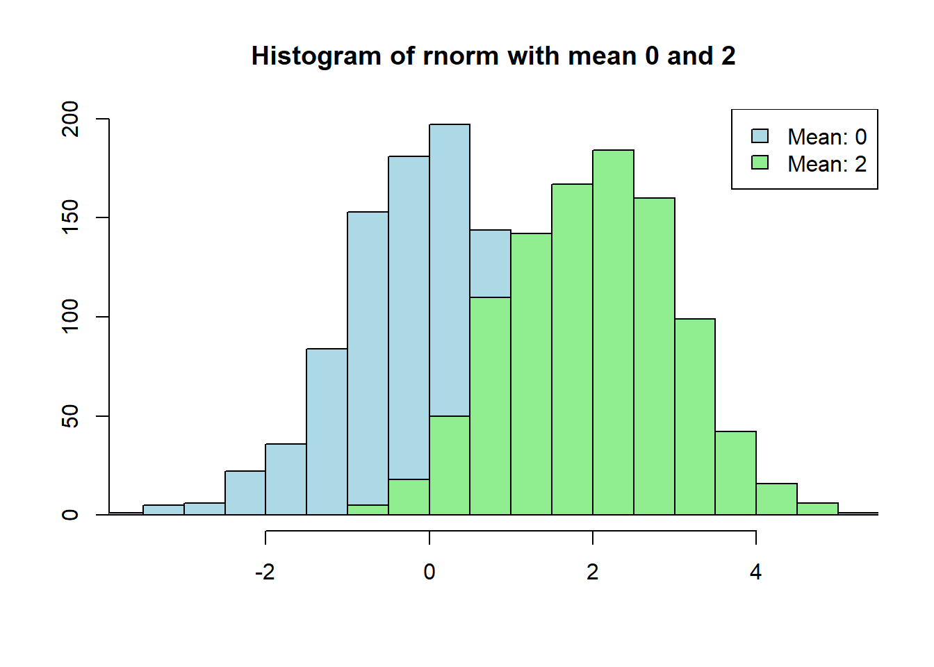
x1 <-rnorm(1000)x2 <-rnorm(1000, mean =2)minx <-min(x1, x2)maxx <-max(x1, x2)# Create a basic dual-variable histogramhist(x1, main="Histogram of rnorm with mean 0 and 2", xlab="", ylab="", col="lightblue", xlim =c(minx, maxx))hist(x2, xlab="", ylab="", col="lightgreen", add=TRUE)legend("topright", legend=c("Mean: 0", "Mean: 2"), fill=c("lightblue", "lightgreen"))
The given R code generates a dual-variable histogram in R using the hist() function. The first two lines of code generate two vectors x1 and x2 of 1000 random normal numbers each, with x1 having a mean of 0 and x2 having a mean of 2. The min() and max() functions are then used to find the minimum and maximum values between x1 and x2. These values are used to set the limits of the x-axis of the histogram.
The hist() function is then called twice to create two histograms, one for x1 and one for x2. The col argument is used to set the color of each histogram. The add argument is set to TRUE for the second histogram so that it is overlaid on top of the first histogram. Finally, the legend() function is used to add a legend to the plot indicating which histogram corresponds to which variable.
In summary, the code generates a dual-variable histogram of two vectors of random normal numbers with different means. The histogram shows the distribution of values for each variable and allows for easy comparison between the two variables.
Dual-Variable Histogram with Transparency
Adding transparency to the histograms can make the visualization more informative when the bars overlap. We can achieve this by setting the alpha parameter in the col argument. Let’s use the same dataset and create a dual-variable histogram with transparency:
Here, we use the rgb() function to set the color with transparency. The alpha parameter controls the transparency level, with values between 0 (completely transparent) and 1 (completely opaque).
Side-by-Side Histograms
If you prefer to display the histograms side by side, you can use the par() function to adjust the layout. Here’s an example:
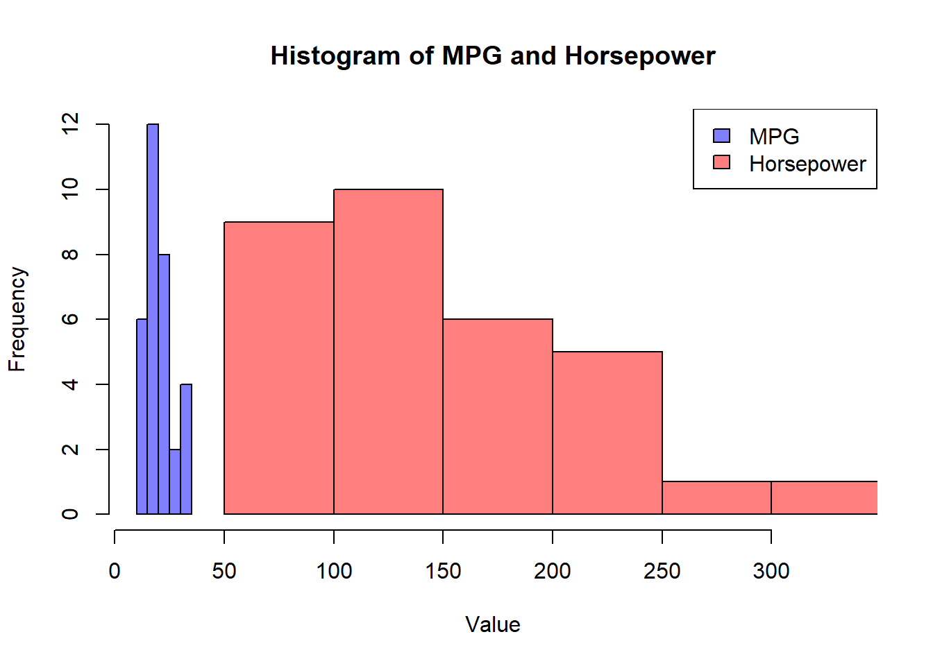
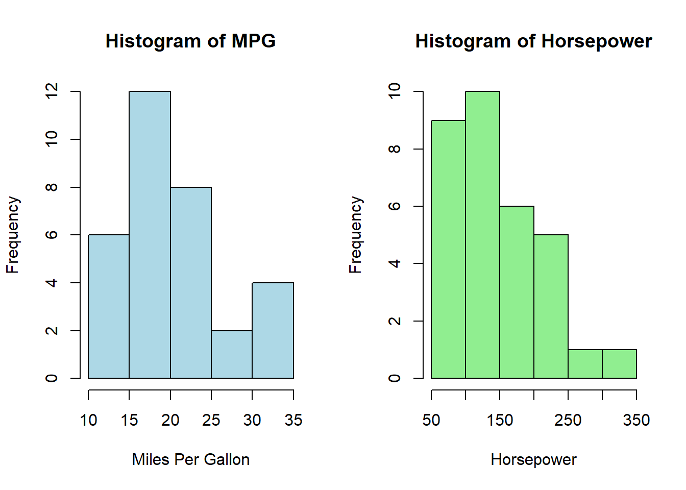
# Set up a side-by-side layoutpar(mfrow=c(1, 2))# Create side-by-side histogramshist(mtcars$mpg, main="Histogram of MPG", xlab="Miles Per Gallon", ylab="Frequency", col="lightblue", xlim=c(10, 35))hist(mtcars$hp, main="Histogram of Horsepower", xlab="Horsepower", ylab="Frequency", col="lightgreen")
par(mfrow=c(1,1))
In this code, we use par(mfrow=c(1, 2)) to set up a 1x2 layout, which means two plots will appear side by side.
Customizing Dual-Variable Histograms
You can customize your dual-variable histograms further by adjusting various parameters, such as bin width, titles, labels, and colors. Experiment with different settings to create visualizations that best convey your data’s story.
Remember, the key to effective data visualization is experimentation and exploration. Try different datasets, play with colors and styles, and find the representation that best suits your needs.
Conclusion
In this blog post, we’ve explored several ways to create histograms of two variables in R. Whether you’re comparing distributions or just visualizing your data, histograms are a valuable tool in your data analysis toolkit. Experiment with the provided examples and take your data visualization skills to the next level!
So, fire up your R environment, load your data, and start creating dual-variable histograms today. Happy coding!