library(ggplot2)
library(caret)Introduction
Data visualization is a powerful tool in a data scientist’s toolkit. It not only helps us understand our data but also presents it in a way that is easy to comprehend. In this blog post, we will explore how to plot predicted values in R using the mtcars dataset. We will train a simple regression model to predict the miles per gallon (mpg) of cars based on their attributes and then visualize the predictions. By the end of this tutorial, you’ll have a clear understanding of how to plot predicted values and can apply this knowledge to your own data analysis projects.
Step 1: Load the Required Libraries
Before we dive into the code, let’s make sure we have the necessary libraries installed. We’ll be using ggplot2 for plotting and caret for model training and evaluation. You can install them if you haven’t already using:
install.packages("ggplot2")
install.packages("caret")
Now, let’s load the libraries:
Step 2: Load and Explore the Data
We’ll use the classic mtcars dataset, which contains various attributes of different car models. Our goal is to predict the fuel efficiency (mpg) of these cars. Let’s load and explore the dataset:
head(mtcars) mpg cyl disp hp drat wt qsec vs am gear carb
Mazda RX4 21.0 6 160 110 3.90 2.620 16.46 0 1 4 4
Mazda RX4 Wag 21.0 6 160 110 3.90 2.875 17.02 0 1 4 4
Datsun 710 22.8 4 108 93 3.85 2.320 18.61 1 1 4 1
Hornet 4 Drive 21.4 6 258 110 3.08 3.215 19.44 1 0 3 1
Hornet Sportabout 18.7 8 360 175 3.15 3.440 17.02 0 0 3 2
Valiant 18.1 6 225 105 2.76 3.460 20.22 1 0 3 1This will display the first few rows of the dataset, giving you an idea of what it looks like.
Step 3: Split the Data into Training and Testing Sets
Before we proceed with modeling and prediction, we need to split our data into training and testing sets. We’ll use 80% of the data for training and the remaining 20% for testing:
set.seed(123)  # for reproducibility
splitIndex <- createDataPartition(mtcars$mpg, p = 0.8, list = FALSE)
training_data <- mtcars[splitIndex, ]
testing_data <- mtcars[-splitIndex, ]
Step 4: Build a Simple Linear Regression Model
Now, let’s build a simple linear regression model to predict mpg based on other attributes. We’ll use the lm() function:
model <- lm(mpg ~ ., data = training_data)This line of code fits the linear regression model using the training data.
Step 5: Make Predictions
With our model trained, we can now make predictions on the testing data:
predictions <- predict(model, newdata = testing_data)Step 6: Create a Scatter Plot of Predicted vs. Actual Values
The most exciting part is visualizing the predicted values. We can do this using a scatter plot. Let’s create one:
# Combine actual and predicted values
plot_data <- data.frame(Actual = testing_data$mpg, Predicted = predictions)

# Create a scatter plot
ggplot(plot_data, aes(x = Actual, y = Predicted)) +
  geom_point() +
  geom_smooth(method = "lm", formula = y ~ x, color = "red") +
  labs(
    x = "Actual MPG",
    y = "Predicted MPG",
    title = "Actual vs. Predicted MPG"
    ) +
  theme_minimal()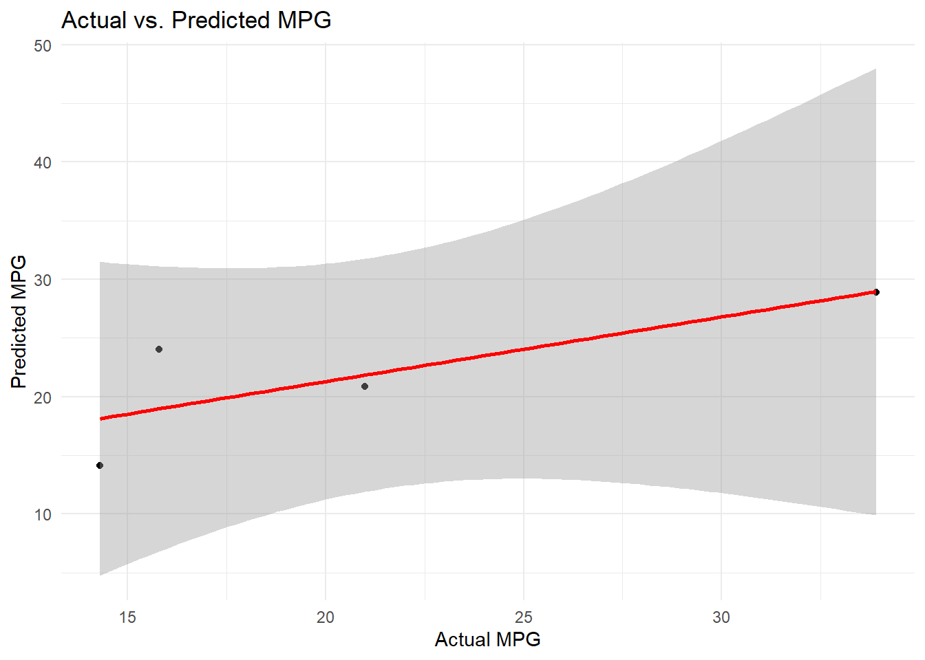
This code generates a scatter plot with the actual MPG values on the x-axis and predicted MPG values on the y-axis. The red line represents a linear regression line that helps us see how well our predictions align with the actual data.
Here is how we also plot the data in base R.
# Combine actual and predicted values
plot_data <- data.frame(Actual = testing_data$mpg, Predicted = predictions)

# Create a scatter plot
plot(plot_data$Actual, plot_data$Predicted,
     xlab = "Actual MPG", ylab = "Predicted MPG",
     main = "Actual vs. Predicted MPG",
     pch = 19, col = "blue")

# Add a regression line
abline(lm(Predicted ~ Actual, data = plot_data), col = "red")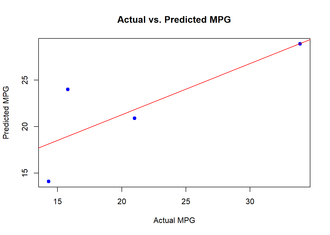
Conclusion
Congratulations! You’ve successfully learned how to plot predicted values in R using the mtcars dataset. Visualization is a vital part of data analysis, and it can provide valuable insights into the performance of your predictive models.
I encourage you to try this on your own datasets and explore more advanced visualization techniques. Experiment with different models and datasets to gain a deeper understanding of data visualization in R. Happy coding!