# Create a basic pairs plot
pairs(iris[, 1:4], main = "Pairs Plot of Iris Data")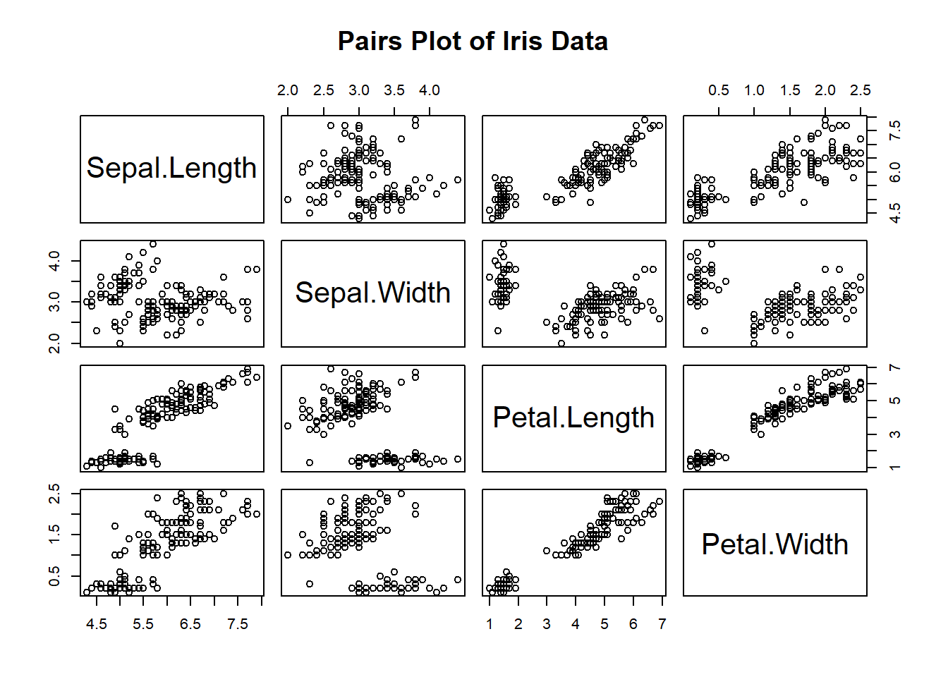
Data visualization is a crucial tool in data analysis, allowing us to gain insights from our data quickly. One of the fundamental techniques for exploring relationships between variables is the pairs plot. In this blog post, we’ll dive into the world of pairs plots in base R. We’ll explore what they are, why they are useful, and how to create and interpret them.
A pairs plot, also known as a scatterplot matrix, is a grid of scatterplots that displays pairwise relationships between multiple variables in a dataset. Each cell in the grid represents the relationship between two variables, and the diagonal cells display histograms or kernel density plots of individual variables. Pairs plots are incredibly versatile, helping us to identify patterns, correlations, and potential outliers in our data.
Before we dive into creating pairs plots, let’s set up our environment and load a dataset. For this tutorial, we’ll use the built-in “iris” dataset, which contains measurements of iris flowers.
# Load the iris dataset
data(iris)To create a basic pairs plot, we’ll use the pairs() function in base R. Here’s how to create one for the “iris” dataset:
# Create a basic pairs plot
pairs(iris[, 1:4], main = "Pairs Plot of Iris Data")
In this example, we specify the columns to include in the pairs plot (columns 1 to 4, which represent the sepal length, sepal width, petal length, and petal width). The main argument sets the title of the plot.
Now that we have our basic pairs plot, let’s break down how to interpret it:
Diagonal Plots: The diagonal cells display histograms (or density plots) of individual variables. These plots show the distribution of each variable in the dataset.
Off-Diagonal Plots: The off-diagonal cells contain scatterplots that show the relationship between pairs of variables. Each point in these scatterplots represents a data point in the dataset.
Patterns: Look for patterns or trends in the scatterplots. For example, do points cluster together, suggesting a strong correlation?
Correlations: Observe the general direction of points. Are they moving upward or downward? This can give you insights into the strength and direction of the correlation.
Outliers: Identify any outliers or data points that deviate significantly from the main cluster. Outliers can be indicative of errors or interesting cases in your data.
You can customize your pairs plot in various ways to make it more informative and visually appealing. Here are some customization options:
Coloring by Groups: If your dataset has categorical variables that define groups, you can use colors to distinguish between them. For example, you can color data points by species in the “iris” dataset.
# Color points by species
pairs(iris[, 1:4], main = "Pairs Plot of Iris Data", col = iris$Species)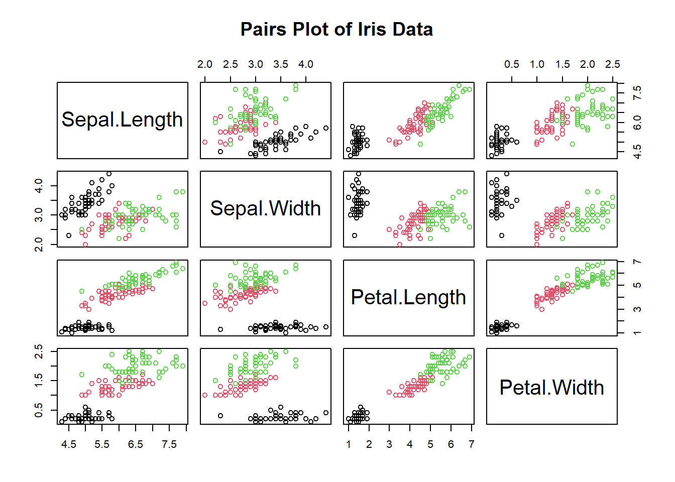
Adding Regression Lines: To visualize linear relationships more clearly, you can add regression lines to the scatterplots.
# Add regression lines
pairs(iris[, 1:4], panel=function(x,y){
  points(x,y)
  abline(lm(y~x), col='red')})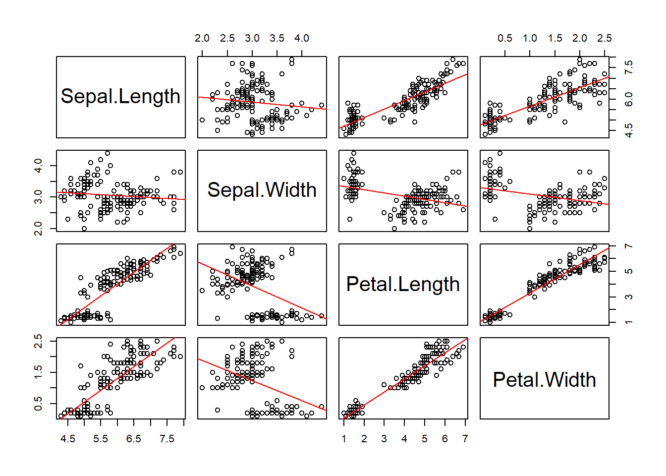
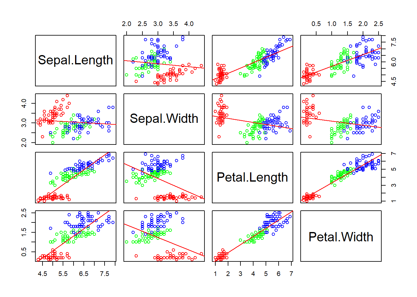
Now let’s add color back into the plot:
pairs(iris[, 1:4], panel=function(x,y){
  # Get a vector of colors for each point in the plot
  colors <- ifelse(iris$Species == "setosa", "red",
                   ifelse(iris$Species == "versicolor", "green", "blue"))

  # Plot the points with the corresponding colors
  points(x, y, col = colors)

  # Add a regression line
  abline(lm(y~x), col='red')
})
Now that you have a basic understanding of pairs plots in base R, I encourage you to try creating and customizing your own pairs plots. Use your own dataset or explore other built-in datasets like “mtcars” or “swiss.” Pairs plots are a powerful tool for exploratory data analysis, and by experimenting with them, you can uncover valuable insights in your data.
In conclusion, pairs plots in base R are a versatile and intuitive way to visualize relationships between multiple variables. Whether you’re a data scientist, analyst, or just someone interested in exploring data, mastering pairs plots can greatly enhance your ability to extract meaningful insights from your datasets. So, grab your data and start plotting!