Enhancing Your Data Visualizations with Base R: Overlaying Points and Lines
rtip
viz
Author
Steven P. Sanderson II, MPH
Published
September 27, 2023
Introduction
Data visualization is a crucial aspect of data analysis and exploration. It allows us to gain insights, spot trends, and communicate our findings effectively. In R, there are numerous packages and libraries available for creating sophisticated plots, but understanding the basics of base R plotting is essential for any data analyst or scientist.
In this blog post, we’ll explore how to overlay points or lines on a plot using Base R. We’ll use the plot() function to create the initial plot and then show how to overlay points with points() and lines with lines(). We’ll provide several examples, explaining each code block in simple terms, and encourage you to try them out on your own datasets.
Setting Up the Environment
Before we start, make sure you have R installed on your system. You can download and install R from the official website (https://www.r-project.org/). Additionally, we’ll assume you have a basic understanding of R syntax and data structures.
Examples
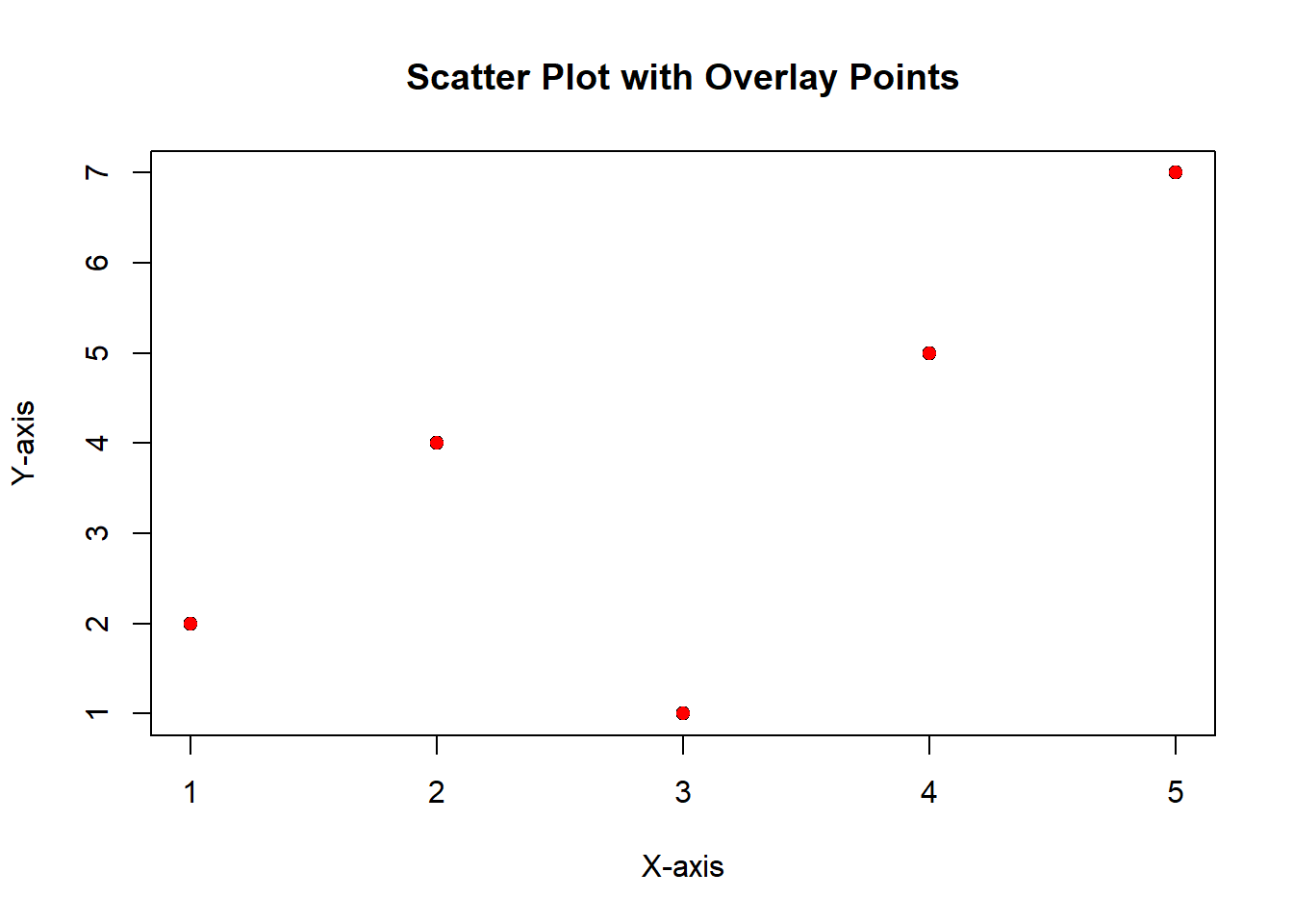
Example 1: Overlaying Points on a Scatter Plot
Let’s begin with a simple scatter plot. Suppose we have two vectors, x and y, representing data points.
# Sample datax <-c(1, 2, 3, 4, 5)y <-c(2, 4, 1, 5, 7)# Create the initial scatter plotplot(x, y, main ="Scatter Plot with Overlay Points", xlab ="X-axis", ylab ="Y-axis")# Overlay additional points (red circles) on the plotpoints(x, y, col ="red", pch =16)
In this example, we use the plot() function to create a scatter plot of x and y. Then, we overlay red circles on the existing plot using points(). The col argument specifies the color, and pch determines the point shape (16 represents circles).
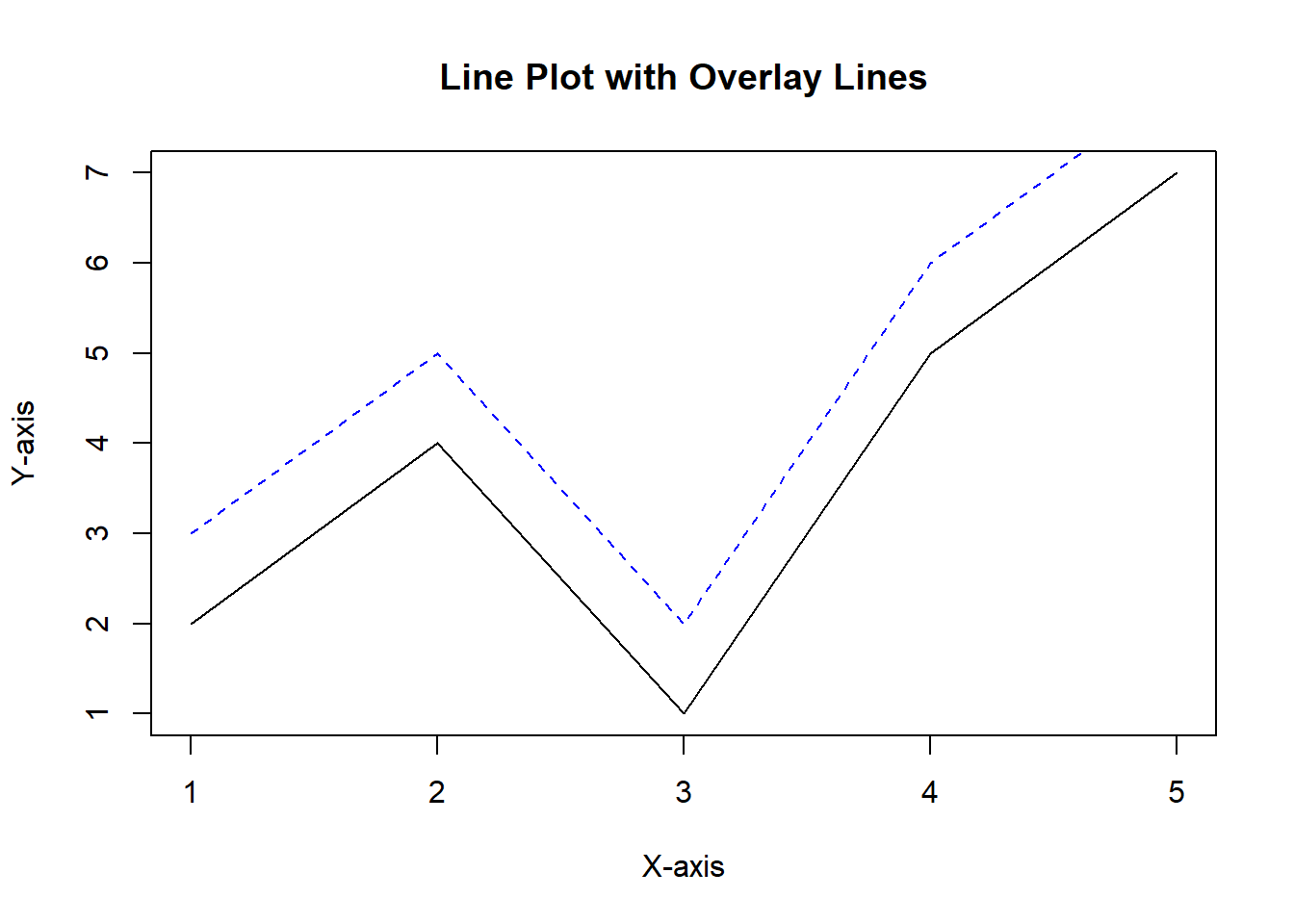
Example 2: Overlaying Lines on a Line Plot
Now, let’s work with line plots. Suppose we have two vectors, x and y, representing data points for a line graph.
# Sample datax <-c(1, 2, 3, 4, 5)y <-c(2, 4, 1, 5, 7)# Create the initial line plotplot(x, y, type ="l", main ="Line Plot with Overlay Lines", xlab ="X-axis", ylab ="Y-axis")# Overlay a new line (dashed, blue) on the plotlines(x, y +1, col ="blue", lty =2)
In this example, we use the plot() function with type = "l" to create a line plot. Then, we overlay a dashed blue line on the plot using lines(). The col argument sets the line color, and lty specifies the line type (2 stands for dashed).
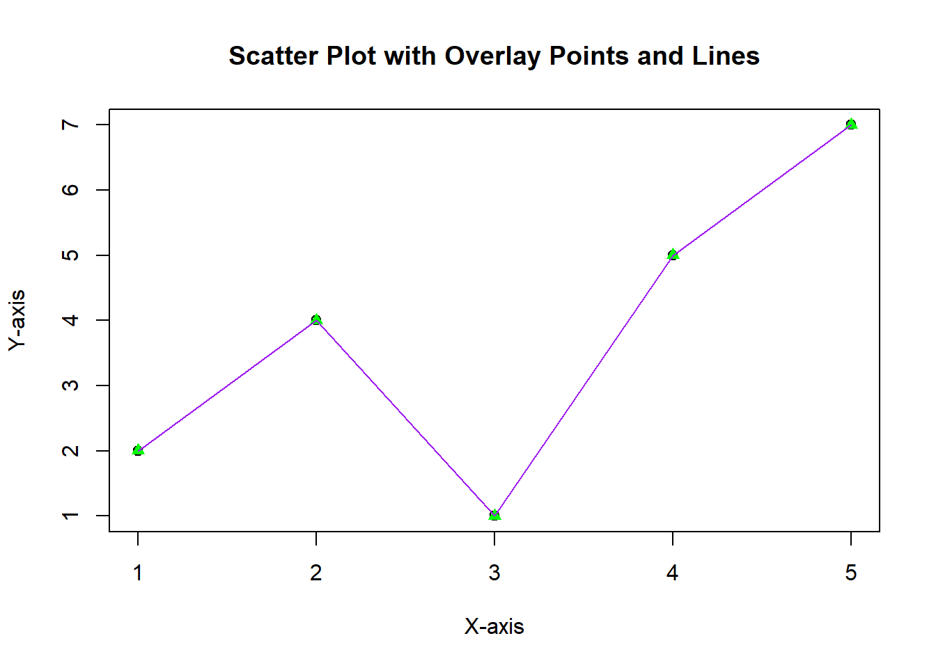
Example 3: Combining Points and Lines
In some cases, you might want to overlay both points and lines on the same plot to illustrate relationships more clearly. Let’s see how to do that:
# Sample datax <-c(1, 2, 3, 4, 5)y <-c(2, 4, 1, 5, 7)# Create the initial scatter plotplot(x, y, main ="Scatter Plot with Overlay Points and Lines", xlab ="X-axis", ylab ="Y-axis")# Overlay points (green triangles)points(x, y, col ="green", pch =17)# Overlay a line (purple) connecting the pointslines(x, y, col ="purple")
In this example, we start with a scatter plot and overlay green triangles using points() and a purple line using lines(). The combination of points and lines can help emphasize patterns and relationships in your data.
Conclusion
In this blog post, we’ve explored how to overlay points and lines on a plot in Base R. We’ve covered scatter plots, line plots, and combinations of both. Overlaying points and lines can be a powerful way to enhance your data visualizations and convey insights effectively.
Now it’s your turn! Experiment with different datasets and customize your plots by adjusting colors, shapes, and line styles. Base R provides a solid foundation for data visualization, and mastering it will enable you to create informative plots for your data analysis projects.