library(rpart)
library(rpart.plot)Introduction
Decision trees are a powerful machine learning algorithm that can be used for both classification and regression tasks. They are easy to understand and interpret, and they can be used to build complex models without the need for feature engineering.
Once you have trained a decision tree model, you can use it to make predictions on new data. However, it can also be helpful to plot the decision tree to better understand how it works and to identify any potential problems.
In this blog post, we will show you how to plot decision trees in R using the rpart and rpart.plot packages. We will also provide an extensive example using the iris data set and explain the code blocks in simple to use terms.
Example
Load the libraries
Split the data into training and test sets
set.seed(123)
train_index <- sample(1:nrow(iris), size = 0.7 * nrow(iris))
train <- iris[train_index, ]
test <- iris[-train_index, ]
Train a decision tree model
tree <- rpart(Species ~ ., data = train, method = "class")Plot the decision tree
rpart.plot(tree, main = "Decision Tree for the Iris Dataset")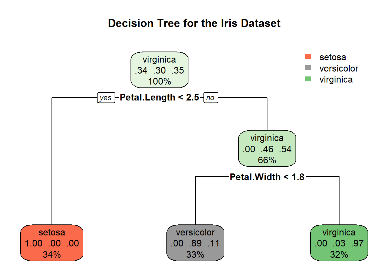
Output
The output of the rpart.plot() function is a tree diagram that shows the decision rules of the model. The root node of the tree is at the top, and the leaf nodes are at the bottom. Each node is labeled with the feature that is used to split the data at that node, and the value of the split. The leaf nodes are labeled with the predicted class for the data that reaches that node.
Interpreting the decision tree
To interpret the decision tree, start at the root node and follow the branches down to a leaf node. The leaf node that you reach is the predicted class for the data that you started with.
For example, if you have a new iris flower with a sepal length of 5.5 cm and a petal length of 2.5 cm, you would start at the root node of the decision tree. At the root node, the feature that is used to split the data is petal length. Since the petal length of the new flower is greater than 2.45 cm, you would follow the right branch down to the next node. At the next node, the feature that is used to split the data is sepal length. Since the sepal length of the new flower is greater than 5.0 cm, you would follow the right branch down to the leaf node. The leaf node that you reach is labeled “versicolor”, so the predicted class for the new flower is versicolor.
Trying it on your own
Now that you have learned how to plot decision trees in R, try it out on your own. You can use the iris data set or your own data set.
To get started, load the rpart and rpart.plot libraries and load your data set. Then, split the data into training and test sets. Train a decision tree model using the rpart() function. Finally, plot the decision tree using the rpart.plot() function.
Once you have plotted the decision tree, take some time to interpret it. Try to understand how the model makes predictions and to identify any potential problems. You can also try to improve the model by adding or removing features or by changing the hyperparameters of the rpart() function.
Conclusion
Plotting decision trees is a great way to better understand how they work and to identify any potential problems. It is also a helpful way to communicate the results of a decision tree model to others.
In this blog post, we showed you how to plot decision trees in R using the rpart and rpart.plot packages. We also provided an extensive example using the iris data set and explained the code blocks in simple to use terms.
We encourage you to try plotting decision trees on your own data sets. It is a great way to learn more about decision trees and to improve your machine learning skills.