library(palmerpenguins)Introduction
Boxplots are a great way to visualize the distribution of a numerical variable. They show the median, quartiles, and outliers of the data, and can be used to compare the distributions of multiple groups.
Horizontal boxplots are a variant of the traditional boxplot, where the x-axis is horizontal and the y-axis is vertical. This can be useful for visualizing data where the x-axis variable is categorical, such as species or treatment group.
Creating horizontal boxplots in base R
To create a horizontal boxplot in base R, we can use the boxplot() function with the horizontal argument set to TRUE.
# Create a horizontal boxplot of bill length by species
boxplot(
  bill_length_mm ~ species,
  data = penguins,
  horizontal = TRUE,
  main = "Bill length by species in Palmer penguins",
  xlab = "Bill length (mm)",
  ylab = "Species"
)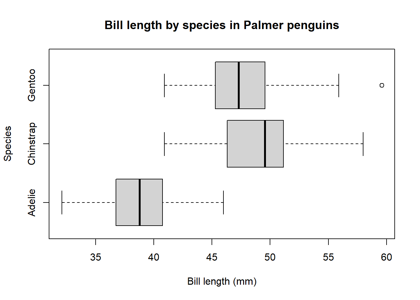
This code will produce a horizontal boxplot with one box for each species of penguin. The boxes show the median, quartiles, and outliers of the bill length data for each species.
Creating horizontal boxplots in ggplot2
To create a horizontal boxplot in ggplot2, we can use the geom_boxplot() function with the coord_flip() function.
library(ggplot2)

# Create a horizontal boxplot of bill length by species using ggplot2
ggplot(penguins, aes(x = bill_length_mm, y = species)) +
  geom_boxplot() +
  labs(
    title = "Bill length by species in Palmer penguins",
    x = "Bill length (mm)",
    y = "Species"
  )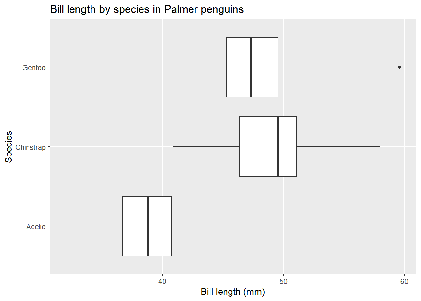
This code will produce a horizontal boxplot that is similar to the one produced by the base R code above. However, the ggplot2 code is more flexible and allows us to customize the appearance of the plot more easily.
Encouragement
I encourage you to try creating horizontal boxplots for your own data. You can use the Palmer penguins data set as a starting point, or you can use your own data. Experiment with different options to customize the appearance of your plots.
Here are some ideas for things to try:
- Compare the distribution of different numerical variables across different groups. For example, you could compare the distribution of bill length across the three species of penguins, or you could compare the distribution of body mass across male and female penguins.
- Use different colors and fill patterns to distinguish between groups.
- Add jitter to the data points to avoid overplotting.
- Add a legend to identify the different groups.
- Save your plots to files or export them to other applications.
I hope this blog post has been helpful. If you have any questions, please leave a comment below.
Conclusion
Horizontal boxplots can be a useful way to visualize the distribution of data when the x-axis variable is categorical. They are easy to create in both base R and ggplot2.