Creating Interactive Radar Charts in R with the ‘fmsb’ Library
rtip
viz
Author
Steven P. Sanderson II, MPH
Published
October 3, 2023
Introduction
Radar charts, also known as spider, web, polar, or star plots, are a useful way to visualize multivariate data. In R, we can create radar charts using the fmsb library. Here are several examples of how to create radar charts in R using the fmsb library:
Examples
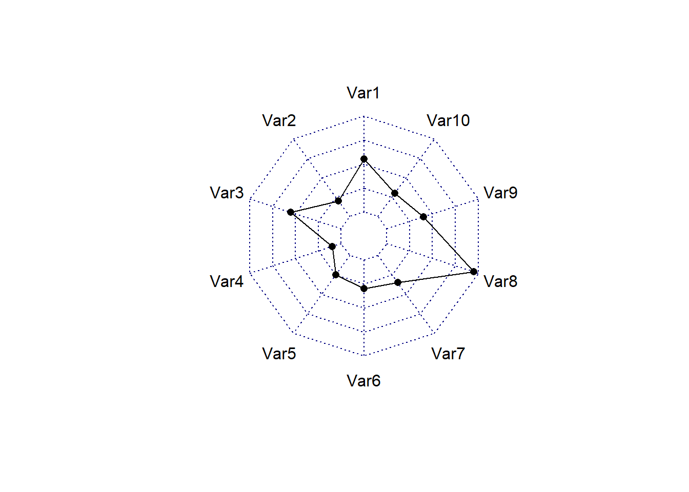
Example 1: Basic radar chart
The following code creates a basic radar chart using the radarchart() function from the fmsb package. The input data format is specific, where each row represents an entity and each column is a variable. The first row should be the maximum values of the data, and the second row should be the minimum values. The default radar chart can be customized using various options, such as line color, fill color, line width, and axis label color.
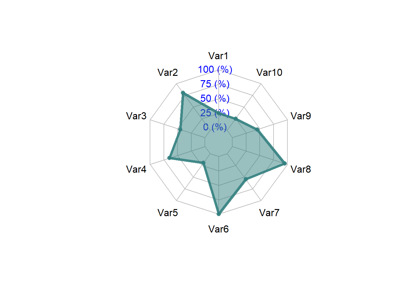
The following code creates a customized radar chart using the radarchart() function. The axistype argument is set to 1 to customize the polygon, and the pcol, pfcol, and plwd arguments are used to customize the grid and line properties.
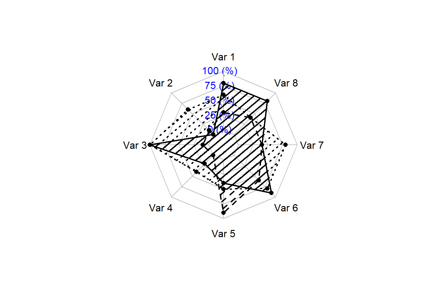
The following code creates a radar chart with multiple groups using the radarchart() function. The input data frame should have more than three variables as axes, and the rows indicate cases as series. The first row should show the maximum values, the second row should show the minimum values, and the actual data should be given as row 3 and lower rows.
These are just a few examples of how to create radar charts in R using the fmsb library. With some creativity, you can customize the charts to suit your needs. I encourage you to try creating your own radar charts using the fmsb library and experiment with different options to see what works best for your data.