# create some fake data
set.seed(0)
data <- sample(0:20, 100, replace = TRUE)

# create stacked dot plot
stripchart(data, method = "stack")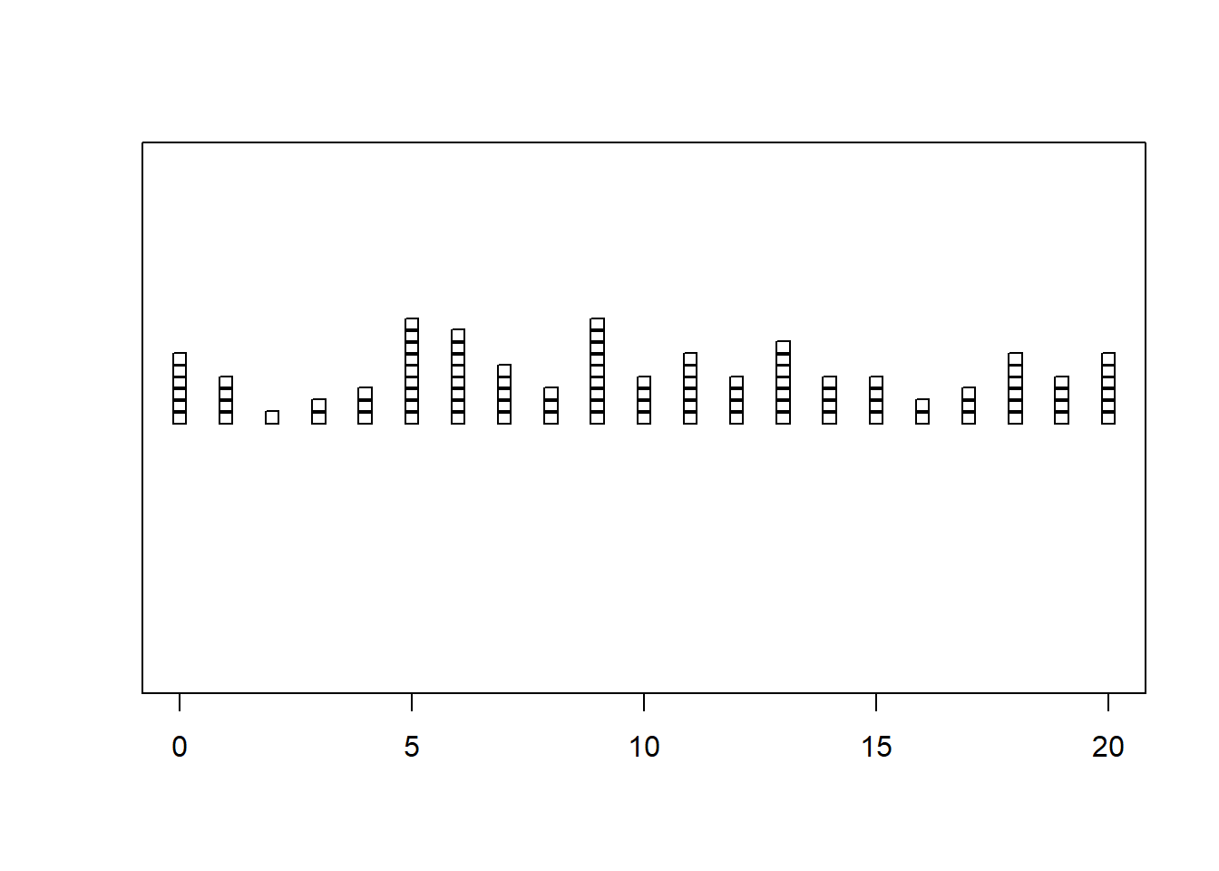
Stacked dot plots are a type of plot that displays frequencies using dots, piled one over the other. In R, there are several ways to create stacked dot plots, including using base R and ggplot2. In this blog post, we will explore how to create stacked dot plots in both Base R and ggplot2, and provide several examples of each.
The stripchart() function in base R can be used to create a basic stacked dot plot. Here is an example of how to use it:
# create some fake data
set.seed(0)
data <- sample(0:20, 100, replace = TRUE)
# create stacked dot plot
stripchart(data, method = "stack")
This will create a basic stacked dot plot. However, we can customize it to make it more aesthetically pleasing. Here is an example of how to do that:
# create some fake data
set.seed(0)
data <- sample(0:20, 100, replace = TRUE)

# create stacked dot plot
stripchart(data, method = "stack", offset = .5, at = 0,
           pch = 19, col = "steelblue",
           main = "Stacked Dot Plot", xlab = "Data Values")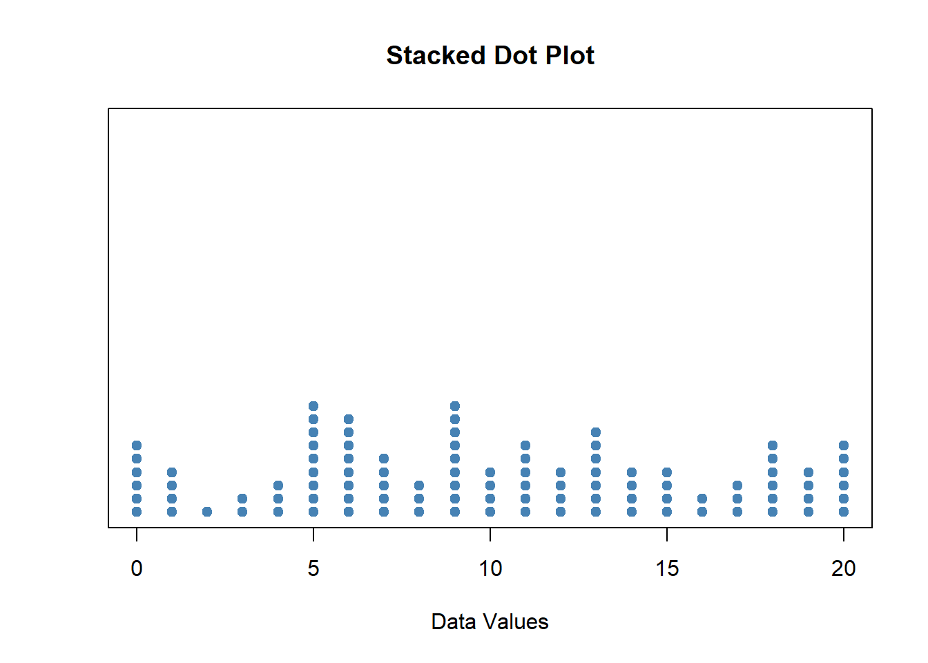
This will create a stacked dot plot with a blue color scheme and a more aesthetically pleasing layout.
Another way to create a stacked dot plot in base R is to use the dotchart() function. Here is an example of how to use it:
# create some fake data
set.seed(0)
data <- sample(0:20, 100, replace = TRUE)

# create stacked dot plot
dotchart(data, cex = .7, col = "steelblue",
         main = "Stacked Dot Plot", xlab = "Data Values")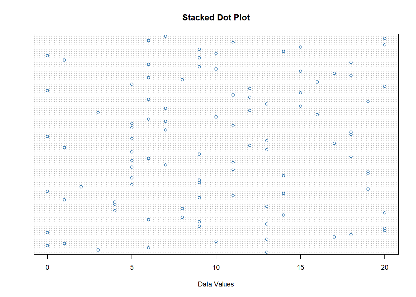
This will create a stacked dot plot with a blue color scheme and a more aesthetically pleasing layout.
The geom_dotplot() function in ggplot2 can be used to create a basic stacked dot plot. Here is an example of how to use it:
# load ggplot2
library(ggplot2)

# create some fake data
set.seed(0)
data <- data.frame(x = sample(0:20, 100, replace = TRUE))

# create stacked dot plot
ggplot(data, aes(x = x)) + geom_dotplot() + theme_minimal()
Bin width defaults to 1/30 of the range of the data. Pick better value with
`binwidth`.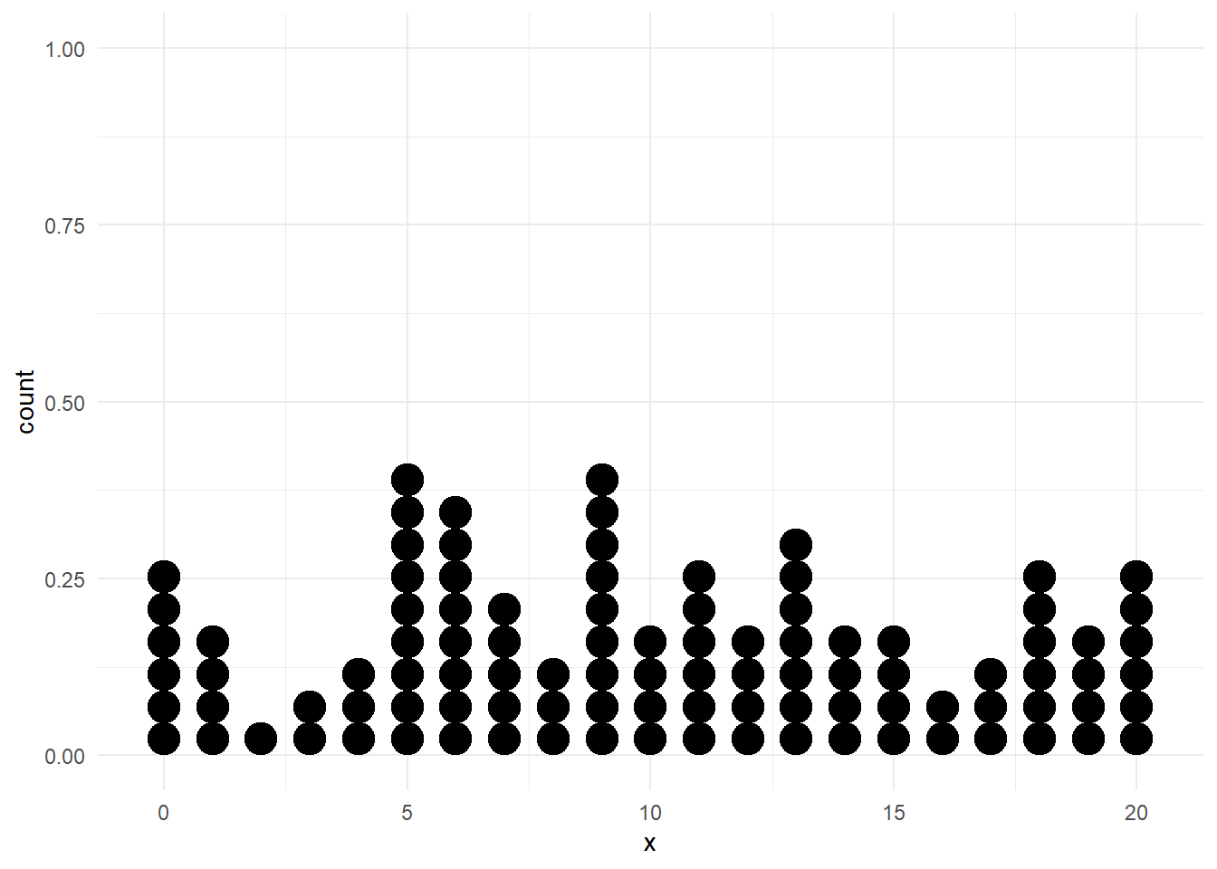
This will create a basic stacked dot plot. However, we can customize it to make it more aesthetically pleasing. Here is an example of how to do that:
# create some fake data
set.seed(0)
data <- data.frame(x = sample(0:20, 100, replace = TRUE))

# create customized stacked dot plot
ggplot(data, aes(x = x)) +
  geom_dotplot(dotsize = .75, stackratio = 1.2,
               fill = "steelblue") +
  scale_y_continuous(NULL, breaks = NULL) +
  labs(title = "Stacked Dot Plot", x = "Data Values") +
  theme_minimal()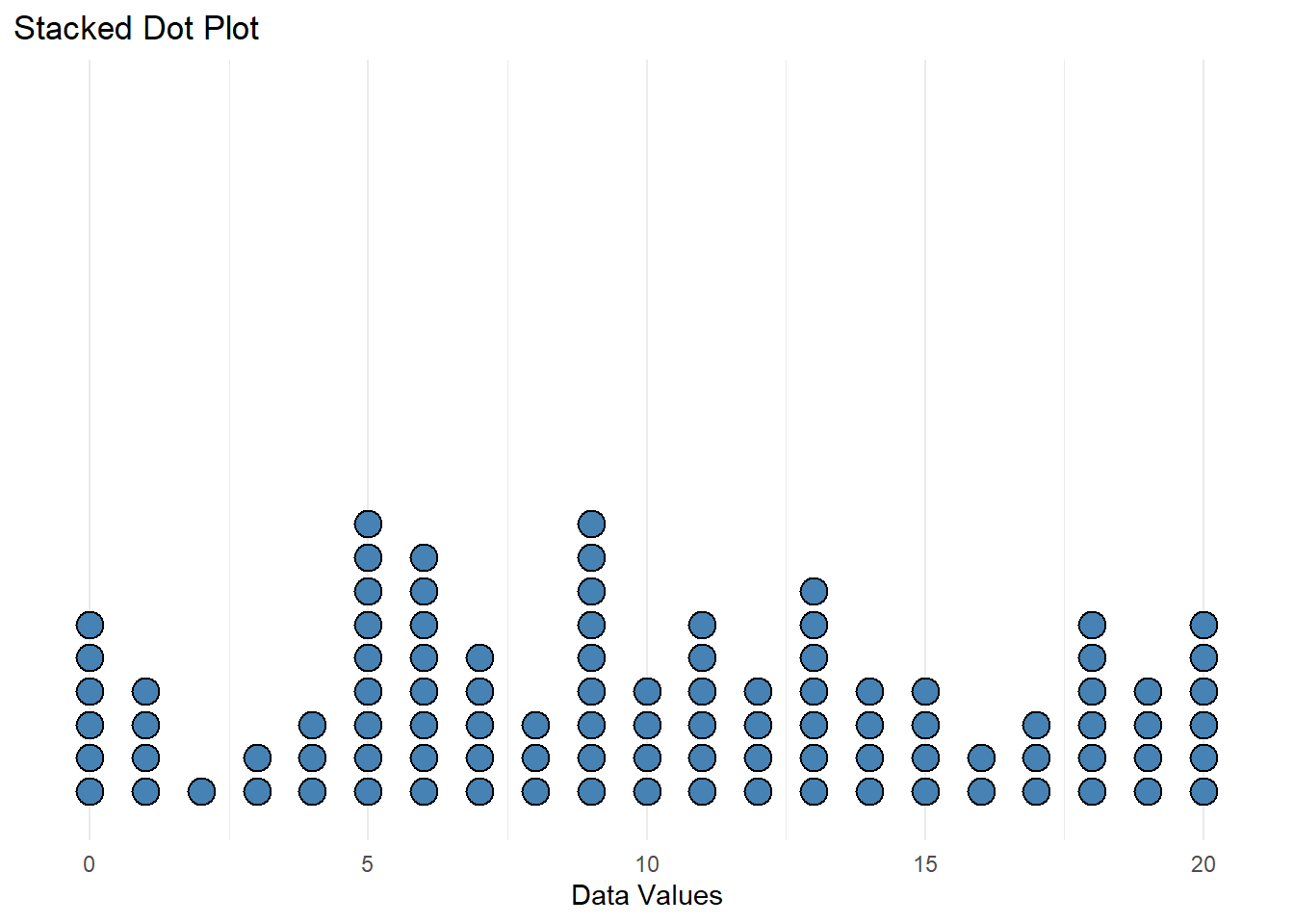
This will create a stacked dot plot with a blue color scheme and a more aesthetically pleasing layout.
Another way to create a stacked dot plot in ggplot2 is to use the geom_jitter() function. Here is an example of how to use it:
# create some fake data
set.seed(0)
data <- data.frame(x = sample(0:20, 100, replace = TRUE))

# create stacked dot plot
ggplot(data, aes(x = x, y = 0)) +
  geom_jitter(height = .1, width = 0, alpha = .5,
              color = "steelblue") +
  labs(title = "Stacked Dot Plot", x = "Data Values") +
  theme_minimal()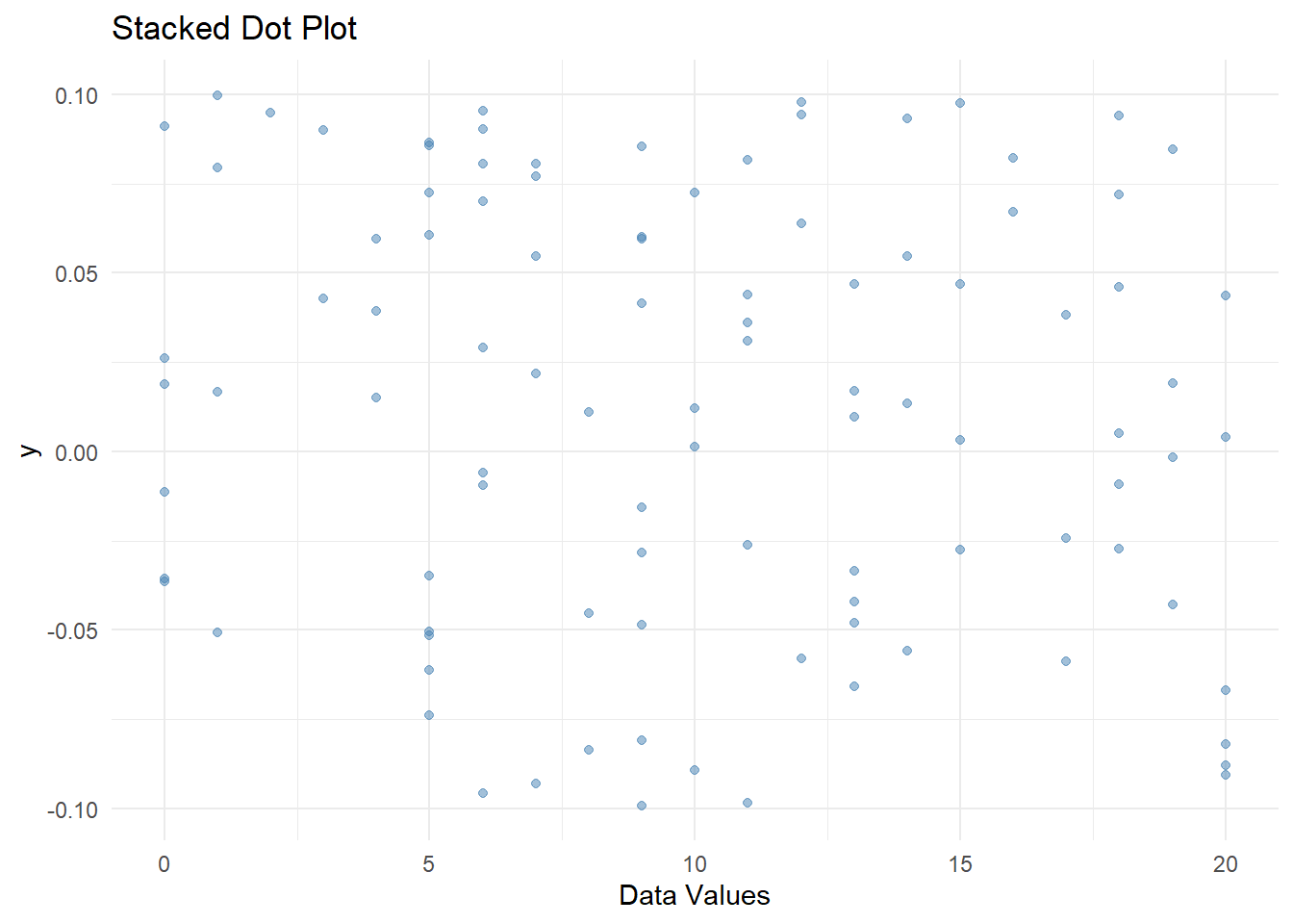
This will create a stacked dot plot with a blue color scheme and a more aesthetically pleasing layout.
In conclusion, creating stacked dot plots in R is a simple and effective way to visualize frequency data. By using either base R or ggplot2, you can create aesthetically pleasing plots that are easy to interpret. We encourage readers to try creating their own stacked dot plots using the examples provided in this blog post.