# Load the car library
library(car)
Loading required package: carData# Fit a linear regression model
model <- lm(mpg ~ disp + hp + drat + am, data = mtcars)
# Create added variable plots
avPlots(model)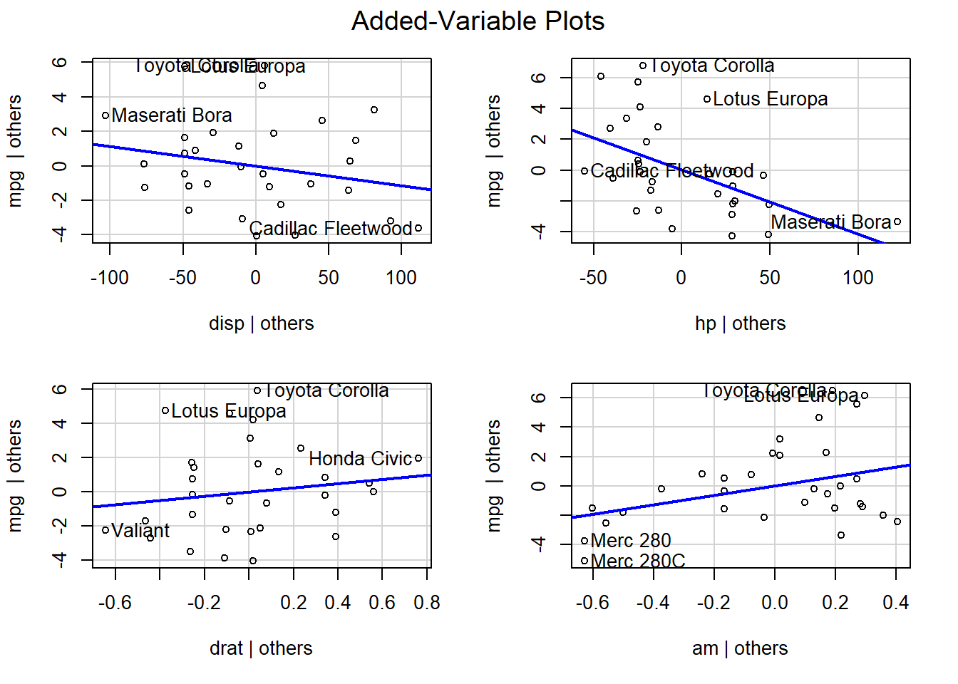
As an R programmer, you may want to create added variable plots to visualize the relationship between a predictor variable and the response variable while controlling for the effects of other predictor variables. In this blog post, we will use the car library and the avPlots() function to create added variable plots in R.
Added variable plots, also known as partial-regression plots, are used to visualize the relationship between a predictor variable and the response variable while controlling for the effects of other predictor variables. They are useful for identifying non-linear relationships and outliers, and for checking the linearity assumption of a linear regression model.
To create added variable plots in R, we will use the avPlots() function from the car library. Here is an example code block:
# Load the car library
library(car)Loading required package: carData# Fit a linear regression model
model <- lm(mpg ~ disp + hp + drat + am, data = mtcars)
# Create added variable plots
avPlots(model)
Let’s break down this code block:
car library using the library() function.lm() function. The model formula specifies mpg as the response variable and disp, hp, am and drat as the predictor variables. The data for the model is mtcars.avPlots() function and passing in the model object.The added variable plots show the relationship between each predictor variable and the response variable while controlling for the effects of the other predictor variables. The x-axis represents the partial residuals of the predictor variable, and the y-axis represents the partial residuals of the response variable. The line in the plot represents the fitted values from a linear regression model of the partial residuals of the response variable on the partial residuals of the predictor variable.
If the relationship between the predictor variable and the response variable is linear, the line in the plot should be approximately horizontal. If the relationship is non-linear, the line may be curved. If there is an outlier, it may be visible as a point that is far away from the other points in the plot.
In this blog post, we have learned how to create added variable plots in R using the car library and the avPlots() function. We have also discussed the interpretation of added variable plots and their usefulness in identifying non-linear relationships and outliers. I encourage you to try creating added variable plots on your own and explore the relationships between predictor variables and response variables in your own datasets.