x <- c(1, 2, 3, 4, 5)
y <- c(2, 4, 6, 8, 10)
plot(x, y)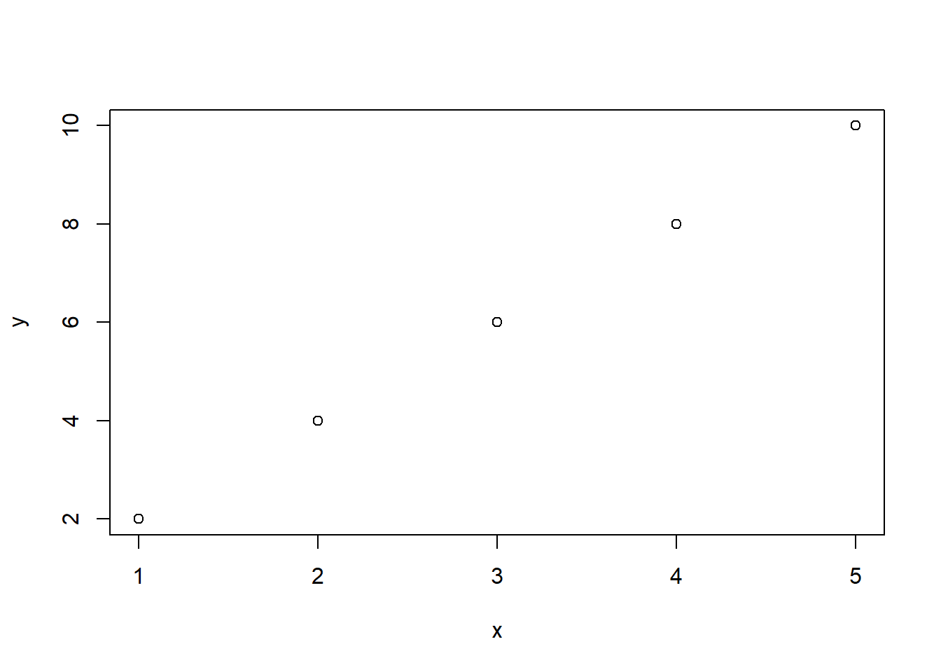
As an R programmer, you may want to draw circles in plots to highlight certain data points or to create visualizations. Here are some simple steps to draw circles in plots using R:
plot() function in R. For example, you can create a scatter plot of x and y values using the following code:x <- c(1, 2, 3, 4, 5)
y <- c(2, 4, 6, 8, 10)
plot(x, y)
symbols() function in R. The symbols() function allows you to draw various shapes, including circles, squares, triangles, and more. To draw a circle, set the circles argument to TRUE. For example, to draw a circle with a radius of 0.5 at the point (3, 6), use the following code:plot(x, y)
symbols(3, 6, circles = 1, add = TRUE)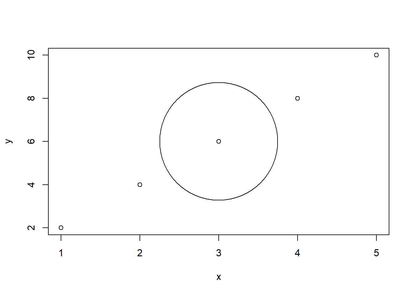
bg and fg arguments. For example, to draw a red circle with a blue border, use the following code:plot(x, y)
symbols(3, 6, circles = 1, add = TRUE, bg = "red", fg = "blue")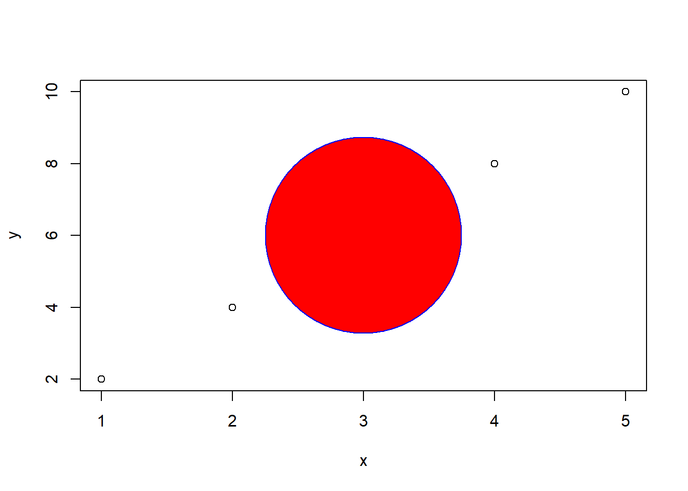
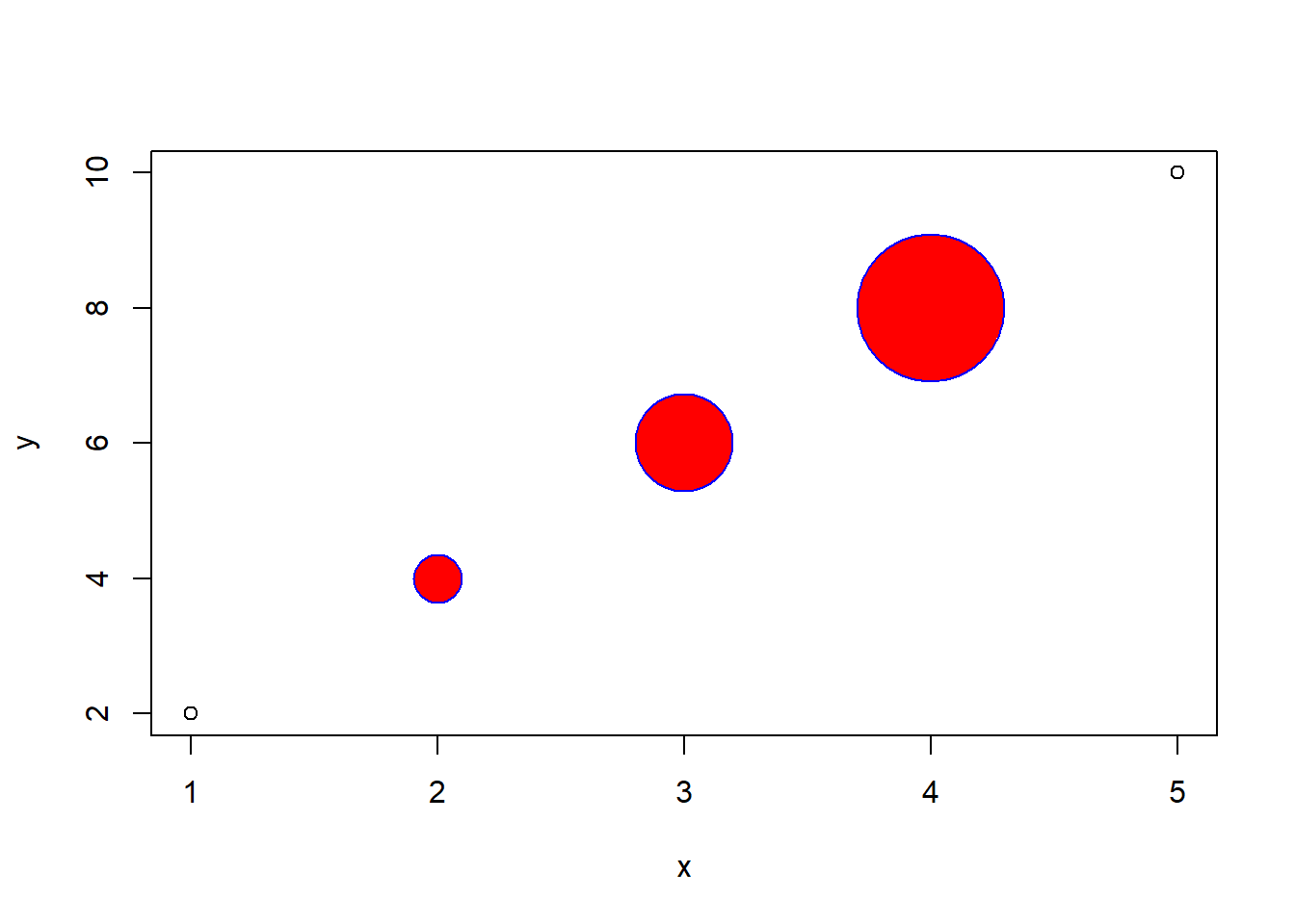
plot(x, y)

coords <- list(c(2, 4), c(3, 6), c(4, 8))
radii <- c(0.1, 0.2, 0.3)

for (i in 1:length(coords)) {
  symbols(
    coords[[i]][1], coords[[i]][2], circles = radii[[i]],
    add = TRUE, bg = "red", fg = "blue", inches = FALSE
  )
}
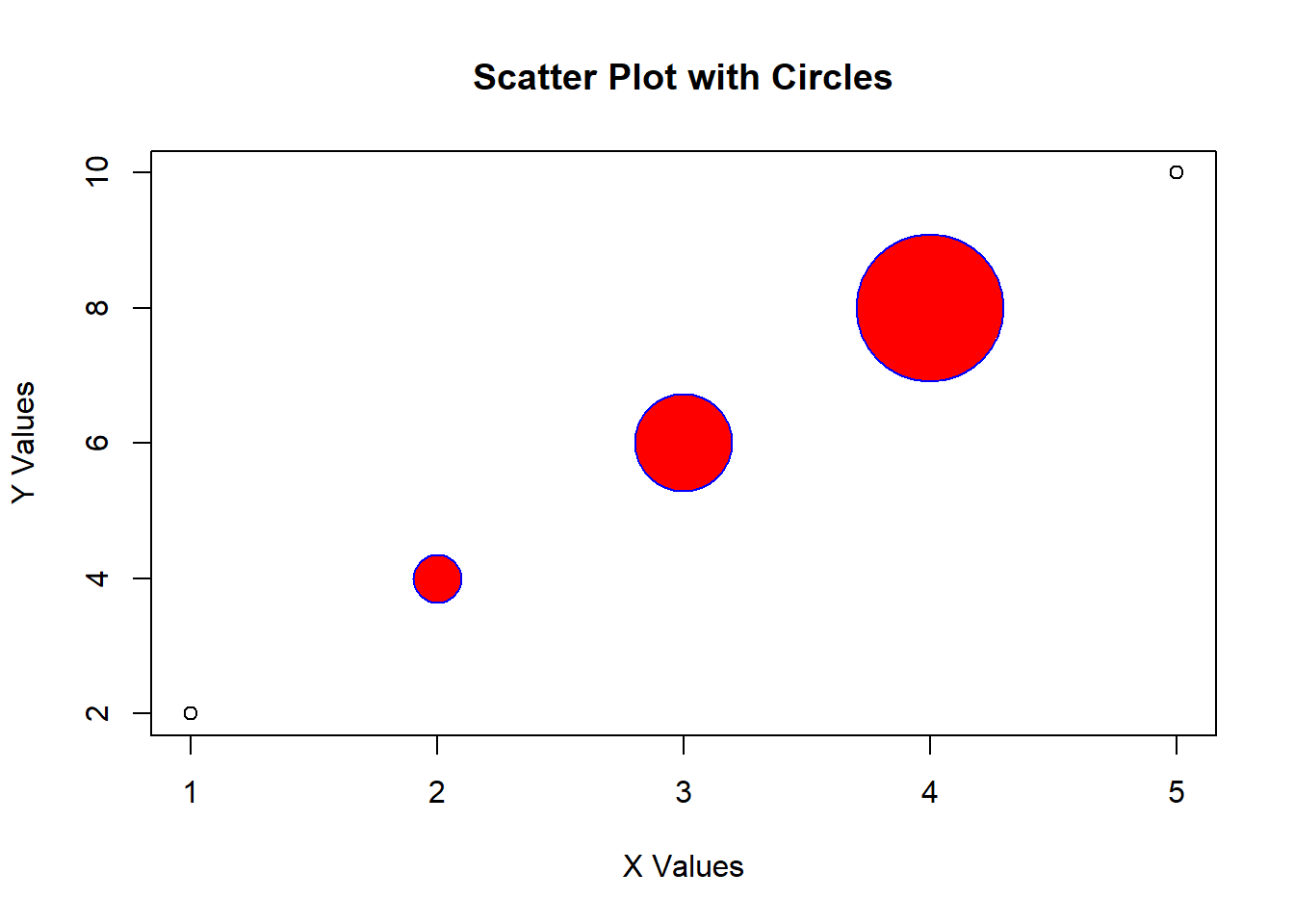
title(), xlab(), and ylab() functions. For example, to add a title and axis labels to the plot, use the following code:x <- c(1, 2, 3, 4, 5)
y <- c(2, 4, 6, 8, 10)
plot(
x, y, main = "Scatter Plot with Circles",
xlab = "X Values", ylab = "Y Values"
)
coords <- list(c(2, 4), c(3, 6), c(4, 8))
radii <- c(0.1, 0.2, 0.3)
for (i in 1:length(coords)) {
symbols(
coords[[i]][1], coords[[i]][2], circles = radii[[i]],
add = TRUE, bg = "red", fg = "blue", inches = FALSE
)
}
Here is one last exmple:
# Create a scatter plot with multiple circles
n <- 10
x <- runif(n, -2, 2)
y <- runif(n, -2, 2)
size <- runif(n, 0.1, 1)
fill <- sample(colors(), n)
border <- sample(colors(), n)

symbols(x, y, circles = size, inches = FALSE, add = F, bg = fill, fg = border)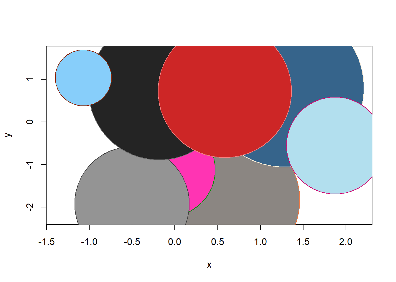
Overall, drawing circles in plots is a simple and effective way to highlight certain data points or to create visualizations. Try experimenting with different coordinates, radii, colors, and borders to create your own custom plots.