set.seed(123)
# Create a sample dataset
data <- data.frame(
  ProductType = rep(c("A", "B", "C", "D"), each = 10),
  Price = trunc(runif(40, 15, 35)),
  CustomerSegment = rep(c("Seg. 1", "Seg. 2"), times = 20),
  Satisfaction = trunc(runif(40, 2, 5))
)Introduction
In the world of data analysis, uncovering hidden relationships between variables is often the key to making informed decisions. Interaction plots in R can be your secret weapon, revealing how two or more variables interact to affect an outcome. In this blog post, we’ll dive into the world of interaction plots, demystifying the process and showing you how to create these insightful visuals using base R.
What Are Interaction Plots?
Interaction plots display how the relationship between two variables changes depending on the value of a third variable. They are particularly useful when dealing with categorical variables, allowing you to see how the effect of one variable on the outcome depends on the levels of another variable. In simpler terms, interaction plots help us understand how the relationship between two variables is influenced by a third variable, making them a valuable tool for data exploration.
Getting Started: Preparing Your Data
Before we create interaction plots, we need some data. For this example, we’ll use a hypothetical dataset about customer satisfaction, where we want to explore how the relationship between “Product Type” and “Price” is influenced by “Customer Segment.”
Now that we have our data, let’s create an interaction plot.
Creating the Interaction Plot
We’ll use the base R package to create our interaction plot. Here’s how you can do it:
# Create the interaction plot
interaction.plot(
  x.factor = data$ProductType,
  trace.factor = data$CustomerSegment,
  response = data$Satisfaction,
  fun = median,
  ylab = "Satisfaction",
  xlab = "Customer Segment",
  lty = 1,
  lwd = 2,
  col = c("steelblue","lightgreen"),
  fixed = TRUE,
  legend = TRUE,
  trace.label = "Segment"
)

# Adding labels and a title
title("Interaction Plot: Product Type vs. Satisfaction by Customer Segment")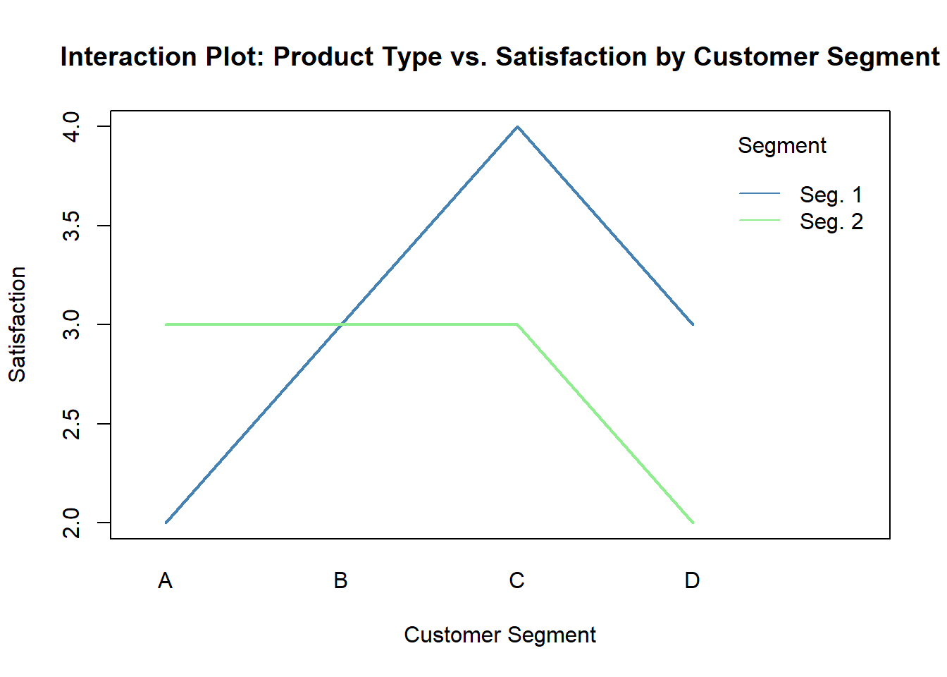
In the code above: - x.factor represents the variable on the x-axis. - trace.factor represents the variable that distinguishes different lines on the plot. - response is the variable we’re interested in. - type = "b" specifies that we want to connect points with lines and plot points. - fixed = TRUE ensures that the x-axis is evenly spaced. - legend = TRUE adds a legend to the plot.
Interpreting the Plot
In our plot, you’ll see lines for each customer segment (Segment 1 and Segment 2). The lines show how satisfaction levels change with different product types (A, B, C and D). If the lines are parallel, it indicates that there’s no interaction between “Product Type” and “Customer Segment.” However, if the lines cross or diverge, it suggests an interaction, meaning that the effect of the product type on satisfaction differs across customer segments.
Conclusion: Your Turn to Explore!
Creating interaction plots in R can be a valuable skill for anyone working with data. They provide deep insights into how variables influence each other. Don’t hesitate to apply this technique to your own datasets and discover the hidden relationships within your data.
So, what are you waiting for? Give it a try and start visualizing the interactions in your data. Happy coding!