Bubble charts are a great way to visualize data with three dimensions. The size of the bubbles represents a third variable, which can be used to show the importance of that variable or to identify relationships between the three variables.
To create a bubble chart in R using ggplot2, you will need to use the geom_point() function. This function will plot points on your chart, and you can use the size aesthetic to control the size of the points.
Getting Started
Before we begin, ensure you have R and ggplot2 installed. If you don’t have ggplot2, you can install it with the command:
install.packages("ggplot2")
Examples
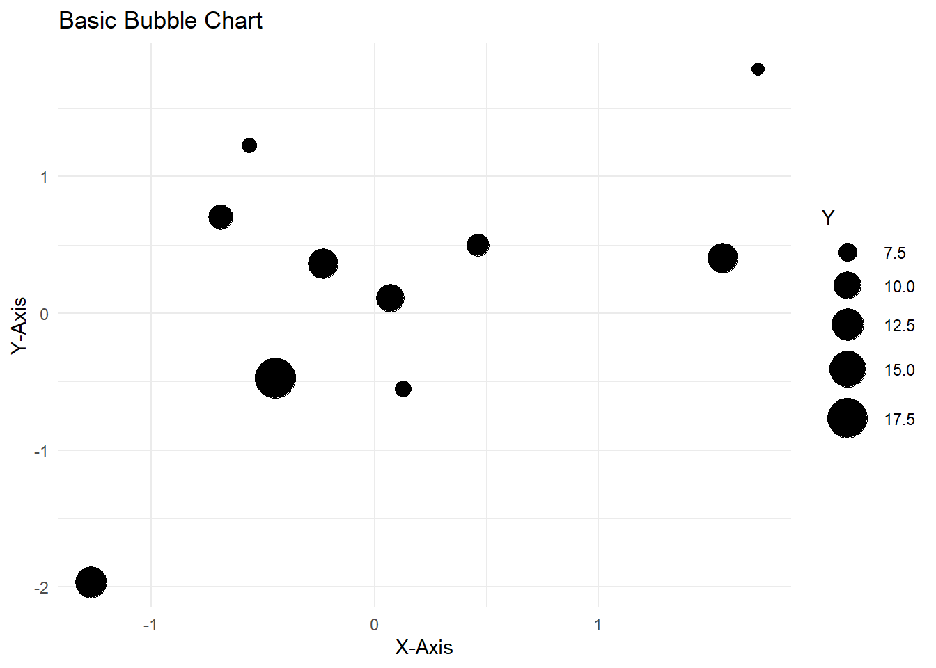
Example 1: Basic Bubble Chart
Let’s start with a simple example using randomly generated data. We’ll create a bubble chart that shows the relationship between two variables and represents a third variable using bubble sizes.
# Load ggplot2 librarylibrary(ggplot2)# Generate random dataset.seed(123)data <-data.frame(x =rnorm(10),y =rnorm(10),size =runif(10, min =5, max =20))# Create a bubble chartggplot(data, aes(x, y, size = size)) +geom_point() +scale_size_continuous(range =c(3, 10)) +labs(title ="Basic Bubble Chart", x ="X-Axis", y ="Y-Axis",size ="Y") +theme_minimal()
In this example, we create a bubble chart with random data points, where x and y are the coordinates, and size represents the bubble size. The geom_point() function is used to add the points, and we adjust the size range using scale_size_continuous().
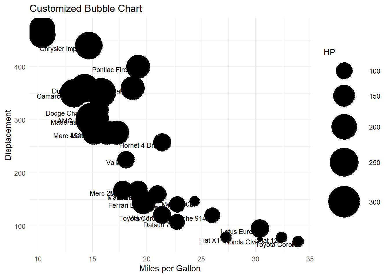
Example 2: Customizing Bubble Chart
Now, let’s customize our bubble chart further. We’ll use a sample dataset to visualize car data, with car names on the bubbles.
# Sample datacars <- mtcarscars$name <-rownames(cars)# Create a bubble chartggplot(cars, aes(x = mpg, y = disp, size = hp, label = name)) +geom_point() +geom_text(vjust =1, hjust =1, size =3) +scale_size_continuous(range =c(3, 20)) +labs(title ="Customized Bubble Chart", x ="Miles per Gallon", y ="Displacement",size ="HP") +theme_minimal()
In this example, we’re using the mtcars dataset to create a bubble chart that displays car names using geom_text(). The vjust and hjust parameters control the text placement.
Other Ways to Use Bubble Charts
Here are a few examples of bubble charts that you can create using ggplot2:
A bubble chart showing the relationship between the population, GDP, and land area of different countries.
A bubble chart showing the relationship between the sales, marketing budget, and customer satisfaction of different companies.
A bubble chart showing the relationship between the temperature, humidity, and wind speed at different locations on a map.
You Try!
Creating bubble charts in R is not only informative but also fun! Encourage your readers to experiment with their own datasets and customize these examples. The ggplot2 library offers a wealth of possibilities for creating beautiful and insightful visualizations. So, don’t hesitate to dive into R and start charting your data with bubbles!
I hope this guide helps you and your readers in creating engaging bubble charts in R using ggplot2. If you have any questions or need further clarification, feel free to ask. Happy coding, Steve!