# Creating example data
method_A <- c(10, 12, 15, 18, 22, 25)
method_B <- c(9.5, 11, 14, 18, 22, 24.5)

# Calculate the differences and means
diff_values <- method_A - method_B
mean_values <- (method_A + method_B) / 2

df <- data.frame(method_A, method_B, mean_values, diff_values)Introduction
Before we dive into the code, let’s briefly understand what a Bland-Altman plot is. It’s a graphical method to visualize the agreement between two measurement techniques, often used in fields like medicine or any domain with comparative measurements. The plot displays the differences between two measurements (Y-axis) against their means (X-axis).
Step 1: Data Preparation
Start by loading your data into R. In our example, we’ll create some synthetic data for illustration purposes. You’d replace this with your real data.
Step 2: Calculate Average Difference and CI
Now that we have our data prepared, let’s create the Bland-Altman plot.
mean_diff <- mean(df$diff_values)
mean_diff
[1] 0.5lower <- mean_diff - 1.96 * sd(df$diff_values)
upper <- mean_diff + 1.96 * sd(df$diff_values)
lower[1] -0.3765386upper[1] 1.376539Step 3: Creating the Bland-Altman Plot
We are going to do this in base R.
# Create a scatter plot
plot(df$mean_values, df$diff_values,
     xlab = "Mean of Methods A and B",
     ylab = "Difference (Method A - Method B)",
     main = "Bland-Altman Plot",
     ylim = c(lower + (lower * .1), upper * 1.1))

# Add a horizontal line at the mean difference
abline(h = mean(diff_values), col = "red", lty = 2)

# Add Confidence Intervals
abline(h = upper, col = "blue", lty = 2)
abline(h = lower, col = "blue", lty = 2)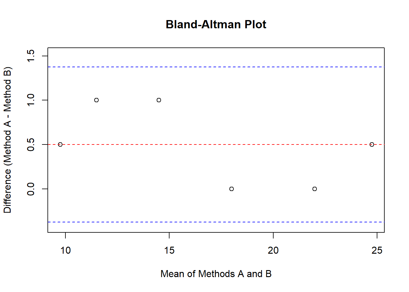
This code will generate a simple Bland-Altman plot, and here’s what each part does:
plot(): Creates the scatter plot with means on the X-axis and differences on the Y-axis.abline(h = mean(diff_values), col = "red", lty = 2): Adds a red dashed line at the mean difference.abline(h = upper, col = "green", lty = 2): Adds blue dashed lines representing the 95% limits of agreement.
Step 4: Interpretation
Now that you’ve generated your Bland-Altman plot, let’s interpret it:
- The red line represents the mean difference between the two methods.
- The blue dashed lines show the 95% limits of agreement, which help you assess the spread of the differences.
If most data points fall within the blue lines, it indicates good agreement between the two methods. If data points are scattered widely outside the lines, there may be a systematic bias or inconsistency between the methods.
Step 5: Exploration
I encourage you to try this out with your own data. Replace the example data with your measurements and see what insights your Bland-Altman plot reveals.
In conclusion, creating a Bland-Altman plot in R is a valuable technique to visualize agreement or bias between two measurement methods. It’s an essential tool for quality control and validation in various fields. I hope this step-by-step guide helps you get started. Happy plotting!