# Create data frame
hours <- runif(100, 1, 10)
score <- 60 + 2 * hours + rnorm(100, mean = 0, sd = 0.45 * hours)
df <- data.frame(hours, score)Introduction
Quantile regression is a robust statistical method that goes beyond traditional linear regression by allowing us to model the relationship between variables at different quantiles of the response distribution. In this blog post, we’ll explore how to perform quantile regression in R using the quantreg library.
Setting the Stage
First things first, let’s create some data to work with. We’ll generate a data frame df with two variables: ‘hours’ and ‘score’. The relationship between ‘hours’ and ‘score’ will have a bit of noise to make things interesting.
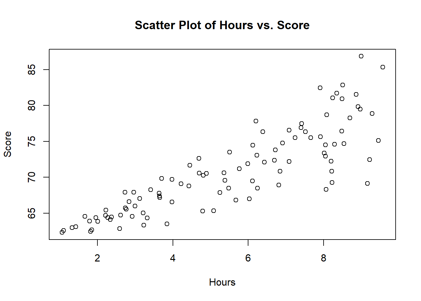
Visualizing the Data
Before we jump into regression, it’s always a good idea to visualize our data. Let’s start with a scatter plot to get a sense of the relationship between hours and scores.
# Scatter plot
plot(df$hours, df$score,
     main = "Scatter Plot of Hours vs. Score",
     xlab = "Hours", ylab = "Score"
     )
Now that we’ve got a clear picture of our data, it’s time to perform quantile regression.
Quantile Regression with quantreg
We’ll use the quantreg library to perform quantile regression. The key function here is rq() (Quantile Regression). We’ll run quantile regression for a few quantiles, say 0.25, 0.5, and 0.75.
# Install and load quantreg if not already installed
# install.packages("quantreg")
library(quantreg)

# Quantile regression
quant_reg_25 <- rq(score ~ hours, data = df, tau = 0.25)
quant_reg_50 <- rq(score ~ hours, data = df, tau = 0.5)
quant_reg_75 <- rq(score ~ hours, data = df, tau = 0.75)

purrr::map(list(quant_reg_25, quant_reg_50, quant_reg_75), broom::tidy)
[[1]]
# A tibble: 2 × 5
term estimate conf.low conf.high tau
<chr> <dbl> <dbl> <dbl> <dbl>
1 (Intercept) 60.3 59.0 61.1 0.25
2 hours 1.56 1.33 1.82 0.25
[[2]]
# A tibble: 2 × 5
term estimate conf.low conf.high tau
<chr> <dbl> <dbl> <dbl> <dbl>
1 (Intercept) 60.2 59.6 60.5 0.5
2 hours 1.96 1.86 2.20 0.5
[[3]]
# A tibble: 2 × 5
term estimate conf.low conf.high tau
<chr> <dbl> <dbl> <dbl> <dbl>
1 (Intercept) 59.9 59.5 60.7 0.75
2 hours 2.36 2.16 2.53 0.75purrr::map(list(quant_reg_25, quant_reg_50, quant_reg_75), broom::glance)[[1]]
# A tibble: 1 × 5
tau logLik AIC BIC df.residual
<dbl> <logLik> <dbl> <dbl> <int>
1 0.25 -259.6364 523. 528. 98
[[2]]
# A tibble: 1 × 5
tau logLik AIC BIC df.residual
<dbl> <logLik> <dbl> <dbl> <int>
1 0.5 -249.6752 503. 509. 98
[[3]]
# A tibble: 1 × 5
tau logLik AIC BIC df.residual
<dbl> <logLik> <dbl> <dbl> <int>
1 0.75 -252.0106 508. 513. 98Visualizing Model Performance
Now, let’s visualize how well our quantile regression models perform. We’ll overlay the regression lines on our scatter plot.
# Scatter plot with regression lines
# Scatter plot with regression lines
plot(df$hours, df$score,
     main = "Quantile Regression: Hours vs. Score",
     xlab = "Hours", ylab = "Score")
abline(a = coef(quant_reg_25),
       b = coef(quant_reg_25)["hours"],
       col = "red", lty = 2)
abline(a = coef(quant_reg_50),
       b = coef(quant_reg_50)["hours"],
       col = "blue", lty = 2)
abline(a = coef(quant_reg_75),
       b = coef(quant_reg_75)["hours"],
       col = "green", lty = 2)
legend("topleft", legend = c("Quantile 0.25", "Quantile 0.5", "Quantile 0.75"),
       col = c("red", "blue", "green"), lty = 2)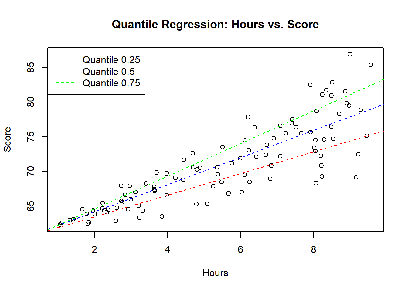
Conclusion
In this blog post, we delved into the fascinating world of quantile regression using R and the quantreg library. We generated some synthetic data, visualized it, and then performed quantile regression at different quantiles. The final touch was overlaying the regression lines on our scatter plot to visualize how well our models fit the data.
Quantile regression provides a more nuanced view of the relationship between variables, especially when dealing with skewed or non-normally distributed data. It’s a valuable tool in your statistical toolkit. Happy coding, and may your regressions be ever quantile-wise accurate!