Unveiling the Magic of Polynomial Regression in R: A Step-by-Step Guide
rtip
regression
Author
Steven P. Sanderson II, MPH
Published
December 5, 2023
Introduction
Hey folks! 👋 Today, let’s embark on a coding adventure and explore the fascinating world of Polynomial Regression in R. Whether you’re new to R or a seasoned coder, we’re going to break down the complexities and make this journey enjoyable and insightful.
What is Polynomial Regression?
At its core, Polynomial Regression is an extension of linear regression, allowing us to capture more complex relationships between variables. It’s like upgrading from a straight road to a curvy one, better accommodating the twists and turns of our data.
Let’s Dive In!
Step 1: Set the Stage
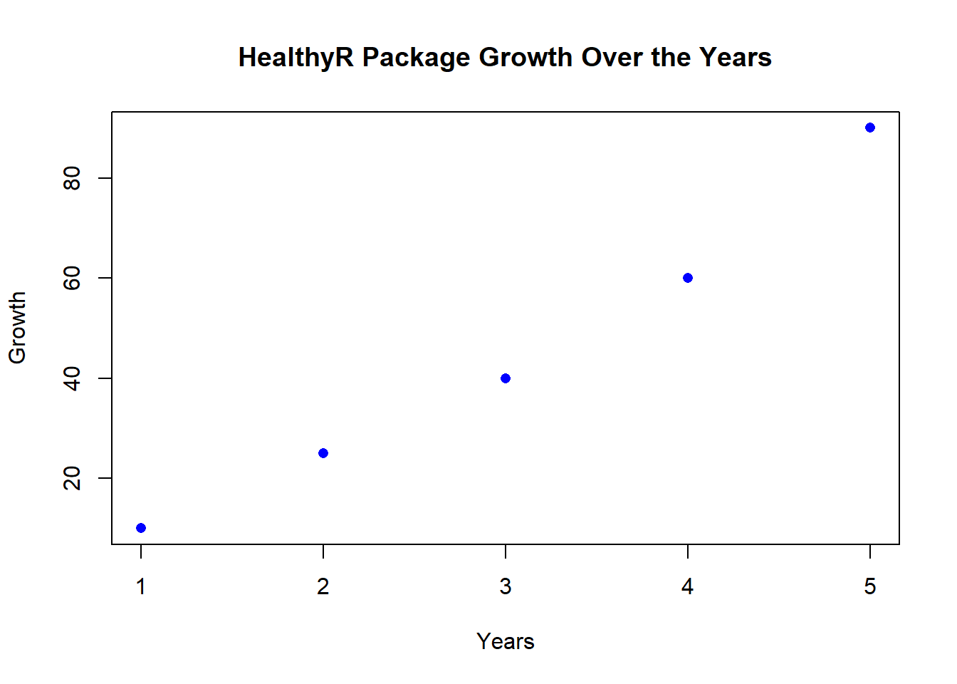
First things first, fire up your RStudio and load your favorite dataset. For our journey, I’ll use a hypothetical dataset about, say, the growth of healthyR packages over the years.
# Assume 'years' and 'growth' are our dataset columnsdata <-data.frame(years =c(1, 2, 3, 4, 5),growth =c(10, 25, 40, 60, 90))# Visualize the dataplot(data$years, data$growth, main ="HealthyR Package Growth Over the Years",xlab ="Years", ylab ="Growth", col ="blue", pch =16)
Step 2: Let’s Fit a Polynomial
Now, let’s fit a polynomial regression model to our data. We’ll use the lm() function, and don’t worry, it’s simpler than it sounds!
# Fit a polynomial regression model (let's go quadratic)model <-lm(growth ~poly(years, 2), data = data)
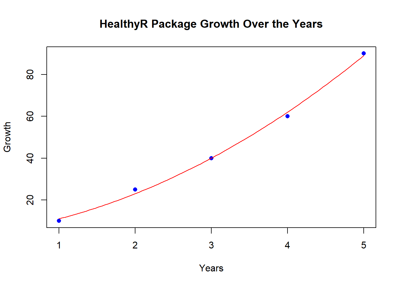
Step 3: Visualize the Magic
Time to visualize the results. We’ll create a smooth curve representing our polynomial fit, compare it against the actual data, and also peek at the residuals.
# Generate points for smooth curvecurve_data <-data.frame(years =seq(1, 5, length.out =100))# Predict growth based on the modelpredictions <-predict(model, newdata = curve_data)# The dataplot(data$years, data$growth, main ="HealthyR Package Growth Over the Years",xlab ="Years", ylab ="Growth", col ="blue", pch =16)# Visualize the fitted modellines(curve_data$years, predictions, col ="red", type ="l")
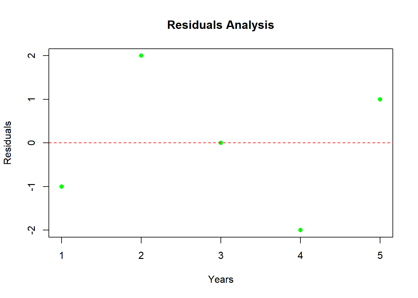
Step 4: Assess Residuals
To ensure our model is doing its job, let’s examine the residuals. These are the differences between our predictions and the actual values.
# Calculate residualsresiduals <-residuals(model)# Visualize the residualsplot(data$years, residuals, main ="Residuals Analysis",xlab ="Years", ylab ="Residuals", col ="green", pch =16)abline(h =0, col ="red", lty =2)
Conclusion: Try It Yourself!
There you have it—a whirlwind tour of Polynomial Regression in R using base R for visuals! I encourage you to take the wheel and try it on your own datasets. Adjust the degree of your polynomial, explore different visualizations, and let the data unveil its secrets.
Remember, coding is an adventure, and each line is a step into the unknown. Happy coding! 🚀
Feel free to reach out if you have any questions or want to share your coding escapades. Until next time, happy data wrangling!