# Setting up the model
model <- lm(mpg ~ disp + hp + wt + drat, data = mtcars)Introduction
Hey there fellow R enthusiasts! Today, we’re diving into the fascinating world of Variance Inflation Factor (VIF) and how to calculate it using R. VIF is a crucial metric that helps us understand the level of multicollinearity among predictors in a regression model. So, buckle up your seatbelts, and let’s embark on this coding adventure!
Setting the Stage
Let’s start by setting up our stage. We’ll use a linear regression model with the mtcars dataset. Here’s the model we’re going to work with:
Calculating VIF with car library
Now, the exciting part! We’ll employ the car library to compute the VIF using the vif function. VIF measures how much the variance of an estimated regression coefficient increases if your predictors are correlated. It’s a handy tool to identify collinearity issues in your model.
# Installing and loading the 'car' library
# install.packages("car")
library(car)

# Calculating VIF
vif_values <- vif(model)
vif_values
disp hp wt drat
8.209402 2.894373 5.096601 2.279547 Visualizing the Model and Residuals
To gain deeper insights, let’s visualize our model and its residuals. Visualizations often provide a clearer picture of what’s happening under the hood.
# Visualizing the model
plot(model, which = 1, main = "Model Fit")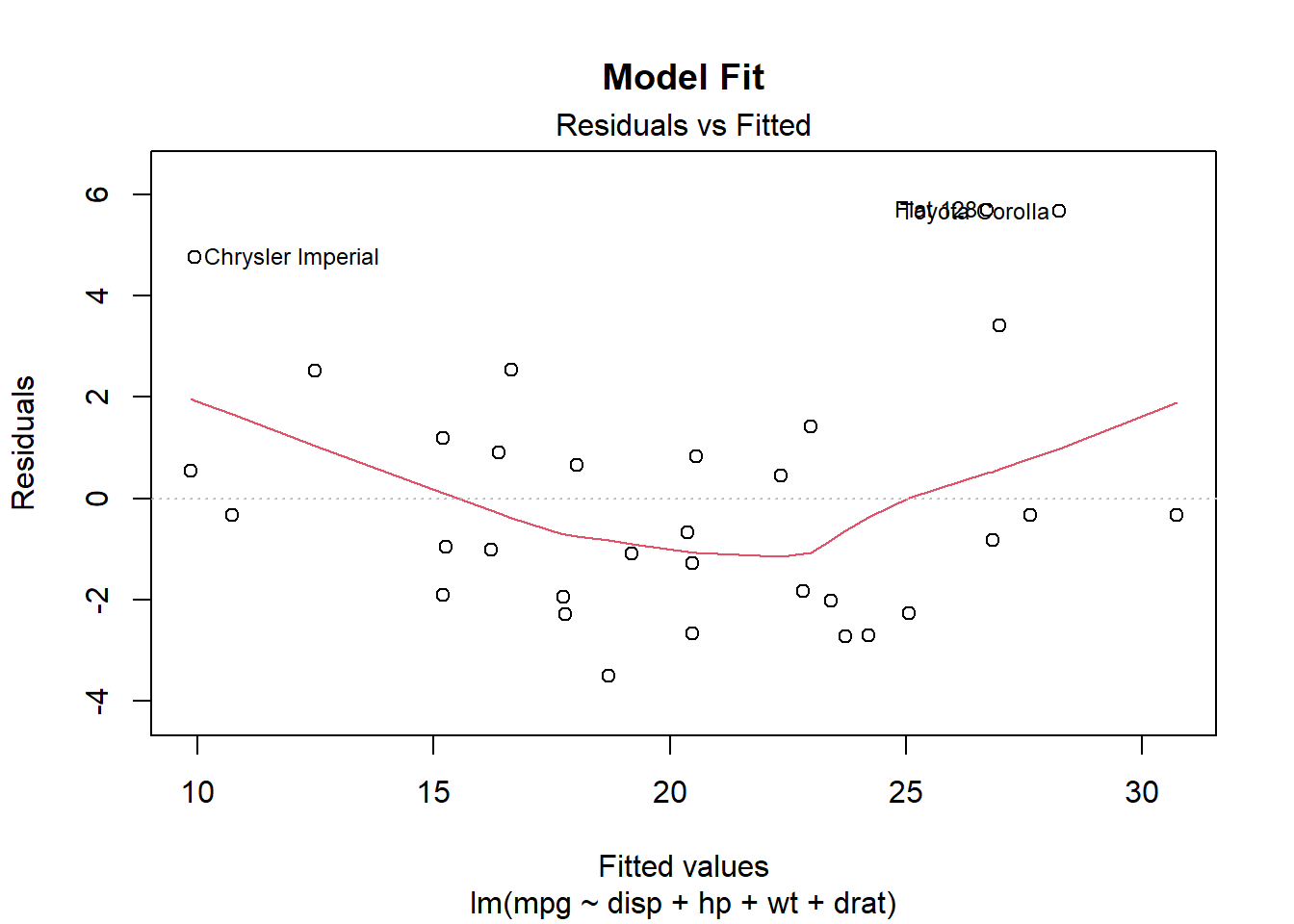
These plots will give us a sense of how well our model fits the data and whether there are any patterns in the residuals.
Visualizing VIF
Now, let’s bring our VIF into the spotlight. We’ll use a barplot to showcase the VIF values for each predictor.
# Visualizing VIF
barplot(vif_values, col = "skyblue", main = "Variance Inflation Factor (VIF)")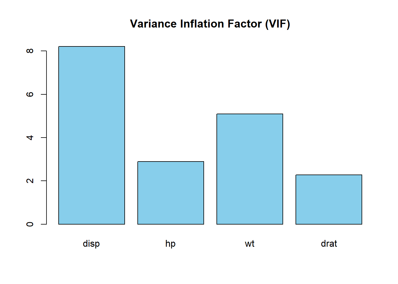
This barplot will help us identify predictors that might be causing multicollinearity issues in our model.
Correlation Matrix and Visualization
To complete our journey, let’s create a correlation matrix of the predictors and visualize it. Understanding the correlations between variables is crucial in regression analysis.
# Creating a correlation matrix
cor_matrix <- cor(mtcars[c("disp", "hp", "wt", "drat")])

# Visualizing the correlation matrix
image(cor_matrix, main = "Correlation Matrix", col = colorRampPalette(c("blue", "white", "red"))(20))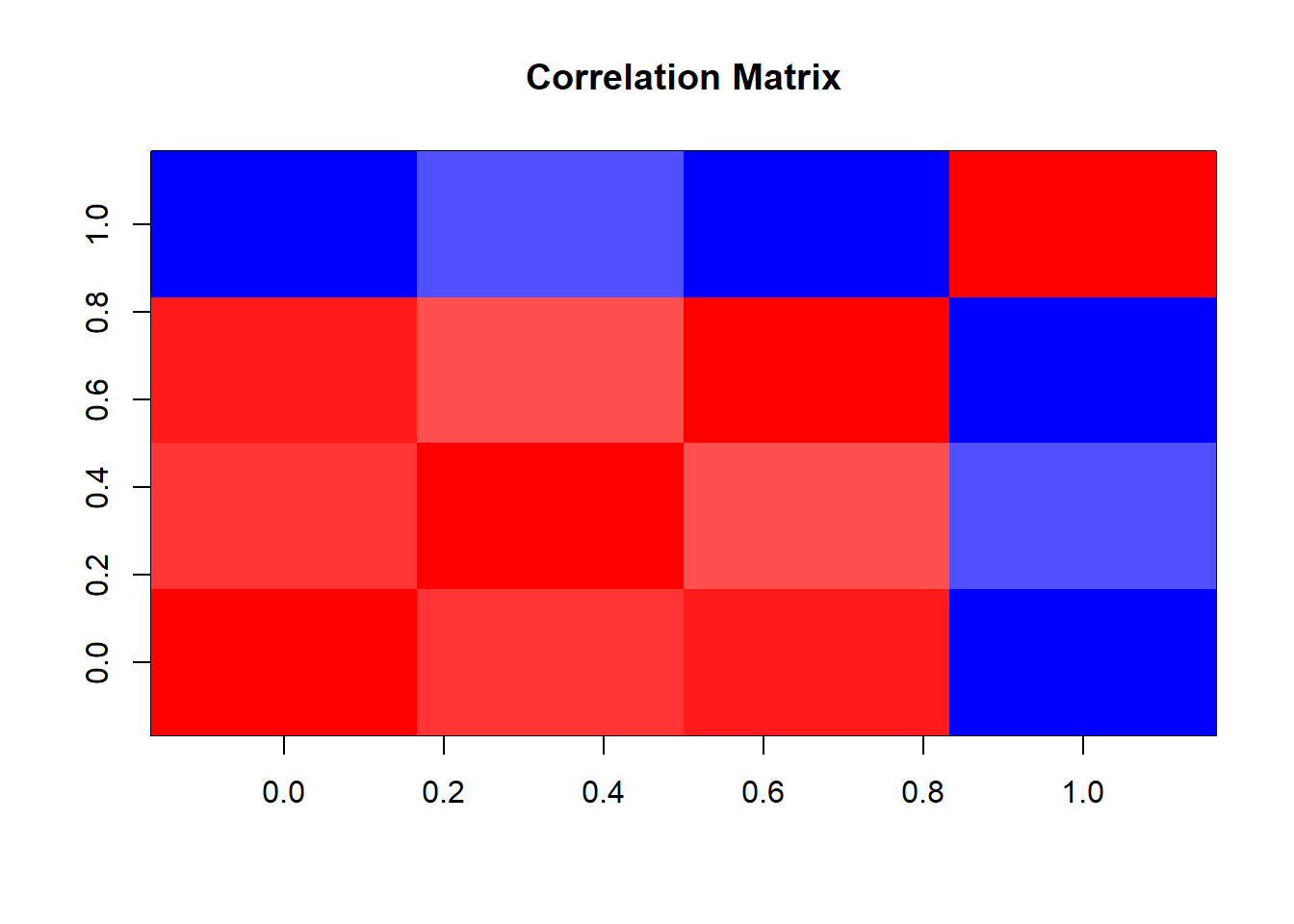
This visualization will give us a colorful snapshot of how our predictors are correlated.
Wrapping Up
And there you have it, folks! We’ve explored the ins and outs of calculating VIF in R, visualized our model, checked residuals, and even took a colorful glance at predictor correlations. These tools are invaluable in ensuring the health and accuracy of our regression models.
Feel free to tweak and play around with the code, and don’t forget to share your findings with the R community. Happy coding!
Keep calm and code in R, Steve