A Gentle Introduction to Poisson Regression for Count Data: School’s Out, Job Offers Incoming!
rtip
regression
Author
Steven P. Sanderson II, MPH
Published
December 19, 2023
Introduction
Hey data enthusiasts! Today, we’re diving into the fascinating world of count data and its trusty sidekick, Poisson regression. Buckle up, because we’re about to explore how this statistical powerhouse helps us understand the factors influencing, you guessed it, counts.
Scenario: Imagine you’re an education researcher, eager to understand how a student’s GPA might influence their job offer count after graduation. But hold on, job offers aren’t continuous – they’re discrete, ranging from 0 to a handful. That’s where Poisson regression comes in!
Generating Data
We’ll keep the data generation part the same, just adjusting the variables in our data frame.
    School               GPA          JobOffers
 Length:100         Min.   :1.000   Min.   :0.00
 Class :character   1st Qu.:1.875   1st Qu.:0.00
 Mode  :character   Median :2.600   Median :0.50
                    Mean   :2.532   Mean   :0.83
                    3rd Qu.:3.200   3rd Qu.:1.00
                    Max.   :4.000   Max.   :4.00
data |>group_by(JobOffers) |>summarise(mean_gpa =mean(GPA))
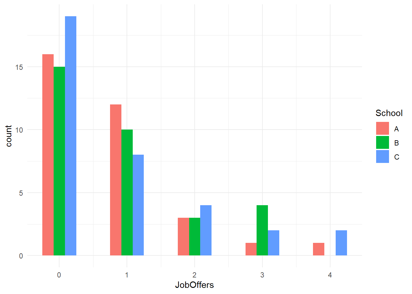
Let’s update the plots to reflect the change in the predictor and outcome.
library(ggplot2)# Plotting GPA distribution by schoolggplot(data, aes(JobOffers, fill = School)) +geom_histogram(binwidth=.5, position="dodge") +theme_minimal()
The density plot now showcases the distribution of GPA scores for each school.
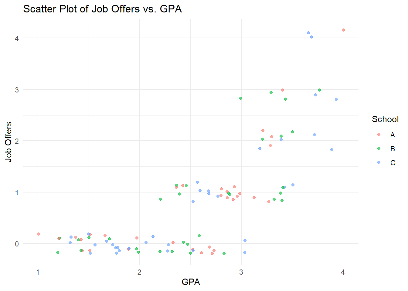
Next, let’s visualize the relationship between GPA and job offers.
# Plotting Job Offers vs. GPAggplot(data, aes(x = GPA, y = JobOffers, color = School)) +geom_point(aes(y = JobOffers), alpha = .628,position =position_jitter(h = .2)) +labs(title ="Scatter Plot of Job Offers vs. GPA",x ="GPA", y ="Job Offers") +theme_minimal()
This scatter plot gives us a visual cue that higher GPAs might correlate with more job offers.
Poisson Regression
Now, let’s adjust the Poisson Regression model to reflect the change in predictor and outcome.
# Fitting Poisson Regression modelpoisson_model <-glm(JobOffers ~ GPA + School, data = data, family ="poisson")# Summary of the modelsummary(poisson_model)
Call:
glm(formula = JobOffers ~ GPA + School, family = "poisson", data = data)

Deviance Residuals:
    Min       1Q   Median       3Q      Max
-1.2452  -0.5856  -0.3483   0.3221   1.6491

Coefficients:
            Estimate Std. Error z value Pr(>|z|)
(Intercept) -5.25817    0.70621  -7.446 9.65e-14 ***
GPA          1.73169    0.21241   8.153 3.56e-16 ***
SchoolB      0.03135    0.27524   0.114    0.909
SchoolC     -0.19137    0.27637  -0.692    0.489
---
Signif. codes:  0 '***' 0.001 '**' 0.01 '*' 0.05 '.' 0.1 ' ' 1

(Dispersion parameter for poisson family taken to be 1)

    Null deviance: 138.07  on 99  degrees of freedom
Residual deviance:  43.18  on 96  degrees of freedom
AIC: 168.06

Number of Fisher Scoring iterations: 5
The model summary will now provide insights into how GPA influences the number of job offers.
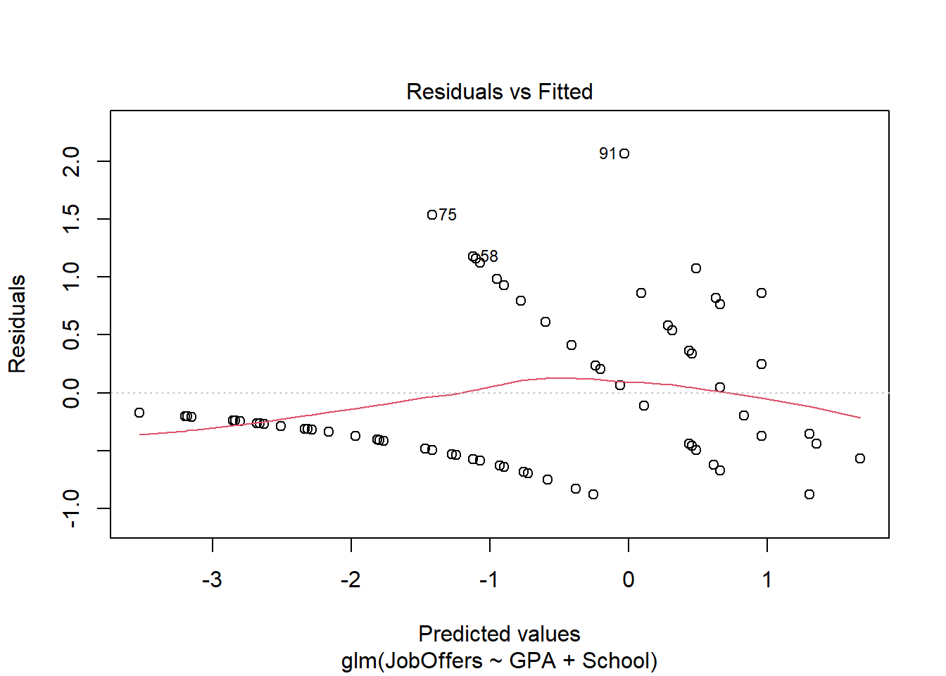
Visualizing Model Fits
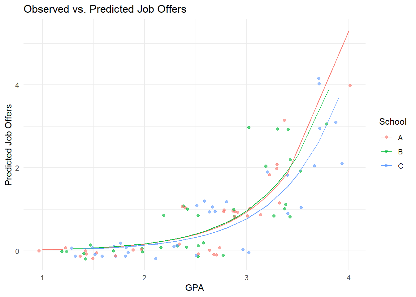
Let’s update the plot to reflect the relationship between GPA and predicted job offers.
# Adding predicted values to the data framedata$Predicted <-predict(poisson_model, type ="response")# Plotting observed vs. predicted valuesggplot(data, aes(x = GPA, y = Predicted, color = School)) +geom_point(aes(y = JobOffers), alpha = .628,position =position_jitter(h = .2)) +geom_line() +labs(title ="Observed vs. Predicted Job Offers",x ="GPA", y ="Predicted Job Offers",color ="School") +theme_minimal()
This plot now illustrates how the Poisson Regression model predicts job offers based on GPA.
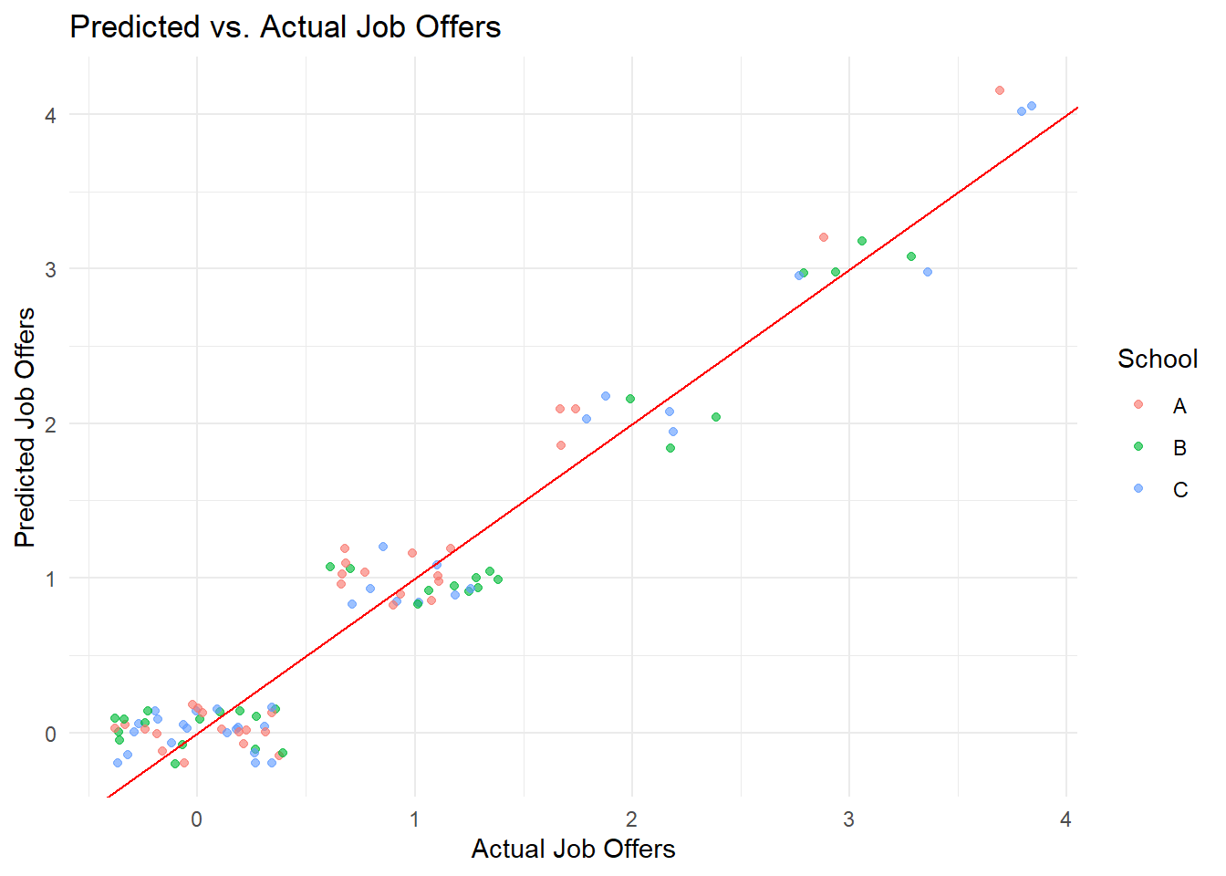
Predicted vs. actual values
ggplot(data, aes(x = JobOffers, y =predict(poisson_model),color = School)) +geom_point(aes(y = JobOffers), alpha = .628,position =position_jitter(h = .2)) +labs(title ="Predicted vs. Actual Job Offers", x ="Actual Job Offers", y ="Predicted Job Offers",color ="School") +geom_abline(intercept =0, slope =1, color ="red") +theme_minimal()