set.seed(123)  # For reproducibility
height <- rnorm(100, mean = 170, sd = 10)
weight <- rnorm(100, mean = 70, sd = 15)
data <- data.frame(height, weight)Introduction
Today, we’re diving into a fundamental data pre-processing technique: scaling values. This might sound simple, but it can significantly impact how your data behaves in analyses.
Why Scale?
Imagine you have data on customer ages (in years) and purchase amounts (in dollars). The age range might be 18-80, while purchase amounts could vary from $10 to $1000. If you use these values directly in a model, the analysis might be biased towards the purchase amount due to its larger scale. Scaling brings both features (age and purchase amount) to a common ground, ensuring neither overpowers the other.
The scale() Function
R offers a handy function called scale() to achieve this. Here’s the basic syntax:
scaled_data <- scale(x, center = TRUE, scale = TRUE)data: This is the vector or data frame containing the values you want to scale. A numeric matrix(like object)center: Either a logical value or numeric-alike vector of length equal to the number of columns of x, where ‘numeric-alike’ means that as.numeric(.) will be applied successfully if is.numeric(.) is not true.scale: Either a logical value or numeric-alike vector of length equal to the number of columns of x.scaled_data: This stores the new data frame with scaled values (typically one standard deviation from the mean).
Example in Action!
Let’s see scale() in action. We’ll generate some sample data for height (in cm) and weight (in kg) of individuals:
This creates a data frame (data) with 100 rows, where height has values around 170 cm with a standard deviation of 10 cm, and weight is centered around 70 kg with a standard deviation of 15 kg.
Visualizing Before and After
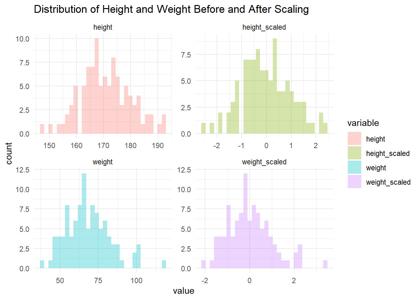
Now, let’s visualize the distribution of both features before and after scaling. We’ll use the ggplot2 package for this:
library(ggplot2)
library(dplyr)
library(tidyr)

# Make Scaled data and cbind to original
scaled_data <- scale(data)
setNames(cbind(data, scaled_data), c("height", "weight", "height_scaled", "weight_scaled")) -> data

# Tidy data for facet plotting
data_long <- pivot_longer(
  data,
  cols = c(height, weight, height_scaled, weight_scaled),
  names_to = "variable",
  values_to = "value"
  )

# Visualize
data_long |>
  ggplot(aes(x = value, fill = variable)) +
  geom_histogram(
    bins = 30,
    alpha = 0.328) +
  facet_wrap(~variable, scales = "free") +
  labs(
    title = "Distribution of Height and Weight Before and After Scaling"
    ) +
  theme_minimal()
Run this code and see the magic! The histograms before scaling will show a clear difference in spread between height and weight. After scaling, both distributions will have a similar shape, centered around 0 with a standard deviation of 1.
Try it Yourself!
This is just a basic example. Get your hands dirty! Try scaling data from your own projects and see how it affects your analysis. Remember, scaling is just one step in data pre-processing. Explore other techniques like centering or normalization depending on your specific needs.
So, the next time you have features with different scales, consider using scale() to bring them to a level playing field and unlock the full potential of your models!