healthyR.ai Primer

code
weeklytip
healthyrai
Author

Steven P. Sanderson II, MPH

Published

October 13, 2022

This is going to serve as a sort of primer for my r packge {healthyR.ai}. The goal of this package is to help with producing uniform machine learning/ai models either from scratch or by way of one of the boilerplate functions.

This particular article is going to focus on k-means clustering with umap projection and visualization.

First things first, lets load in the library:

library(healthyR.ai)

== Welcome to healthyR.ai ===========================================================================
If you find this package useful, please leave a star: 
   https://github.com/spsanderson/healthyR.ai'

If you encounter a bug or want to request an enhancement please file an issue at:
   https://github.com/spsanderson/healthyR.ai/issues

Thank you for using healthyR.ai

Information

K-Means is a partition algorithm initially designed for signal processing. The goal is to partition n observations into k clusters where each n is in k. The unsupervised k-means algorithm has a loose relationship to the k-nearest neighbor classifier, a popular supervised machine learning technique for classification that is often confused with k-means due to the name. Applying the 1-nearest neighbor classifier to the cluster centers obtained by k-means classifies new data into the existing clusters.

The aim of this post is to showcase the use of the healthyR.ai wrapper for the kmeans function along with the wrapper and plot for the uwot::umap projection function. We will go through the entire workflow from getting the data to getting the final UMAP plot.

Generate some data

suppressPackageStartupMessages(library(healthyR.data))
suppressPackageStartupMessages(library(dplyr))
suppressPackageStartupMessages(library(broom))
suppressPackageStartupMessages(library(ggplot2))

data_tbl <- healthyR_data %>%
    filter(ip_op_flag == "I") %>%
    filter(payer_grouping != "Medicare B") %>%
    filter(payer_grouping != "?") %>%
    select(service_line, payer_grouping) %>%
    mutate(record = 1) %>%
    as_tibble()

data_tbl %>%
  glimpse()
Rows: 116,823
Columns: 3
$ service_line   <chr> "Medical", "Schizophrenia", "Syncope", "Pneumonia", "Ch…
$ payer_grouping <chr> "Blue Cross", "Medicare A", "Medicare A", "Medicare A",…
$ record         <dbl> 1, 1, 1, 1, 1, 1, 1, 1, 1, 1, 1, 1, 1, 1, 1, 1, 1, 1, 1…

Now that we have our data we need to generate what is called a user item table. To do this we use the function hai_kmeans_user_item_tbl which takes in just a few arguments. The purpose of the user item table is to aggregate and normalize the data between the users and the items.

The data that we have generated is going to look for clustering amongst the service_lines (the user) and the payer_grouping (item) columns.

Lets now create the user item table.

User Item Tibble

uit_tbl <- hai_kmeans_user_item_tbl(
  data_tbl, 
  service_line, 
  payer_grouping, 
  record
)

uit_tbl
# A tibble: 23 × 12
   service_line   Blue …¹ Comme…² Compe…³ Excha…⁴    HMO Medic…⁵ Medic…⁶ Medic…⁷
   <chr>            <dbl>   <dbl>   <dbl>   <dbl>  <dbl>   <dbl>   <dbl>   <dbl>
 1 Alcohol Abuse   0.0941 0.0321  5.25e-4 0.0116  0.0788 0.158    0.367   0.173 
 2 Bariatric Sur…  0.317  0.0583  0       0.0518  0.168  0.00324  0.343   0.0485
 3 Carotid Endar…  0.0845 0.0282  0       0       0.0141 0        0.0282  0.648 
 4 Cellulitis      0.110  0.0339  1.18e-2 0.00847 0.0805 0.0869   0.192   0.355 
 5 Chest Pain      0.144  0.0391  2.90e-3 0.00543 0.112  0.0522   0.159   0.324 
 6 CHF             0.0295 0.00958 5.18e-4 0.00414 0.0205 0.0197   0.0596  0.657 
 7 COPD            0.0493 0.0228  2.28e-4 0.00548 0.0342 0.0461   0.172   0.520 
 8 CVA             0.0647 0.0246  1.07e-3 0.0107  0.0524 0.0289   0.0764  0.555 
 9 GI Hemorrhage   0.0542 0.0175  1.25e-3 0.00834 0.0480 0.0350   0.0855  0.588 
10 Joint Replace…  0.139  0.0179  3.36e-2 0.00673 0.0516 0        0.0874  0.5   
# … with 13 more rows, 3 more variables: `Medicare HMO` <dbl>,
#   `No Fault` <dbl>, `Self Pay` <dbl>, and abbreviated variable names
#   ¹​`Blue Cross`, ²​Commercial, ³​Compensation, ⁴​`Exchange Plans`, ⁵​Medicaid,
#   ⁶​`Medicaid HMO`, ⁷​`Medicare A`

The table is aggregated by item for the various users to which the algorithm will be applied.

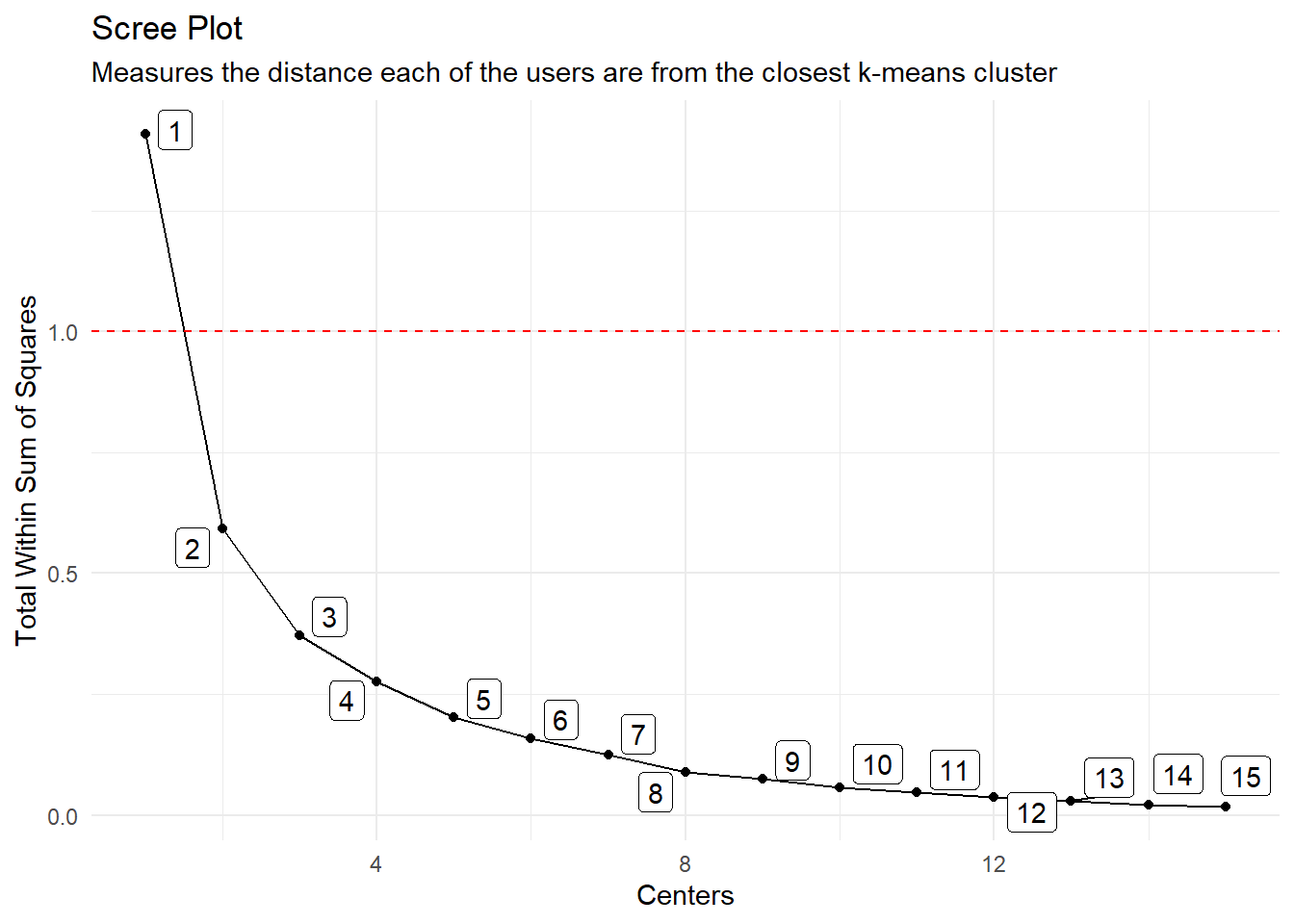
Now that we have this data we need to find what will be out optimal k (clusters). To do this we need to generate a table of data that will have a column of k and for that k apply the k-means function to the data with that k and return the total within sum of squares.

To do this there is a convienent function called hai_kmeans_mapped_tbl that takes as its sole argument the output from the hai_kmeans_user_item_tbl. There is an argument .centers where the default is set to 15.

K-Means Mapped Tibble

kmm_tbl <- hai_kmeans_mapped_tbl(uit_tbl)
kmm_tbl
# A tibble: 15 × 3
   centers k_means  glance          
     <int> <list>   <list>          
 1       1 <kmeans> <tibble [1 × 4]>
 2       2 <kmeans> <tibble [1 × 4]>
 3       3 <kmeans> <tibble [1 × 4]>
 4       4 <kmeans> <tibble [1 × 4]>
 5       5 <kmeans> <tibble [1 × 4]>
 6       6 <kmeans> <tibble [1 × 4]>
 7       7 <kmeans> <tibble [1 × 4]>
 8       8 <kmeans> <tibble [1 × 4]>
 9       9 <kmeans> <tibble [1 × 4]>
10      10 <kmeans> <tibble [1 × 4]>
11      11 <kmeans> <tibble [1 × 4]>
12      12 <kmeans> <tibble [1 × 4]>
13      13 <kmeans> <tibble [1 × 4]>
14      14 <kmeans> <tibble [1 × 4]>
15      15 <kmeans> <tibble [1 × 4]>

As we see there are three columns, centers, k_means and glance. The k_means column is the k_means list object and glance is the tibble returned by the broom::glance function.

kmm_tbl %>%
  tidyr::unnest(glance)
# A tibble: 15 × 6
   centers k_means  totss tot.withinss betweenss  iter
     <int> <list>   <dbl>        <dbl>     <dbl> <int>
 1       1 <kmeans>  1.41       1.41    1.33e-15     1
 2       2 <kmeans>  1.41       0.592   8.17e- 1     1
 3       3 <kmeans>  1.41       0.372   1.04e+ 0     2
 4       4 <kmeans>  1.41       0.276   1.13e+ 0     2
 5       5 <kmeans>  1.41       0.202   1.21e+ 0     2
 6       6 <kmeans>  1.41       0.159   1.25e+ 0     3
 7       7 <kmeans>  1.41       0.124   1.28e+ 0     3
 8       8 <kmeans>  1.41       0.0884  1.32e+ 0     2
 9       9 <kmeans>  1.41       0.0745  1.33e+ 0     3
10      10 <kmeans>  1.41       0.0576  1.35e+ 0     2
11      11 <kmeans>  1.41       0.0460  1.36e+ 0     2
12      12 <kmeans>  1.41       0.0363  1.37e+ 0     3
13      13 <kmeans>  1.41       0.0293  1.38e+ 0     3
14      14 <kmeans>  1.41       0.0202  1.39e+ 0     2
15      15 <kmeans>  1.41       0.0161  1.39e+ 0     2

As stated we use the tot.withinss to decide what will become our k, an easy way to do this is to visualize the Scree Plot, also known as the elbow plot. This is done by ploting the x-axis as the centers and the y-axis as the tot.withinss.

Scree Plot and Data

hai_kmeans_scree_plt(.data = kmm_tbl)

If we want to see the scree plot data that creates the plot then we can use another function hai_kmeans_scree_data_tbl.

hai_kmeans_scree_data_tbl(kmm_tbl)
# A tibble: 15 × 2
   centers tot.withinss
     <int>        <dbl>
 1       1       1.41  
 2       2       0.592 
 3       3       0.372 
 4       4       0.276 
 5       5       0.202 
 6       6       0.159 
 7       7       0.124 
 8       8       0.0884
 9       9       0.0745
10      10       0.0576
11      11       0.0460
12      12       0.0363
13      13       0.0293
14      14       0.0202
15      15       0.0161

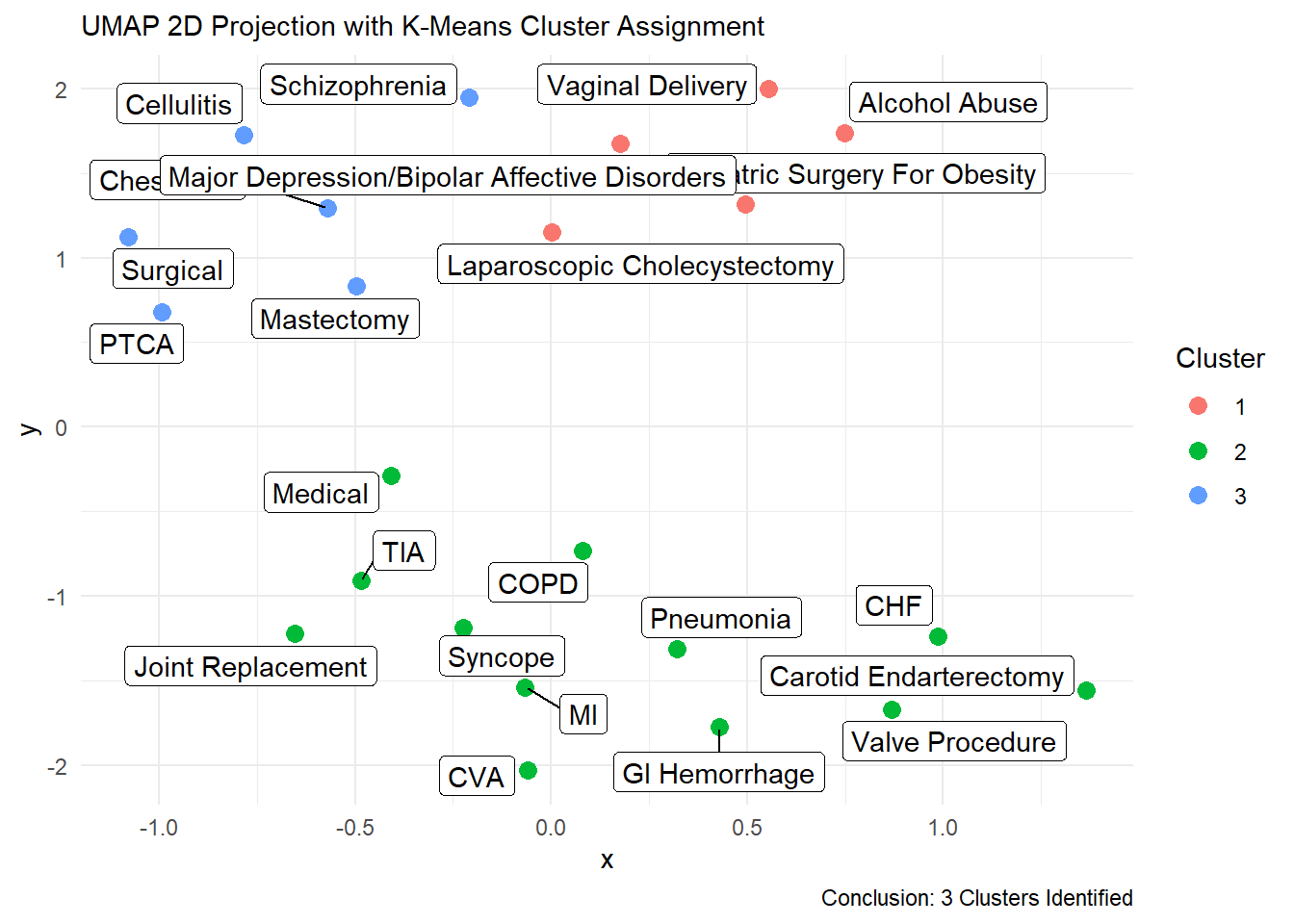
With the above pieces of information we can decide upon a value for k, in this instance we are going to use 3. Now that we have that we can go ahead with creating the umap list object where we can take a look at a great many things associated with the data.

UMAP List Object

Now lets go ahead and create our UMAP list object.

ump_lst <- hai_umap_list(.data = uit_tbl, kmm_tbl, 3)

Now that it is created, lets take a look at each item in the list. The umap_list function returns a list of 5 items.

  • umap_obj
  • umap_results_tbl
  • kmeans_obj
  • kmeans_cluster_tbl
  • umap_kmeans_cluster_results_tbl

Since we have the list object we can now inspect the kmeans_obj, first thing we will do is use the hai_kmeans_tidy_tbl function to inspect things.

km_obj <- ump_lst$kmeans_obj
hai_kmeans_tidy_tbl(.kmeans_obj = km_obj, .data = uit_tbl, .tidy_type = "glance")
# A tibble: 1 × 4
  totss tot.withinss betweenss  iter
  <dbl>        <dbl>     <dbl> <int>
1  1.41        0.372      1.04     2
hai_kmeans_tidy_tbl(km_obj, uit_tbl, "augment")
# A tibble: 23 × 2
   service_line                  cluster
   <chr>                         <fct>  
 1 Alcohol Abuse                 1      
 2 Bariatric Surgery For Obesity 1      
 3 Carotid Endarterectomy        2      
 4 Cellulitis                    3      
 5 Chest Pain                    3      
 6 CHF                           2      
 7 COPD                          2      
 8 CVA                           2      
 9 GI Hemorrhage                 2      
10 Joint Replacement             2      
# … with 13 more rows
hai_kmeans_tidy_tbl(km_obj, uit_tbl, "tidy")
# A tibble: 3 × 14
  Blue …¹ Comme…² Compe…³ Excha…⁴    HMO Medic…⁵ Medic…⁶ Medic…⁷ Medic…⁸ No Fa…⁹
    <dbl>   <dbl>   <dbl>   <dbl>  <dbl>   <dbl>   <dbl>   <dbl>   <dbl>   <dbl>
1  0.150   0.0368 3.07e-4 0.0207  0.163   0.131   0.314    0.132  0.0319 0.00136
2  0.0784  0.0218 4.32e-3 0.00620 0.0449  0.0368  0.0800   0.563  0.152  0.00348
3  0.117   0.0314 1.02e-2 0.0139  0.0982  0.0856  0.147    0.354  0.105  0.00707
# … with 4 more variables: `Self Pay` <dbl>, size <int>, withinss <dbl>,
#   cluster <fct>, and abbreviated variable names ¹​`Blue Cross`, ²​Commercial,
#   ³​Compensation, ⁴​`Exchange Plans`, ⁵​Medicaid, ⁶​`Medicaid HMO`,
#   ⁷​`Medicare A`, ⁸​`Medicare HMO`, ⁹​`No Fault`

UMAP Plot

Now that we have all of the above data we can visualize our clusters that are colored by their cluster number.

hai_umap_plot(.data = ump_lst, .point_size = 3, TRUE)