tidy_multi_single_dist(
  .tidy_dist = NULL,
  .param_list = list()
)Introduction
In statistics, it is often useful to view different versions of the same statistical distribution. For example, when working with the normal distribution, it may be helpful to see how the distribution changes as the mean and standard deviation are varied.
One way to do this is by using the R library {TidyDensity}, which has a function called tidy_multi_single_dist(). This function allows a user to easily generate multiple versions of the same statistical distribution which can be plotted on the same graph, with each version representing a different combination of mean and standard deviation.
To use this function, the user simply needs to specify the distribution they want to plot (e.g. “normal”), the range of values for the mean and standard deviation, and the number of versions they want to plot. The function will then generate a plot showing the different versions of the distribution, with each version represented by a different color.
There are several reasons why it might be a good idea to view different versions of the same statistical distribution. For one, it can help the user understand how the shape of the distribution changes as the mean and standard deviation are varied. This can be particularly useful for distributions that have a wide range of possible values for the mean and standard deviation, such as the normal distribution.
In addition, viewing different versions of the same distribution can also help the user identify patterns and trends in the data. For example, the user may notice that the distribution becomes more spread out as the standard deviation increases, or that the distribution shifts to the left or right as the mean changes.
Overall, the TidyDensity function tidy_multi_single_dist() is a useful tool for anyone interested in visualizing different versions of the same statistical distribution. Whether you are a student learning about statistics for the first time, or an experienced data scientist looking to better understand your data, this function can help you gain a deeper understanding of the underlying distribution and identify patterns and trends in your data.
Function
Let’s take a look at the full function call.
Now let’s look at the arguments that go to the parameters.
.tidy_dist- The type of tidy_ distribution that you want to run. You can only choose one..param_list- This must be a list() object of the parameters that you want to pass through to the{TidyDensity}‘tidy_’ distribution function.
Example
Let’s run through an example.
library(TidyDensity)
library(dplyr)

tn <-tidy_multi_single_dist(
  .tidy_dist = "tidy_normal",
  .param_list = list(
    .n = 200,
    .mean = c(-1, 0, 1),
    .sd = 1,
    .num_sims = 3
  )
)
Now that we have generated the data, let’s take a look and see if these different distributions have indeed been created.
tidy_distribution_summary_tbl(tn, dist_name) |>
  select(dist_name, mean_val, std_val)
# A tibble: 3 × 3
dist_name mean_val std_val
<fct> <dbl> <dbl>
1 Gaussian c(-1, 1) -1.03 0.988
2 Gaussian c(0, 1) 0.0136 1.01
3 Gaussian c(1, 1) 0.990 1.02 Look’s good there, now let’s visualize.
tn %>%
  tidy_multi_dist_autoplot()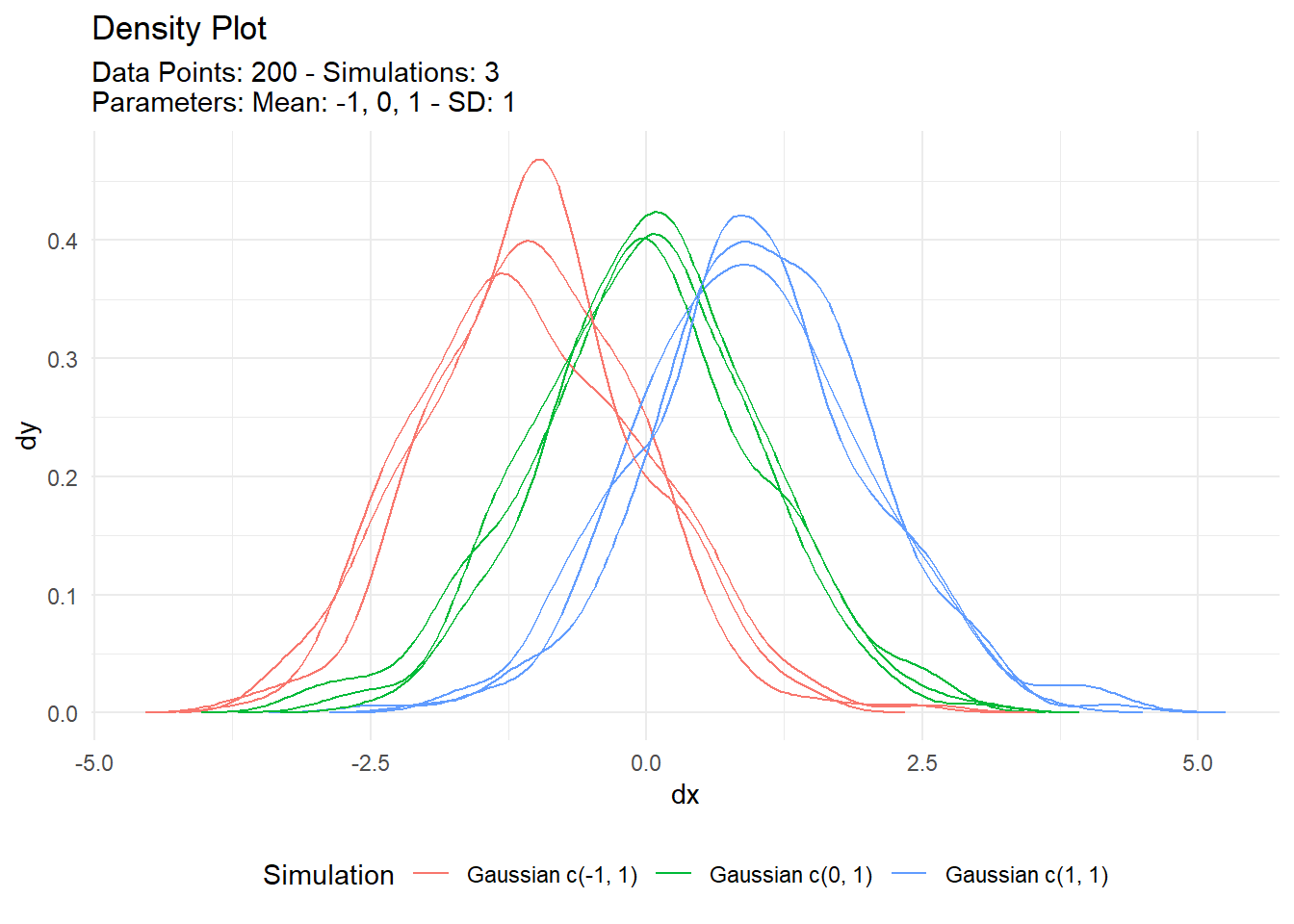
Voila!