Plot out the data from the ts_time_event_analysis_tbl() function.
Arguments
- .data
The data that comes from the
ts_time_event_analysis_tbl()- .plot_type
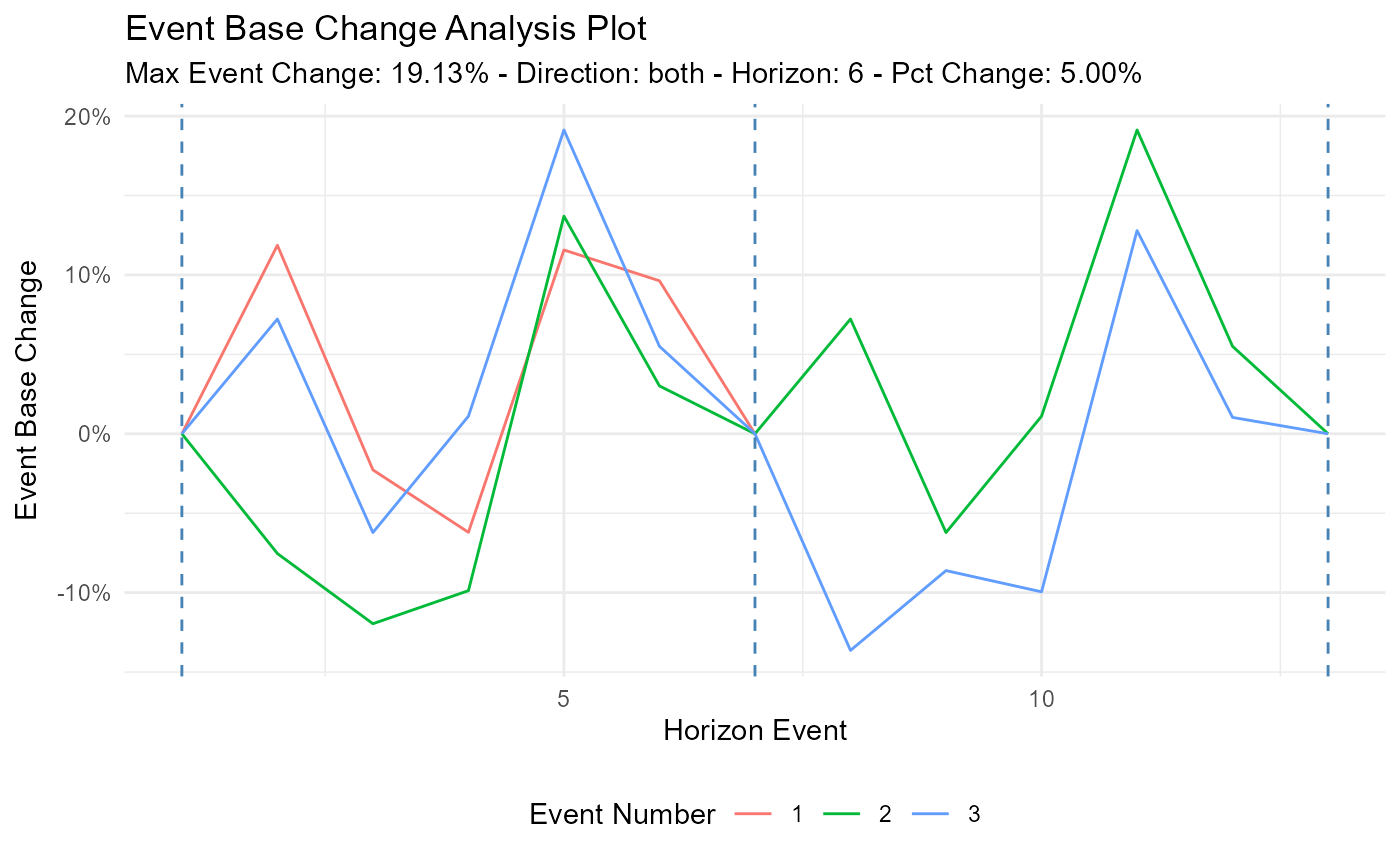
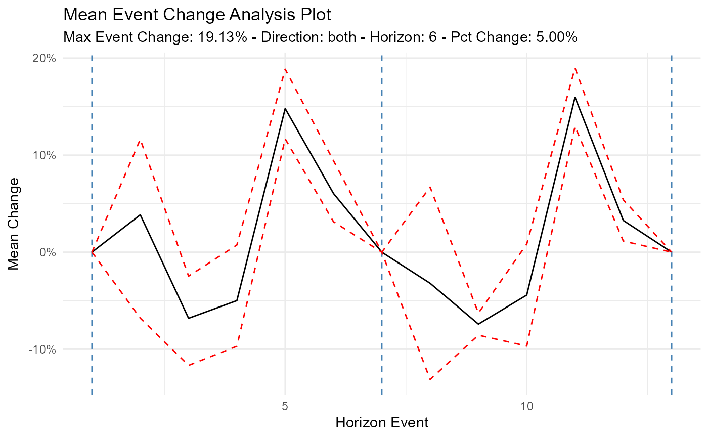
The default is "mean" which will show the mean event change of the output from the analysis tibble. The possible values for this are: mean, median, and individual.
- .plot_ci
The default is TRUE. This will only work if you choose one of the aggregate plots of either "mean" or "median"
- .interactive
The default is FALSE. TRUE will return a plotly plot.
Details
This function will take in data strictly from the ts_time_event_analysis_tbl()
and plot out the data. You can choose what type of plot you want in the parameter
of .plot_type. This will give you a choice of "mean", "median", and "individual".
You can also plot the upper and lower confidence intervals if you choose one of the aggregate plots ("mean"/"median").
Examples
library(dplyr)
df <- ts_to_tbl(AirPassengers) %>% select(-index)

ts_time_event_analysis_tbl(
  .data = df,
  .horizon = 6,
  .date_col = date_col,
  .value_col = value,
  .direction = "both"
) %>%
  ts_event_analysis_plot()


ts_time_event_analysis_tbl(
  .data = df,
  .horizon = 6,
  .date_col = date_col,
  .value_col = value,
  .direction = "both"
) %>%
  ts_event_analysis_plot(.plot_type = "individual")
ts_time_event_analysis_tbl(
.data = df,
.horizon = 6,
.date_col = date_col,
.value_col = value,
.direction = "both"
) %>%
ts_event_analysis_plot(.plot_type = "individual")