boxplot(mpg ~ cyl, data = mtcars)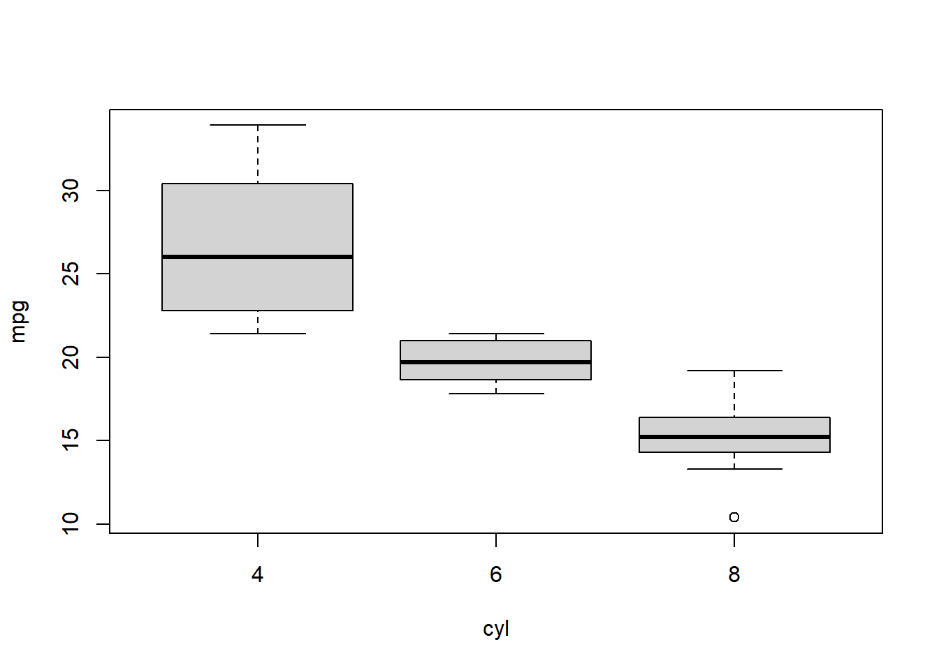
Are you ready to dive into the world of data visualization in R? One powerful tool at your disposal is the box plot, also known as a box-and-whisker plot. This versatile chart can help you understand the distribution of your data and identify potential outliers. In this blog post, we’ll walk you through the process of creating box plots using R’s ggplot2 package, using the airquality dataset as an example. Whether you’re a beginner or an experienced R programmer, you’ll find something valuable here.
A box plot is a graphical representation of the distribution of a dataset. It provides a quick summary of key statistics such as the median, quartiles, and potential outliers. The plot consists of a rectangular box (the interquartile range, IQR) and two “whiskers” that extend from the box to the smallest and largest observations within a certain range.
The syntax of the R function boxplot() is as follows:
boxplot(x, data, notch, varwidth, names, main, ylab, xlab, ...)The arguments are:
x: A vector or a formula. If a vector, it contains the data to be plotted. If a formula, it takes the form y ~ x, where y is the variable to be plotted and x is the grouping variable.data: A data frame containing the data.notch: A logical value. If TRUE, a notch is drawn on the boxplot to indicate the confidence interval for the median.varwidth: A logical value. If TRUE, the width of the box is proportional to the sample size.names: A vector of strings. The names of the groups to be plotted.main: A string. The title of the plot.ylab: A string. The label for the y-axis.xlab: A string. The label for the x-axis....: Other arguments passed to the plot() function.For example, to create a boxplot of the mpg variable in the mtcars dataset, you would use the following code:
boxplot(mpg ~ cyl, data = mtcars)
This code would create a boxplot of the mpg variable, with the groups being the different number of cylinders (cyl) in the cars.
Before we jump into code, let’s get the ggplot2 package loaded and our dataset ready:
# Load the ggplot2 package
library(ggplot2)Let’s start with a basic example. Suppose we want to visualize the distribution of ozone levels in the airquality dataset. Here’s how you can create a plain box plot:
# Basic box plot for ozone levels
basic_box_plot <- ggplot(airquality, aes(x = factor(1), y = Ozone)) +
  geom_boxplot() +
  labs(title = "Basic Box Plot of Ozone Levels",
       x = "", y = "Ozone Levels") +
  theme_minimal()

basic_box_plot
Warning: Removed 37 rows containing non-finite values (`stat_boxplot()`).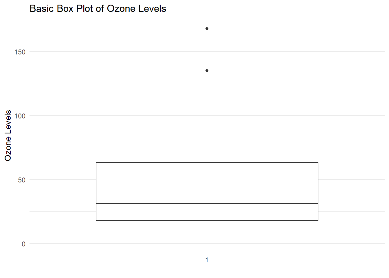
In this example, we use ggplot() to initiate the plot and specify the x aesthetic as a factor to create a single box plot. The y aesthetic is set to the Ozone variable, and we add the geom_boxplot() layer to create the box plot itself. The labs() function helps us set the title and axis labels.
If you want to add more visual depth to your box plots, you can use color to differentiate categories. Let’s create a box plot of ozone levels, grouped by the months:
# Box plot with fill for different months
filled_box_plot <- ggplot(
  airquality,
  aes(
    x = factor(Month),
    y = Ozone,
    fill = factor(Month)
    )
  ) +
  geom_boxplot() +
  labs(title = "Box Plot of Ozone Levels by Month",
       x = "Month", y = "Ozone Levels") +
  scale_fill_discrete(name = "Month") +
  theme_minimal()

filled_box_plot
Warning: Removed 37 rows containing non-finite values (`stat_boxplot()`).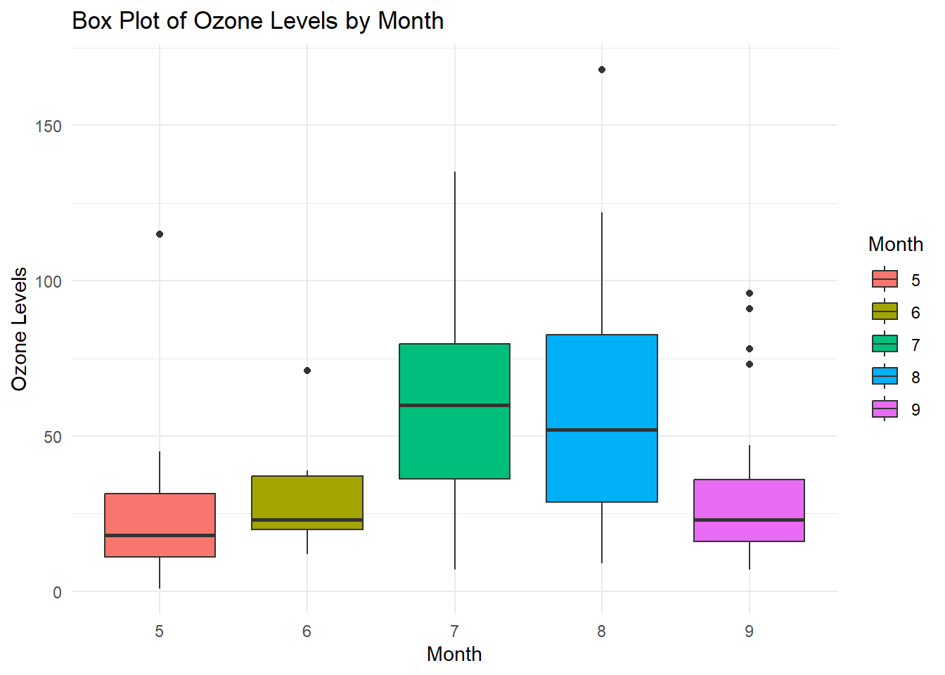
In this code, we add the fill aesthetic to the aes() function, which creates separate box plots for each month and fills them with different colors based on the Month variable.
A notched box plot can help you compare the medians of different groups. Let’s create a notched box plot to visualize the distribution of ozone levels for different temperatures:
# Notched box plot for ozone levels by temperature
notched_box_plot <- ggplot(
  airquality,
  aes(
    x = factor(Temp),
    y = Ozone,
    fill = factor(Temp)
    )
  ) +
  geom_boxplot(notch = TRUE) +
  labs(title = "Notched Box Plot of Ozone Levels by Temperature",
       x = "Temperature", y = "Ozone Levels") +
  scale_fill_discrete(name = "Temperature") +
  theme_minimal() +
  theme(legend.position = "none")

notched_box_plot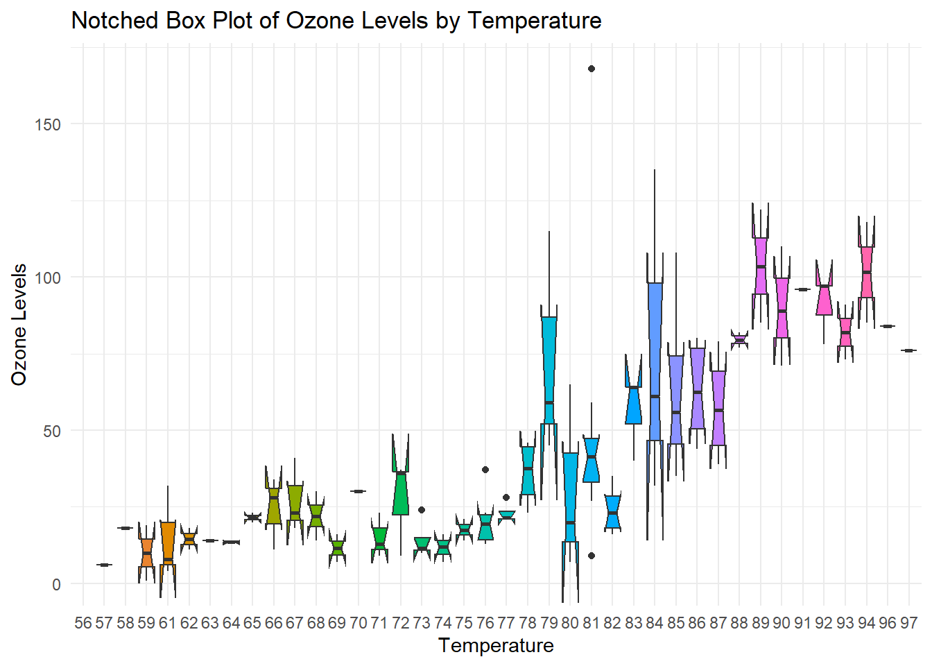
By setting notch = TRUE within geom_boxplot(), you add notches to the boxes that provide a rough comparison of medians.
# Create a filled box plot of ozone by month
boxplot(
  airquality$Ozone ~ airquality$Month,
  main = "Distribution of Ozone by Month",
  xlab = "Month",
  ylab = "Ozone",
  col = "lightblue"
  )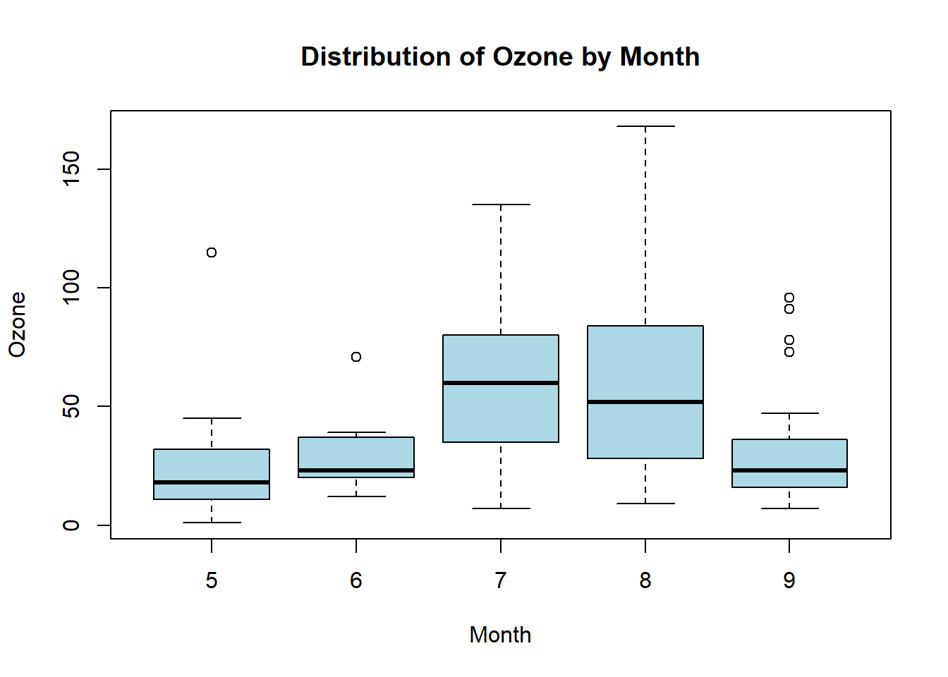
Explanation:
(~) to create a filled box plot of the ozone variable (airquality$Ozone) grouped by the month variable (airquality$Month).Box plots are a fantastic tool for quickly understanding the distribution of your data. With the ggplot2 package in R, creating informative and visually appealing box plots is both accessible and customizable. I encourage you to experiment with different aesthetics, variations, and datasets to explore the insights these plots can reveal. So why not grab your R console and embark on your data visualization journey today? Happy plotting!
Remember, the best way to truly master box plots is by trying them yourself. Copy and paste the code snippets provided here into your R environment, modify them, and observe how the plots change. As you become more comfortable, you can start applying box plots to your own datasets and discover new patterns and trends. Happy coding!