Exploring Box Plots with Mean Values using Base R and ggplot2
rtip
viz
Author
Steven P. Sanderson II, MPH
Published
August 21, 2023
Introduction
Data visualization is a powerful tool for understanding and interpreting data. In this blog post, we will explore how to create box plots with mean values using both base R and ggplot2. We will use the famous iris dataset as an example. So, grab your coding tools and let’s dive into the world of box plots!
Examples
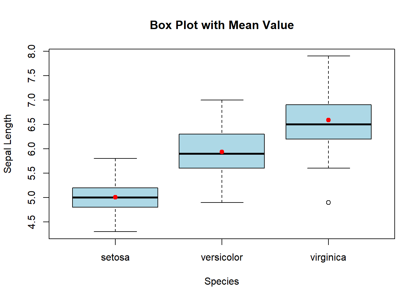
Example 1: Box Plots with Mean Value in Base R
To start, let’s use base R to create box plots with mean values. Here’s the code:
# Calculate the mean for each speciesmean_values <-aggregate(iris$Sepal.Length, by =list(iris$Species), FUN = mean)# Create a box plot with mean valueboxplot(iris$Sepal.Length ~ iris$Species, main ="Box Plot with Mean Value",xlab ="Species", ylab ="Sepal Length", col ="lightblue")points(mean_values$x ~ mean_values$Group.1, col ="red", pch =19)
In this code, we first load the iris dataset using the data() function. Then, we calculate the mean value for each species using the aggregate() function. Finally, we create a box plot using boxplot() and add the mean values as red points using points().
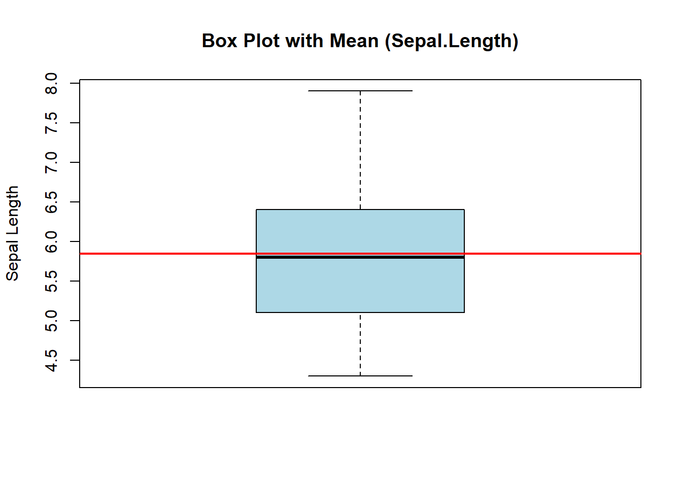
Example 2: Single Boxplot with mean line
# Create a basic box plot with mean using Base Rboxplot(iris$Sepal.Length, main="Box Plot with Mean (Sepal.Length)", ylab="Sepal Length", col="lightblue")abline(h=mean(iris$Sepal.Length), col="red", lwd=2)
In this code snippet, we load the Iris dataset and generate a box plot for the Sepal.Length attribute. The abline() function adds a horizontal line at the mean value, highlighted in red. Don’t hesitate to modify attributes like color, line width, or title to customize your plot to your heart’s content!
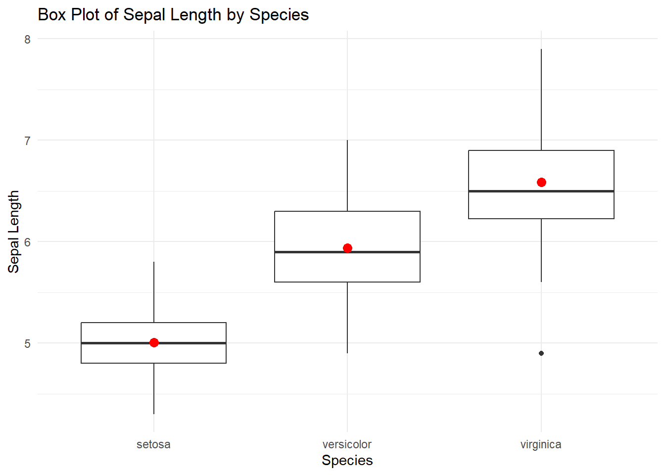
Example 3: Box Plots with Mean Value in ggplot2
Now let’s use the ggplot2 library.
# Load necessary librarylibrary(ggplot2)# Create a box plot with mean using ggplot2ggplot(iris, aes(x = Species, y = Sepal.Length)) +geom_boxplot() +geom_point(data =aggregate(Sepal.Length ~ Species, data = iris, mean),aes(x = Species, y = Sepal.Length), color ="red", size =3) +labs(title ="Box Plot of Sepal Length by Species",x ="Species",y ="Sepal Length") +theme_minimal()
We load the ggplot2 library using library(ggplot2).
We use the ggplot() function to create a ggplot object and specify the dataset and aesthetic mappings with the aes() function.
We use geom_boxplot() to create the box plot.
We use geom_point() to add red points representing the mean values using the aggregate() result.
labs() is used to set the plot title and axis labels.
We use theme_minimal() to apply a clean and minimal theme to the plot.
Example 4: Single Boxplot with mean line ggplot2
# Create a box plot with mean using ggplot2ggplot(iris, aes(x="", y=Sepal.Length)) +geom_boxplot(fill="lightblue", color="black") +geom_hline(yintercept =mean(iris$Sepal.Length), color="red", linetype="dashed") +labs(title="Box Plot with Mean using ggplot2",y="Sepal Length") +theme_minimal()
Here, we use the ggplot() function to set up the plot structure and aesthetics. The geom_boxplot() function generates the box plot, and the geom_hline() function adds the mean line. Customize the color palette, line types, titles, and themes to make your visualization shine!
Conclusion:
In this blog post, we explored how to create box plots with mean values using both base R and ggplot2. We used the iris dataset as an example and provided code snippets for each approach. Box plots are a great way to visualize the distribution of data and the addition of mean values provides further insights. We encourage you to try these examples with the iris dataset or apply them to your own data. Happy coding and happy visualizing!
Remember, data visualization is an art form, so feel free to experiment with different customizations and explore other types of plots. The more you practice, the better you’ll become at creating informative and visually appealing visualizations. So, keep coding and keep exploring the world of data visualization!