# Load the required packages
library(ggplot2)
library(corrplot)
library(ggcorrplot)Introduction
Data visualization is a powerful tool for understanding the relationships between variables in a dataset. One of the most common and insightful ways to visualize correlations is through heatmaps. In this blog post, we’ll dive into the world of correlation heatmaps using R, using the mtcars and iris datasets as examples. By the end of this post, you’ll be equipped to create informative correlation heatmaps on your own.
Understanding Correlation
Correlation is a statistical measure that quantifies the strength and direction of the linear relationship between two variables. It ranges from -1 to 1, where -1 indicates a perfect negative correlation, 1 indicates a perfect positive correlation, and 0 indicates no linear correlation.
The Power of Heatmaps
Heatmaps are a visual representation of data where values are depicted using colors. In the context of correlation, heatmaps use color intensity to represent the strength of the correlation between variables. Darker colors usually indicate higher correlation values, while lighter colors indicate lower or no correlation.
Getting Started
Before we dive into creating correlation heatmaps, let’s load the necessary packages.
Creating Correlation Heatmaps
Example 1: mtcars Dataset
Let’s start by exploring the relationships within the mtcars dataset, which contains information about various car models and their characteristics.
# Calculate the correlation matrix
cor_matrix <- cor(mtcars)

# Create a basic correlation heatmap using corrplot
corrplot(cor_matrix, method = "color")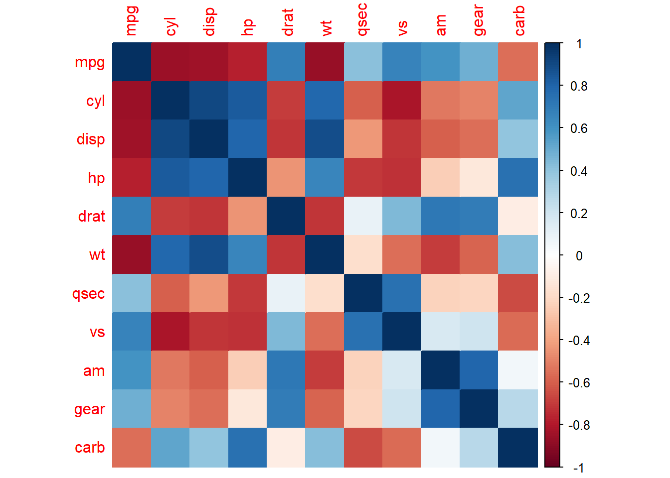
In this example, we use the cor() function to compute the correlation matrix for the mtcars dataset. The corrplot() function is then used to create the heatmap. The argument method = "color" specifies that we want to represent the correlation values using colors.
Example 2: iris Dataset
Now, let’s explore the relationships within the iris dataset, which contains measurements of various iris flowers.
# Calculate the correlation matrix
cor_matrix_iris <- cor(iris[, 1:4])  # Consider only numeric columns

# Create a more visually appealing heatmap
ggcorrplot(cor_matrix_iris, type = "lower", colors = c("#6D9EC1", "white", "#E46726"))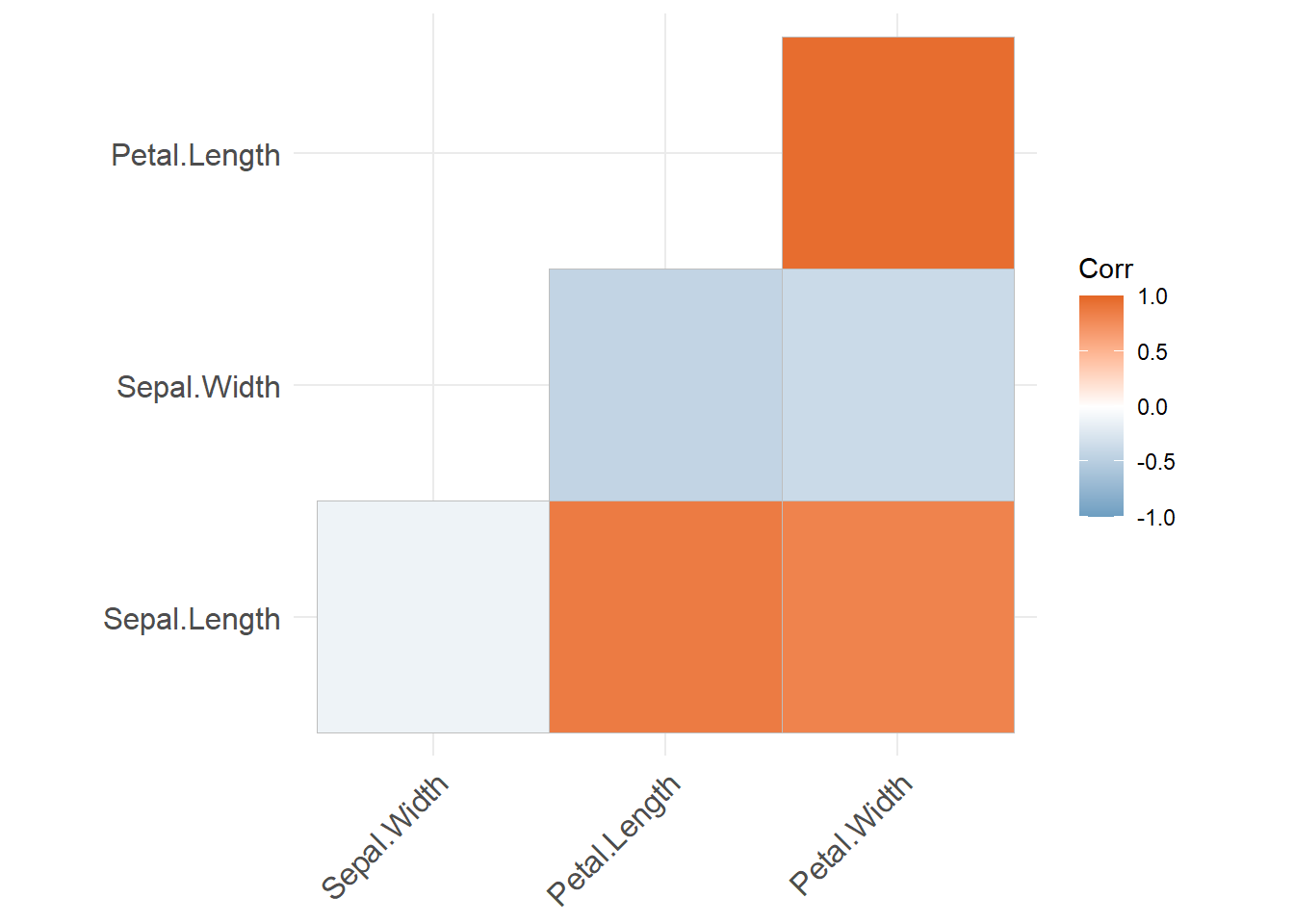
In this example, we calculate the correlation matrix for the first four numeric columns of the iris dataset using cor(). We then use the corrplot() function from the ggcorrplot package to create a more aesthetically pleasing heatmap. The type = "lower" argument indicates that we want to display only the lower triangle of the correlation matrix. We also customize the color scheme using the colors argument.
If you want to check out how to get a correlation heatmap for a time series lagged against itself you can see this article here.
Interpreting the Heatmap
In both examples, the heatmap provides a visual representation of the relationships between variables. Darker colors indicate stronger correlations, while lighter colors suggest weaker or no correlations. By analyzing the heatmap, you can quickly identify which variables are positively, negatively, or not correlated with each other.
Try It Yourself!
Now that you have a basic understanding of creating correlation heatmaps, I encourage you to experiment with your own datasets. The cor() function is your go-to tool for calculating correlation matrices, and the corrplot() and ggcorrplot() functions help you visualize them in a meaningful way.
Remember, correlation does not imply causation. While heatmaps are excellent for identifying relationships, further analysis is needed to establish any causal links between variables.
In conclusion, correlation heatmaps are a valuable addition to your data analysis toolkit. They provide an intuitive and informative way to explore relationships within your data. So, grab your favorite dataset, load up R, and start uncovering the hidden connections between variables! Happy coding!