# Create a histogram with default breaks
hist(mtcars$mpg, main = "Default Breaks", xlab = "Miles per Gallon")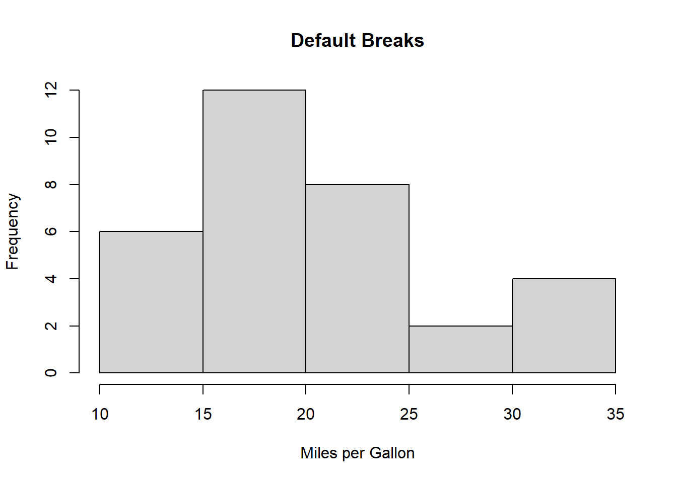
Histograms are a fundamental tool in data analysis and visualization, allowing us to explore the distribution of data quickly and effectively. While creating a histogram in R is straightforward, specifying breaks appropriately can make a world of difference in the insights you can draw from your data. In this blog post, we will delve into the art of specifying breaks in a histogram, providing you with multiple examples and encouraging you to experiment on your own.
Before we get started, it’s worth mentioning that this topic has been explored in depth by Steve Sanderson in his previous blog post. If you’re interested in diving even deeper, make sure to check out his article here: Steve’s Blog Post on Optimal Binning. Now, let’s embark on our journey into the fascinating world of histogram breaks in R.
Histograms divide data into bins, or intervals, and then count how many data points fall into each bin. The breaks parameter in R allows you to control how these bins are defined. By specifying breaks thoughtfully, you can highlight specific patterns and nuances in your data.
Let’s start with a simple example using R’s built-in mtcars dataset:
# Create a histogram with default breaks
hist(mtcars$mpg, main = "Default Breaks", xlab = "Miles per Gallon")
In this case, R automatically selects the breaks based on the range of the data. The resulting histogram might not reveal finer details, and it’s essential to understand how to customize breaks to suit your analysis.
You can specify equal-width breaks using the breaks parameter. Here’s an example:
# Create a histogram with equal-width breaks
hist(mtcars$mpg, main = "Equal Width Breaks", xlab = "Miles per Gallon", breaks = 10)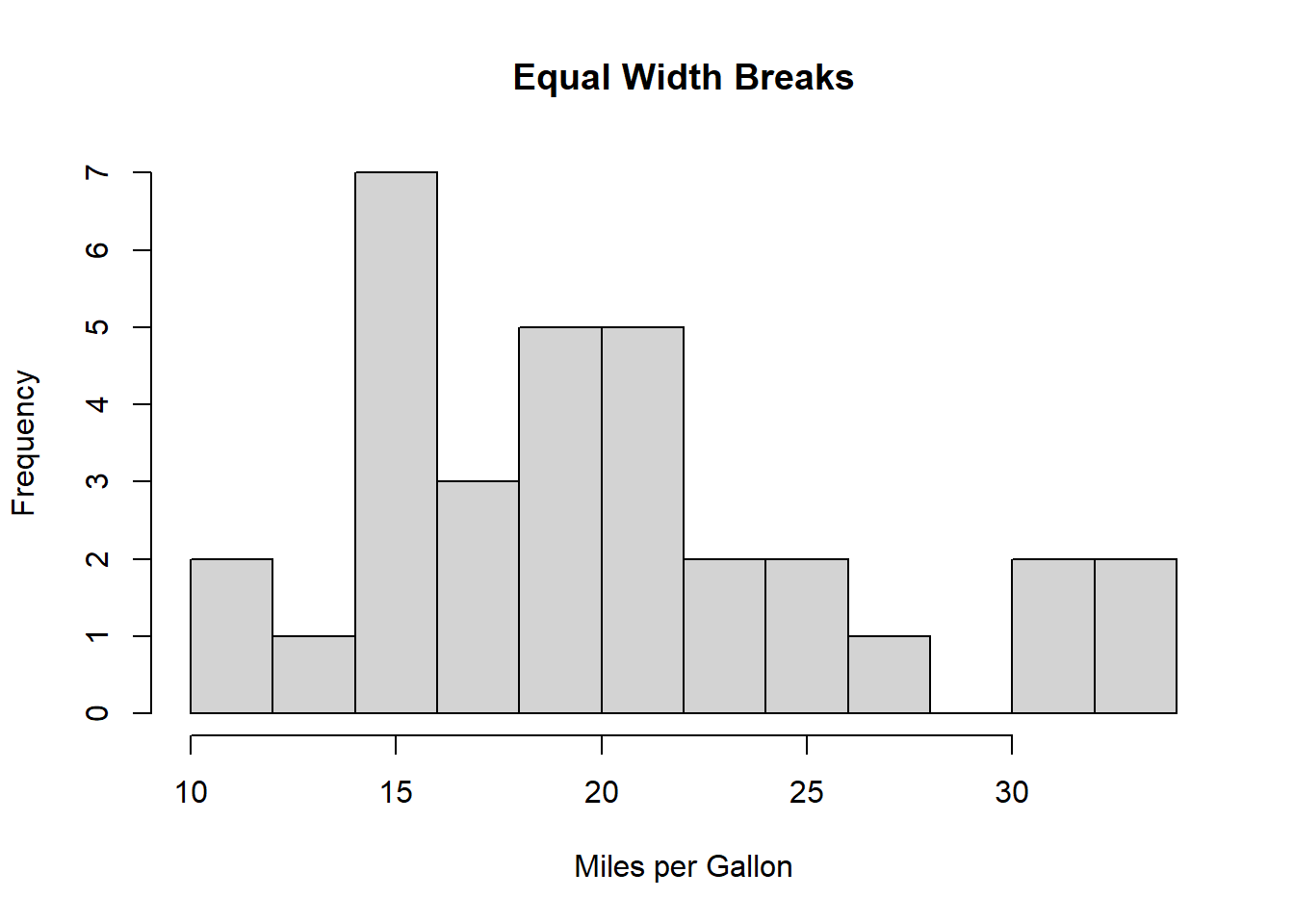
In this example, we divided the data into 10 equal-width bins. This approach can help reveal underlying patterns in the data distribution.
Sometimes, you may have domain knowledge that suggests specific break points. Let’s explore a case where we set custom breaks:
# Create a histogram with custom breaks
custom_breaks <- c(10, 15, 20, 25, 30, 35)
hist(mtcars$mpg, main = "Custom Breaks", xlab = "Miles per Gallon", breaks = custom_breaks)
Here, we’ve defined custom break points, which can help emphasize critical thresholds in the data.
In some cases, data may follow a logarithmic distribution. You can use logarithmic breaks to visualize such data effectively:
# Create a histogram with logarithmic breaks
hist(log(mtcars$mpg), main = "Logarithmic Breaks", xlab = "Log(Miles per Gallon)")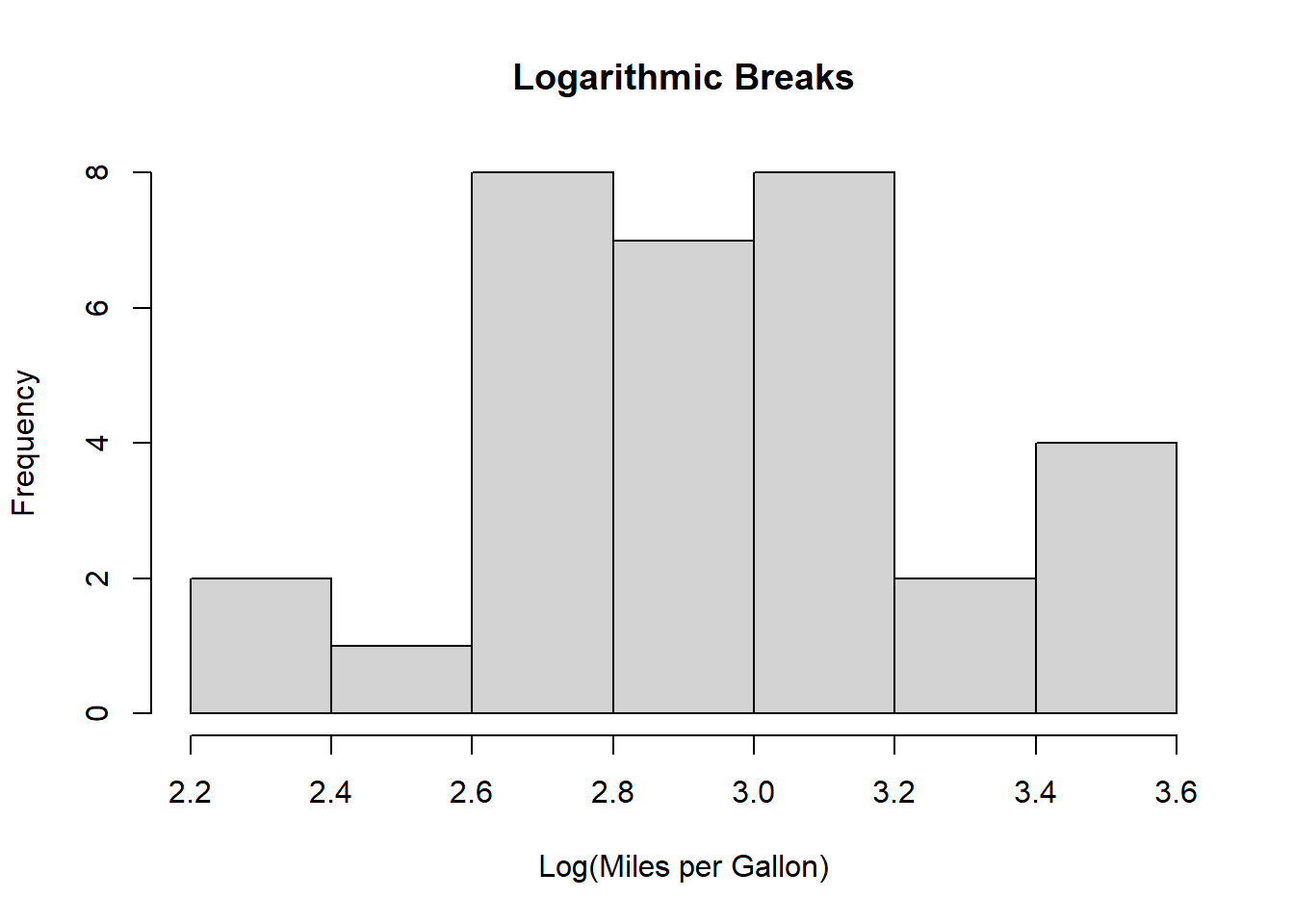
By taking the logarithm of the data and setting appropriate breaks, you can bring out patterns that might be obscured in a standard histogram.
Now that you’ve seen various ways to specify breaks in a histogram, it’s your turn to experiment. Try different datasets, change the number of breaks, and explore different types of breaks (equal width, custom, logarithmic) to discover how they impact your data visualization.
Histograms are powerful tools for exploring data distributions, and understanding how to specify breaks effectively can elevate your data analysis. Whether you’re highlighting subtle patterns or emphasizing important thresholds, customizing breaks in R allows you to tell a richer data story. Don’t forget to check out Steve Sanderson’s previous blog post for even more insights on this topic.
Happy coding and visualizing!