ts_sma_plot(
  .data,
  .date_col,
  .value_col,
  .sma_order = 2,
  .func = mean,
  .align = "center",
  .partial = FALSE
)Introduction
The R package {healthyR.ts}, is an R package that allows users to easily plot and analyze their time series data. The package includes a variety of functions, but one of the standout features is the ts_sma_plot() function, which allows users to quickly visualize their time series data and any number of simple moving averages (SMAs) of their choosing.
SMAs are a common tool used by analysts and investors to smooth out short-term fluctuations in data and identify longer-term trends. By overlaying SMAs of different time periods on top of the original time series data, the ts_sma_plot() function makes it easy to compare and contrast different time periods and identify potential trends and patterns in the data.
With {healthyR.ts} and the ts_sma_plot() function, users can quickly and easily gain valuable insights into their time series data and make more informed decisions based on the trends and patterns they uncover.
Ok enough of that, let’s see the function.
Function
Here is the full function call.
Let’s take a look at the arguments that get provided to the parameters.
.data- The data that you are passing, must be a data.frame/tibble..date_col- The column that holds the date..value_col- The column that holds the value..sma_order- This will default to 1. This can be a vector like c(2,4,6,12).func- The unquoted function you want to pass, mean, median, etc.align- This can be either “left”, “center”, “right”.partial- This is a bool value of TRUE/FALSE, the default is TRUE
Example
Let’s take a look at an example with the AirPassengers dataset.
library(healthyR.ts)

df <- ts_to_tbl(AirPassengers)
out <- ts_sma_plot(df, date_col, value, .sma_order = c(3,6))
Now let’s see the output of the function. There are two core components, data and plots.
The data returns the original data augmented with the moving function data in long format.
The plots returns both a ggplot2 static plot and an interactive plotly plot.
Data
out$data# A tibble: 288 × 5
index date_col value sma_order sma_value
<yearmon> <date> <dbl> <fct> <dbl>
1 Jan 1949 1949-01-01 112 3 NA
2 Feb 1949 1949-02-01 118 3 121.
3 Mar 1949 1949-03-01 132 3 126.
4 Apr 1949 1949-04-01 129 3 127.
5 May 1949 1949-05-01 121 3 128.
6 Jun 1949 1949-06-01 135 3 135.
7 Jul 1949 1949-07-01 148 3 144.
8 Aug 1949 1949-08-01 148 3 144
9 Sep 1949 1949-09-01 136 3 134.
10 Oct 1949 1949-10-01 119 3 120.
# … with 278 more rowsPlots
out$plots$static_plotWarning: Removed 7 rows containing missing values (`geom_line()`).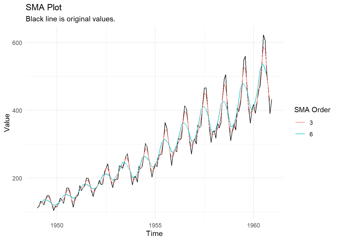
out$plots$interactive_plotVoila!