ts_scedacity_scatter_plot(
  .calibration_tbl,
  .model_id = NULL,
  .interactive = FALSE
)Introduction
Scedacity plots are a useful tool for evaluating the performance of time series models and identifying trends or patterns in the data. They are a type of scatter plot that compares the predicted values produced by a model to the observed values in the data, with a diagonal reference line indicating perfect agreement between the two.
The {healthyR.ts} package in R provides a convenient function for creating scedacity plots for time series data, called ts_scedacity_scatter_plot(). This function takes as input a calibration tibble which you would get from using the {modeltime} library, and produces a scedacity plot showing the predicted values against the observed values.
One of the main benefits of using a scedacity plot is that it allows you to visualize the accuracy of the model’s predictions. If the points on the plot fall close to the reference line, it indicates that the model is able to accurately predict the values in the data. On the other hand, if the points are scattered far from the reference line, it suggests that the model is not performing well and may need to be improved or refined.
In addition to evaluating the accuracy of the model, scedacity plots can also be used to identify trends or patterns in the data. For example, if there is a clear upward or downward trend in the points on the plot, it may indicate that the model is over- or under-estimating the values in the data. By identifying these trends, you can adjust the model or try different approaches to improve its performance.
Overall, scedacity plots are a useful tool for evaluating the performance of time series models and identifying trends or patterns in the data. The ts_scedacity_scatter_plot() function in the {healthyR.ts} package makes it easy to create these plots and gain insights into the performance of your time series models.
Function
Let’s take a look at the full function call.
Let’s take a look at the arguments that get provided to the parameters.
.calibration_tbl- A calibrated modeltime table..model_id- The id of a particular model from a calibration tibble. If there are multiple models in the tibble and this remains NULL then the plot will be returned usingggplot2::facet_grid(~ .model_id).interactive- A boolean with a default value of FALSE. TRUE will produce an interactive plotly plot.
Example
Now for an example.
library(healthyR.ts)
library(dplyr)
library(timetk)
library(modeltime)
library(rsample)
library(workflows)
library(parsnip)
library(recipes)

data_tbl <- ts_to_tbl(AirPassengers) %>%
  select(-index)

splits <- time_series_split(
  data_tbl,
  date_var = date_col,
  assess = "12 months",
  cumulative = TRUE
)

rec_obj <- recipe(value ~ ., training(splits))

model_spec_arima <- arima_reg() %>%
  set_engine(engine = "auto_arima")

model_spec_mars <- mars(mode = "regression") %>%
  set_engine("earth")

wflw_fit_arima <- workflow() %>%
  add_recipe(rec_obj) %>%
  add_model(model_spec_arima) %>%
  fit(training(splits))

wflw_fit_mars <- workflow() %>%
  add_recipe(rec_obj) %>%
  add_model(model_spec_mars) %>%
  fit(training(splits))

model_tbl <- modeltime_table(wflw_fit_arima, wflw_fit_mars)

calibration_tbl <- model_tbl %>%
  modeltime_calibrate(new_data = testing(splits))

ts_scedacity_scatter_plot(calibration_tbl)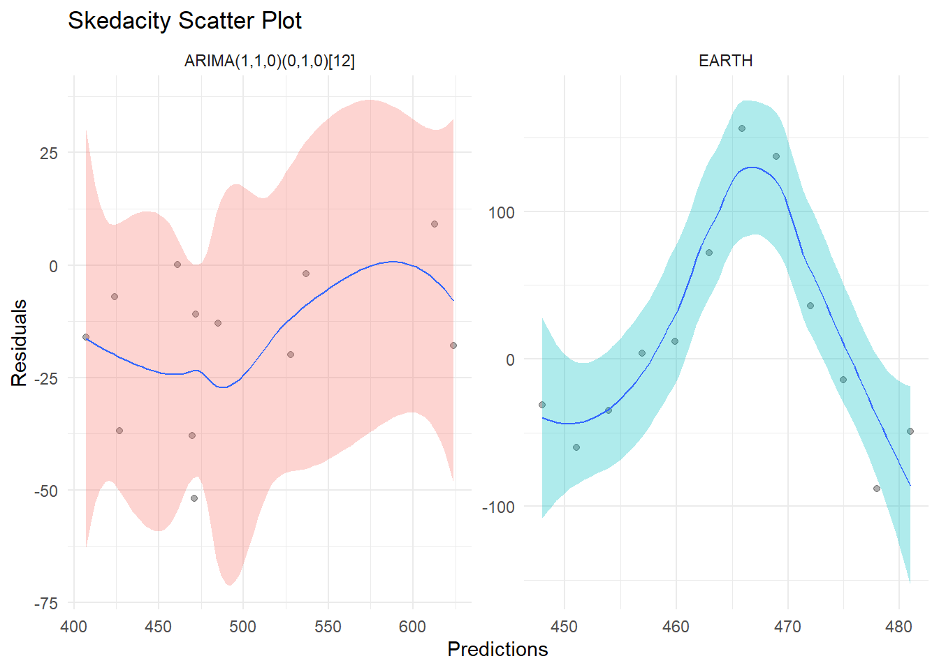
Now the interactive plot.
ts_scedacity_scatter_plot(calibration_tbl, .interactive = TRUE)Voila!