ts_ma_plot(
  .data,
  .date_col,
  .value_col,
  .ts_frequency = "monthly",
  .main_title = NULL,
  .secondary_title = NULL,
  .tertiary_title = NULL
)Introduction
Are you interested in visualizing time series data in a clear and concise way? The R package {healthyR.ts} provides a variety of tools for time series analysis and visualization, including the ts_ma_plot() function.
The ts_ma_plot() function is designed to help you quickly and easily create moving average plots for time series data. This function takes several arguments, including the data you want to visualize, the date column from your data, the value column from your data, and the frequency of the aggregation.
One of the great features of ts_ma_plot() is that it can handle both weekly and monthly data frequencies, making it a flexible tool for analyzing a variety of time series data. If you pass in a frequency other than “weekly” or “monthly”, the function will default to weekly, so it’s important to ensure that your data is aggregated at the appropriate frequency.
With ts_ma_plot(), you can create a variety of plots to help you better understand your time series data. The function allows you to add up to three different titles to your plot, helping you to organize and communicate your findings effectively. The main_title argument sets the title for the main plot, while the secondary_title and tertiary_title arguments set the titles for the second and third plots, respectively.
If you’re interested in using ts_ma_plot() for your own time series data, you’ll first need to preprocess your data so that it’s in the appropriate format for this function. Once you’ve done that, though, ts_ma_plot() can help you to quickly identify trends and patterns in your data that might not be immediately apparent from a raw data set.
In summary, ts_ma_plot() is a powerful and flexible tool for visualizing time series data. Whether you’re working with weekly or monthly data, this function can help you to quickly and easily create moving average plots that can help you to better understand your data. If you’re interested in time series analysis, be sure to check out {healthyR.ts} and give ts_ma_plot() a try!
Function
Here is the full function call.
Now for the arguments to the parameters.
.data: the data you want to visualize, which should be pre-processed and the aggregation should match the .frequency argument..date_col: the data column from the .data argument that contains the dates for your time series..value_col: the data column from the .data argument that contains the values for your time series..ts_frequency: the frequency of the aggregation, which should be quoted as “weekly” or “monthly”. If not specified, the function defaults to weekly..main_title: the title of the main plot..secondary_title: the title of the second plot..tertiary_title: the title of the third plot.
Example
Now for an example.
library(healthyR.ts)
library(dplyr)
data_tbl <- ts_to_tbl(AirPassengers) |>
select(-index)
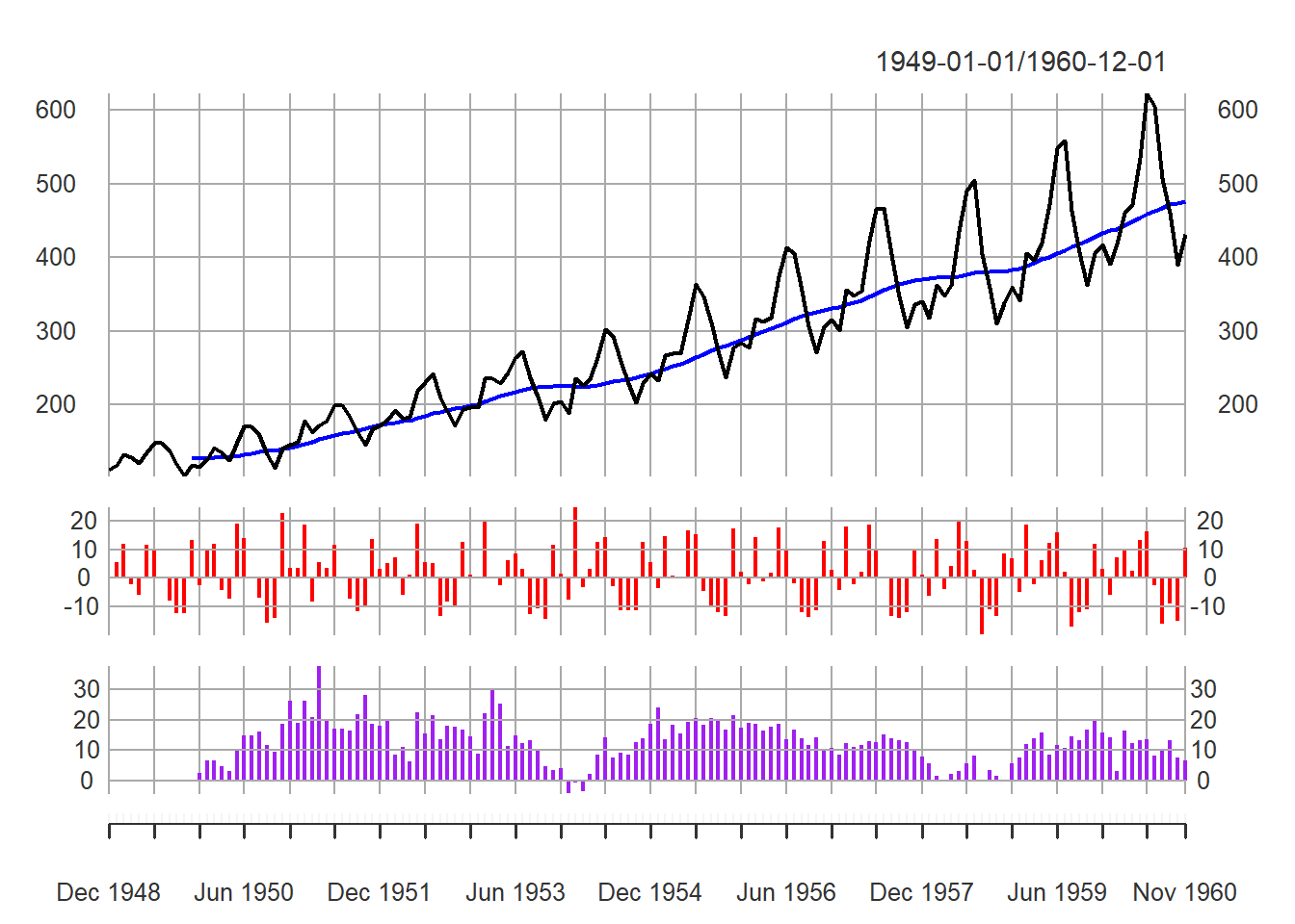
output <- ts_ma_plot(
.data = data_tbl,
.date_col = date_col,
.value_col = value
)Let’s take a look at each piece of the output.
output$data_trans_xts |> head() value ma12
1949-01-01 112 NA
1949-02-01 118 NA
1949-03-01 132 NA
1949-04-01 129 NA
1949-05-01 121 NA
1949-06-01 135 NAoutput$data_diff_xts_a |> head() diff_a
1949-01-01 NA
1949-02-01 5.357143
1949-03-01 11.864407
1949-04-01 -2.272727
1949-05-01 -6.201550
1949-06-01 11.570248output$data_diff_xts_b |> head() diff_b
1949-01-01 NA
1949-02-01 NA
1949-03-01 NA
1949-04-01 NA
1949-05-01 NA
1949-06-01 NAoutput$data_summary_tbl# A tibble: 144 × 5
date_col value ma12 diff_a diff_b
<date> <dbl> <dbl> <dbl> <dbl>
1 1949-01-01 112 NA 0 0
2 1949-02-01 118 NA 5.36 0
3 1949-03-01 132 NA 11.9 0
4 1949-04-01 129 NA -2.27 0
5 1949-05-01 121 NA -6.20 0
6 1949-06-01 135 NA 11.6 0
7 1949-07-01 148 NA 9.63 0
8 1949-08-01 148 NA 0 0
9 1949-09-01 136 NA -8.11 0
10 1949-10-01 119 NA -12.5 0
# … with 134 more rowsoutput$pgrid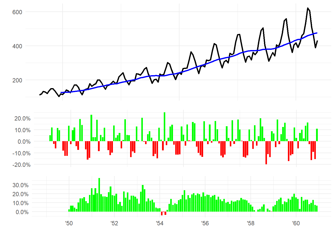
output$xts_plt