Understanding the fundamental concepts behind TidyDensity will help you use the package effectively.
Tidy Data Philosophy
What is Tidy Data?
Tidy data follows three principles:
- Each variable is a column
- Each observation is a row
- Each type of observational unit is a table
Why Tidy Data Matters
# Traditional approach (base R)
x <- rnorm(100)
# Just a vector - limited functionality

# TidyDensity approach
data <- tidy_normal(.n = 100)
# A tibble with structure:
# - sim_number: simulation ID
# - x: observation number
# - y: random value
# - dx, dy: density values
# - p: cumulative probability
# - q: quantile

head(data)
#> # A tibble: 6 × 7
#>   sim_number     x      y    dx       dy      p      q
#>   <fct>      <int>  <dbl> <dbl>    <dbl>  <dbl>  <dbl>
#> 1 1              1 -0.387 -2.99 0.000241 0.349  -0.387
#> 2 1              2 -0.785 -2.92 0.000431 0.216  -0.785
#> 3 1              3 -1.06  -2.86 0.000743 0.145  -1.06
#> 4 1              4 -0.796 -2.79 0.00125  0.213  -0.796
#> 5 1              5 -1.76  -2.72 0.00202  0.0395 -1.76
#> 6 1              6 -0.691 -2.65 0.00318  0.245  -0.691
Benefits of Tidy Format
1. Pipeable:
tidy_normal(.n = 100) |>
  filter(y > 0) |>
  summarise(mean = mean(y), sd = sd(y))
#> # A tibble: 1 × 2
#>    mean    sd
#>   <dbl> <dbl>
#> 1 0.788 0.651
2. Visualization-ready:
tidy_normal(.n = 100) |>
  tidy_autoplot(.plot_type = "density")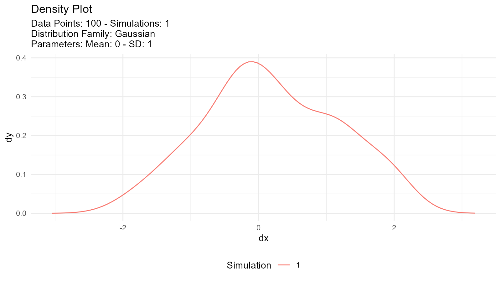
3. Analysis-friendly:
tidy_normal(.n = 100, .num_sims = 10) |>
  group_by(sim_number) |>
  summarise(mean = mean(y))
#> # A tibble: 10 × 2
#>    sim_number    mean
#>    <fct>        <dbl>
#>  1 1          -0.177
#>  2 2          -0.0517
#>  3 3          -0.163
#>  4 4           0.0554
#>  5 5          -0.102
#>  6 6           0.138
#>  7 7          -0.147
#>  8 8          -0.207
#>  9 9          -0.0922
#> 10 10          0.0844
Probability Distributions
What is a Probability Distribution?
A probability distribution describes how values of a random variable are distributed.
Types of Distributions
Continuous Distributions
Values can take any real number within a range:
# Normal distribution
normal_data <- tidy_normal(.n = 100, .mean = 0, .sd = 1)

# Uniform distribution
uniform_data <- tidy_uniform(.n = 100, .min = 0, .max = 1)

# Visualize both
p1 <- tidy_autoplot(normal_data, .plot_type = "density") +
  ggtitle("Normal Distribution")
p2 <- tidy_autoplot(uniform_data, .plot_type = "density") +
  ggtitle("Uniform Distribution")

p1 | p2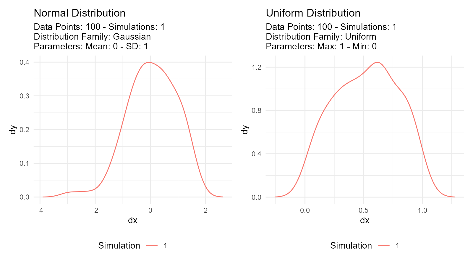
Discrete Distributions
Values can only take specific integers:
# Poisson distribution
poisson_data <- tidy_poisson(.n = 100, .lambda = 5)

# Binomial distribution
binomial_data <- tidy_binomial(.n = 100, .size = 10, .prob = 0.5)

# Visualize both
p1 <- tidy_autoplot(poisson_data, .plot_type = "density") +
  ggtitle("Poisson Distribution")
p2 <- tidy_autoplot(binomial_data, .plot_type = "density") +
  ggtitle("Binomial Distribution")

p1 | p2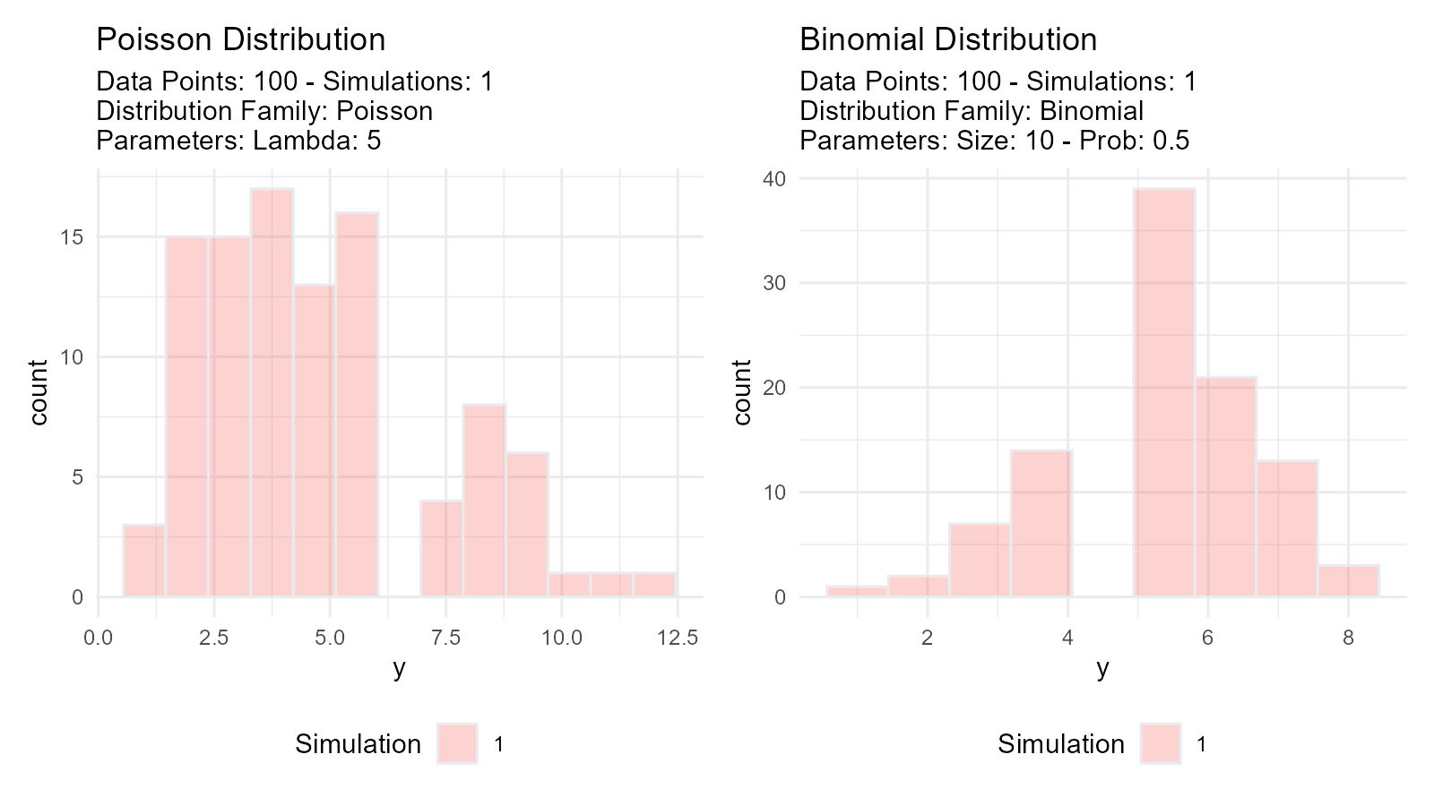
Distribution Characteristics
Location (Center): - Where the distribution is centered - Examples: mean, median, mode
Scale (Spread): - How spread out the values are - Examples: standard deviation, variance, IQR
Shape: - Form of the distribution - Examples: skewness, kurtosis, modality
# Normal: Symmetric, bell-shaped
normal <- tidy_normal(.n = 100, .mean = 0, .sd = 1)

# Gamma: Right-skewed
gamma <- tidy_gamma(.n = 100, .shape = 2, .scale = 1)

# Uniform: Flat, all values equally likely
uniform <- tidy_uniform(.n = 100, .min = 0, .max = 1)

# Visualize characteristics
p1 <- tidy_autoplot(normal, .plot_type = "density") +
  ggtitle("Normal: Symmetric")
p2 <- tidy_autoplot(gamma, .plot_type = "density") +
  ggtitle("Gamma: Right-skewed")
p3 <- tidy_autoplot(uniform, .plot_type = "density") +
  ggtitle("Uniform: Flat")

p1 | p2 | p3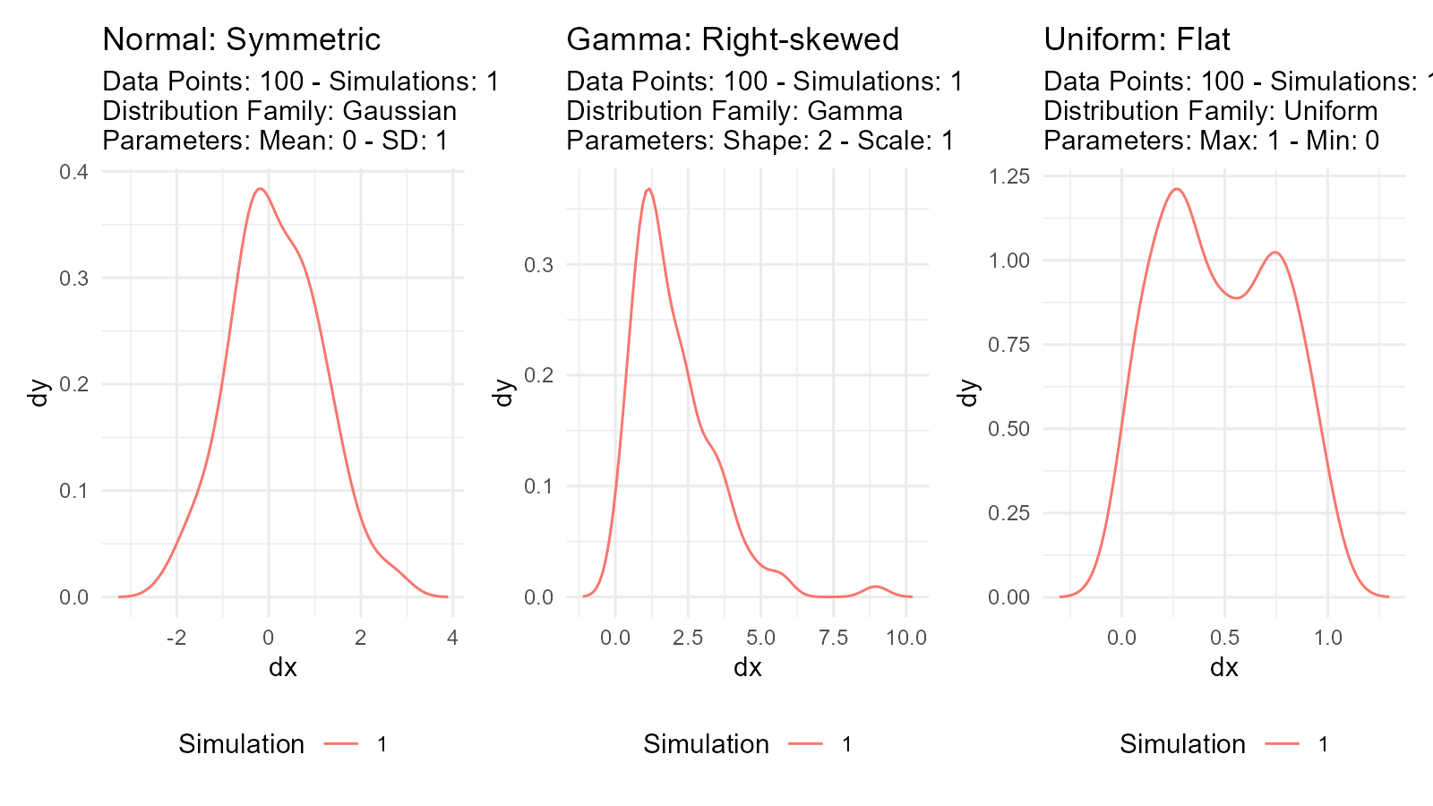
Distribution Functions (d, p, q, r)
Every probability distribution has four related functions:
1. Density Function (d)
Probability Density Function (PDF) for continuous
distributions: - How likely is a specific value? - In
TidyDensity: dy column
data <- tidy_normal(.n = 100, .mean = 0, .sd = 1)
# dy column contains density values
head(data[, c("y", "dy")])
#> # A tibble: 6 × 2
#>        y       dy
#>    <dbl>    <dbl>
#> 1 -1.05  0.000147
#> 2 -1.38  0.000288
#> 3  0.479 0.000533
#> 4 -0.114 0.000941
#> 5 -0.603 0.00158
#> 6 -0.630 0.00254
2. Probability Function (p)
Cumulative Distribution Function (CDF): - What’s the
probability of getting a value ≤ x? - In TidyDensity: p
column
data <- tidy_normal(.n = 100, .mean = 0, .sd = 1)
# p column contains cumulative probabilities
# p = 0.5 means 50% of values are below this point
head(data[, c("y", "p")])
#> # A tibble: 6 × 2
#>         y     p
#>     <dbl> <dbl>
#> 1 -0.566  0.286
#> 2  1.67   0.952
#> 3 -0.126  0.450
#> 4  1.21   0.886
#> 5 -0.0960 0.462
#> 6 -1.03   0.150
3. Quantile Function (q)
Inverse of CDF (Quantile Function): - What value
corresponds to a given probability? - In TidyDensity: q
column
data <- tidy_normal(.n = 100, .mean = 0, .sd = 1)
# q column contains quantile values
# q at p=0.5 gives the median
head(data[, c("p", "q")])
#> # A tibble: 6 × 2
#>       p      q
#>   <dbl>  <dbl>
#> 1 0.293 -0.545
#> 2 0.405 -0.239
#> 3 0.834  0.970
#> 4 0.702  0.531
#> 5 0.612  0.284
#> 6 0.294 -0.542
4. Random Generation Function (r)
Generate random values: - Simulate data from the
distribution - In TidyDensity: y column
data <- tidy_normal(.n = 100, .mean = 0, .sd = 1)
# y column contains randomly generated values
head(data[, c("x", "y")])
#> # A tibble: 6 × 2
#>       x      y
#>   <int>  <dbl>
#> 1     1 -1.17
#> 2     2  1.01
#> 3     3  0.594
#> 4     4 -1.00
#> 5     5  1.25
#> 6     6 -0.130
Visual Comparison
data <- tidy_normal(.n = 100, .num_sims = 1)

# Density plot (d function)
p1 <- tidy_autoplot(data, .plot_type = "density") +
  ggtitle("Density (d)")

# CDF plot (p function)
p2 <- tidy_autoplot(data, .plot_type = "probability") +
  ggtitle("Probability (p)")

# Quantile plot (q function)
p3 <- tidy_autoplot(data, .plot_type = "quantile") +
  ggtitle("Quantile (q)")

# Combined view
(p1 | p2) / p3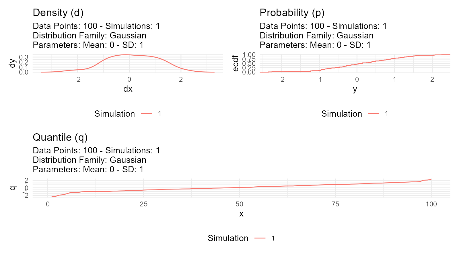
Random Number Generation
Pseudorandom Numbers
Computer-generated “random” numbers are actually pseudorandom: - Deterministic algorithm - Appears random but reproducible with same seed - Good enough for most applications
Setting Seeds for Reproducibility
# Use withr::with_seed() for reproducible results
data1 <- withr::with_seed(123, tidy_normal(.n = 10))

data2 <- withr::with_seed(123, tidy_normal(.n = 10))

# data1 and data2 are identical
all.equal(data1$y, data2$y)
#> [1] TRUE
Multiple Simulations
Why use multiple simulations?
# Single simulation - might not represent true distribution
single <- tidy_normal(.n = 100, .num_sims = 1)

# Multiple simulations - better understanding of variability
multiple <- tidy_normal(.n = 100, .num_sims = 20)

p1 <- tidy_autoplot(single, .plot_type = "density") +
  ggtitle("Single Simulation")
p2 <- tidy_autoplot(multiple, .plot_type = "density") +
  ggtitle("20 Simulations")

p1 | p2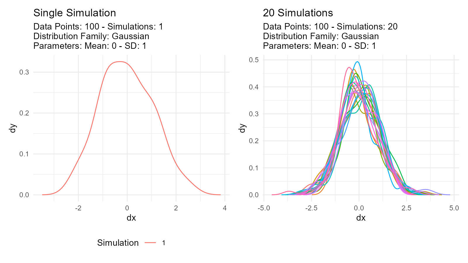
Use cases: - Assess sampling variability - Monte Carlo simulation - Sensitivity analysis - Uncertainty quantification
Parameter Estimation
What is Parameter Estimation?
Goal: Estimate distribution parameters from observed data
# Observed data
observed <- c(10.2, 9.8, 10.5, 10.1, 9.9)

# Estimate parameters
fit <- util_normal_param_estimate(observed)

# Get estimates
fit$parameter_tbl
#> # A tibble: 2 × 8
#>   dist_type samp_size   min   max method              mu stan_dev shape_ratio
#>   <chr>         <int> <dbl> <dbl> <chr>            <dbl>    <dbl>       <dbl>
#> 1 Gaussian          5   9.8  10.5 EnvStats_MME_MLE  10.1    0.245        41.2
#> 2 Gaussian          5   9.8  10.5 EnvStats_MVUE     10.1    0.274        36.9
Estimation Methods
Maximum Likelihood Estimation (MLE)
Concept: Find parameters that maximize probability of observing the data
Characteristics: - Asymptotically efficient - Best for large samples (n > 30) - Most commonly used
Model Selection
Akaike Information Criterion (AIC): - Balances fit quality with model complexity - Lower AIC = better model - Used to compare distributions
# Generate some data with local seed
data_y <- withr::with_seed(42, rnorm(100, mean = 5, sd = 2))

# Compare multiple distributions
normal_aic <- util_normal_aic(.x = data_y)
cauchy_aic <- util_cauchy_aic(.x = data_y)
logistic_aic <- util_logistic_aic(.x = data_y)

# Show AIC values
cat("Normal AIC:", normal_aic, "\n")
#> Normal AIC: 433.517
cat("Cauchy AIC:", cauchy_aic, "\n")
#> Cauchy AIC: 466.3125
cat("Logistic AIC:", logistic_aic, "\n")
#> Logistic AIC: 433.9747

# Choose distribution with lowest AIC
best_model <- c("Normal", "Cauchy", "Logistic")[which.min(c(normal_aic, cauchy_aic, logistic_aic))]
cat("Best model:", best_model, "\n")
#> Best model: Normal
Statistical Inference
Hypothesis Testing
Using distributions for hypothesis tests:
# Test if sample mean differs from 0
observed_data <- withr::with_seed(456, rnorm(100, mean = 0.5, sd = 1))

# Generate null distribution with local seed
null_dist <- withr::with_seed(789, tidy_normal(.n = 100, .mean = 0, .sd = 1, .num_sims = 1000))

# Calculate test statistic
observed_mean <- mean(observed_data)

# Calculate null means for each simulation
null_means <- null_dist |>
  group_by(sim_number) |>
  summarise(sim_mean = mean(y), .groups = "drop")

# P-value: proportion of null means more extreme than observed
p_value <- mean(abs(null_means$sim_mean) >= abs(observed_mean))
cat("The mean of observed data is:", observed_mean, "\n")
#> The mean of observed data is: 0.6205748
cat("The p-value is:", p_value, "\n")
#> The p-value is: 0
Confidence Intervals
Bootstrap confidence intervals:
# Bootstrap resampling
boot_data <- tidy_bootstrap(.x = observed_data, .num_sims = 2000)

# Calculate 95% CI
ci <- boot_data |>
  bootstrap_unnest_tbl() |>
  summarise(
    lower = quantile(y, 0.025),
    upper = quantile(y, 0.975)
  )

cat("95% Confidence Interval:", ci$lower, "to", ci$upper, "\n")
#> 95% Confidence Interval: -1.22054 to 2.520635
Power Analysis
Determining required sample size:
# Simulate to estimate power
simulate_test <- function(n, effect_size, alpha = 0.05) {
  group1 <- rnorm(n, mean = 0, sd = 1)
  group2 <- rnorm(n, mean = effect_size, sd = 1)
  t.test(group1, group2)$p.value < alpha
}

# Run many simulations
n_sims <- 1000
power <- mean(replicate(n_sims, simulate_test(n = 50, effect_size = 0.5)))
cat("Power:", power, "\n")
#> Power: 0.68
Tidyverse Integration
Works with dplyr
tidy_normal(.n = 100, .num_sims = 5) |>
group_by(sim_number) |>
summarise(
mean = mean(y),
sd = sd(y),
median = median(y)
) |>
arrange(desc(mean))
#> # A tibble: 5 × 4
#> sim_number mean sd median
#> <fct> <dbl> <dbl> <dbl>
#> 1 4 0.196 1.01 0.208
#> 2 2 0.107 0.986 0.0464
#> 3 3 0.0651 1.01 -0.0146
#> 4 1 0.0201 0.986 -0.0117
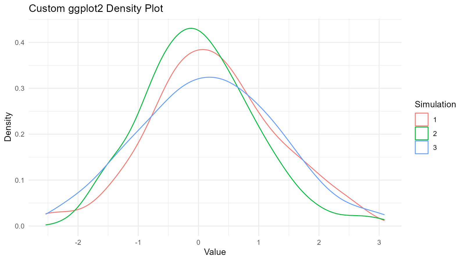
#> 5 5 0.0125 1.08 -0.109Works with ggplot2
data <- tidy_normal(.n = 100, .num_sims = 3)

# Custom ggplot
ggplot(data, aes(x = y, color = sim_number)) +
  geom_density() +
  theme_minimal() +
  labs(
    title = "Custom ggplot2 Density Plot",
    x = "Value",
    y = "Density",
    color = "Simulation"
  )
Works with tidyr
library(tidyr)

data <- tidy_normal(.n = 100, .num_sims = 3)

# Widen data
wide_data <- data |>
  select(sim_number, x, y) |>
  pivot_wider(names_from = sim_number, values_from = y, names_prefix = "sim_")

head(wide_data)
#> # A tibble: 6 × 4
#>       x  sim_1  sim_2  sim_3
#>   <int>  <dbl>  <dbl>  <dbl>
#> 1     1 -1.73  -1.76   0.191
#> 2     2  1.34   1.73   1.14
#> 3     3  2.07  -0.213  1.55
#> 4     4 -0.546  0.902  0.701
#> 5     5 -0.628 -0.426  1.02
#> 6     6  0.254  0.855 -1.74
Works with purrr
library(purrr)

# Generate multiple distributions
distributions <- list(
  normal = tidy_normal(.n = 100),
  gamma = tidy_gamma(.n = 100, .shape = 2, .scale = 1),
  beta = tidy_beta(.n = 100, .shape1 = 2, .shape2 = 5)
)

# Map over distributions
distributions |>
  map(~ summarise(., mean = mean(y), sd = sd(y)))
#> $normal
#> # A tibble: 1 × 2
#>     mean    sd
#>    <dbl> <dbl>
#> 1 0.0931 0.902
#>
#> $gamma
#> # A tibble: 1 × 2
#>    mean    sd
#>   <dbl> <dbl>
#> 1  1.87  1.31
#>
#> $beta
#> # A tibble: 1 × 2
#>    mean    sd
#>   <dbl> <dbl>
#> 1 0.274 0.152
Key Takeaways
1. Tidy Format Enables Analysis
Every TidyDensity function returns a structured tibble that works with tidyverse tools.
2. Four Functions (d, p, q, r)
Understanding these four functions is key to working with distributions.
4. Reproducibility Matters
Use withr::with_seed() for reproducible random number
generation with explicit scope.