TidyDensity offers powerful advanced features including mixture models, empirical distributions, random walks, and multi-distribution comparisons.
Mixture Models
What are Mixture Models?
Mixture models combine multiple probability distributions to model complex data patterns:
- Multimodal distributions (multiple peaks)
- Heterogeneous populations
- Complex real-world phenomena
Creating Mixture Models
Basic Mixture Creation
dist1 <- tidy_normal(.n = 100, .mean = -2, .sd = 0.5)
dist2 <- tidy_normal(.n = 100, .mean = 2, .sd = 0.5)

# Create mixture
mixture <- tidy_mixture_density(
  dist1,
  dist2,
  .combination_type = "stack"
)

# Visualize
mixture$plots
#> $line_plot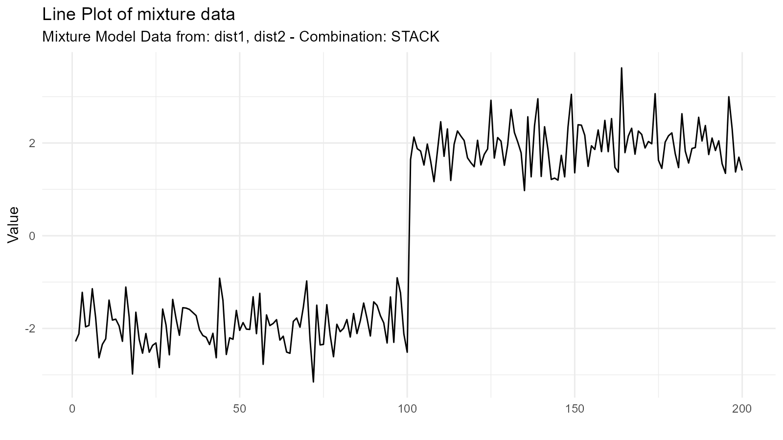
#>
#> $dens_plot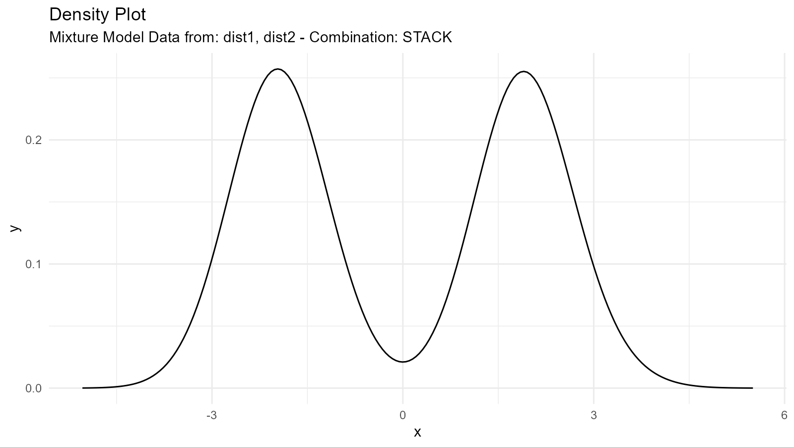
Mixture Types
1. Addition Mixture ("add")
Combines distributions by adding their sample values (element-wise) and then computing the resulting density:
mixture_add <- tidy_mixture_density(
  dist1, dist2,
  .combination_type = "add"
)

mixture_add$plots
#> $line_plot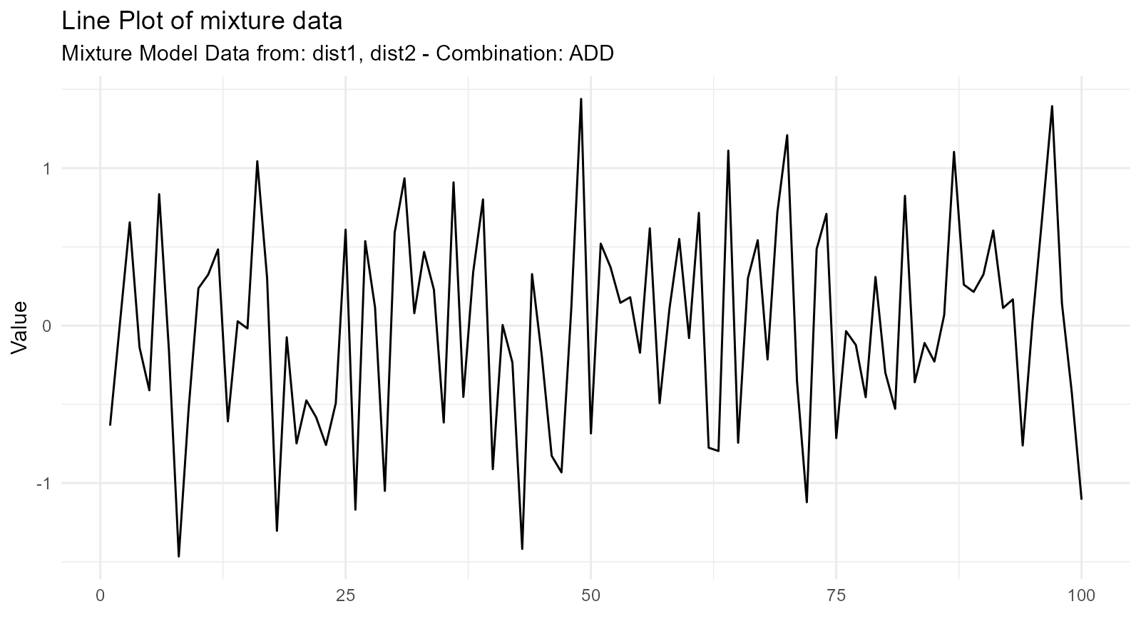
#>
#> $dens_plot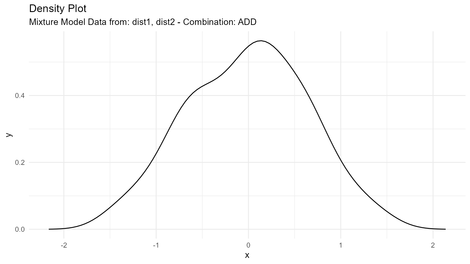
Use Case: Modeling populations with two distinct groups
2. Multiplication Mixture ("multiply")
Multiplies distributions:
mixture_mult <- tidy_mixture_density(
  dist1, dist2,
  .combination_type = "multiply"
)

mixture_mult$plots
#> $line_plot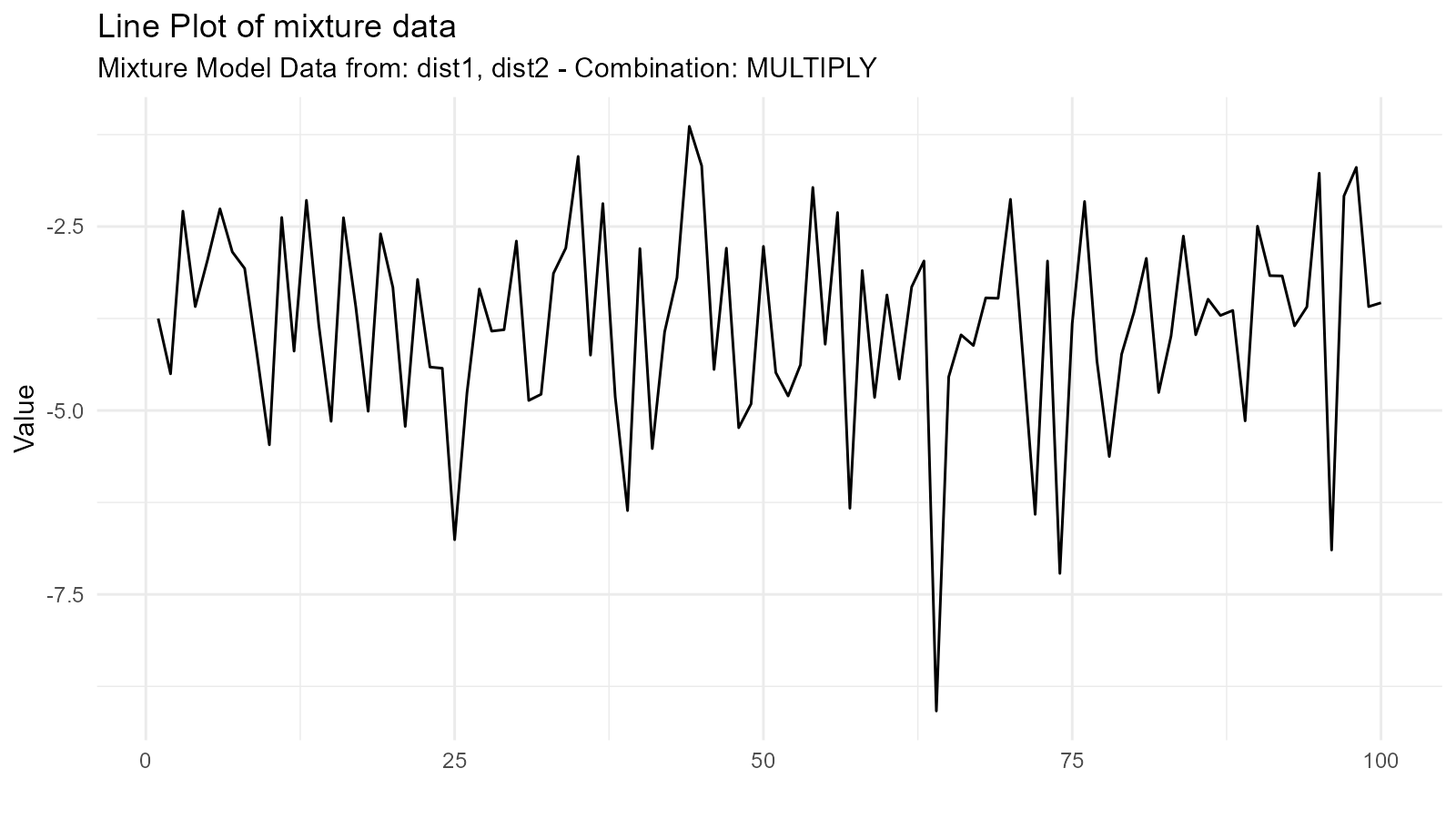
#>
#> $dens_plot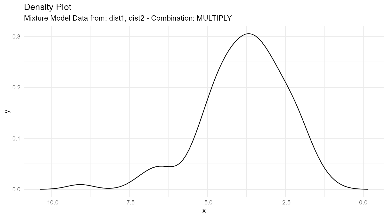
Use Case: Modeling joint effects or constraints
3. Subtraction Mixture ("subtract")
Subtracts second from first:
mixture_sub <- tidy_mixture_density(
  dist1, dist2,
  .combination_type = "subtract"
)

mixture_sub$plots
#> $line_plot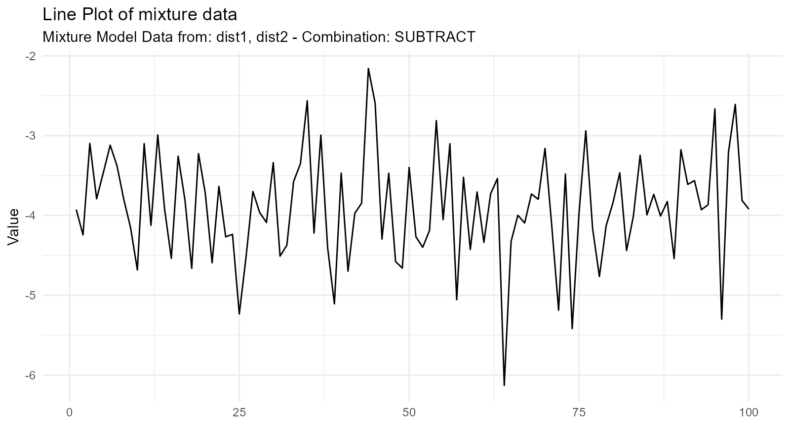
#>
#> $dens_plot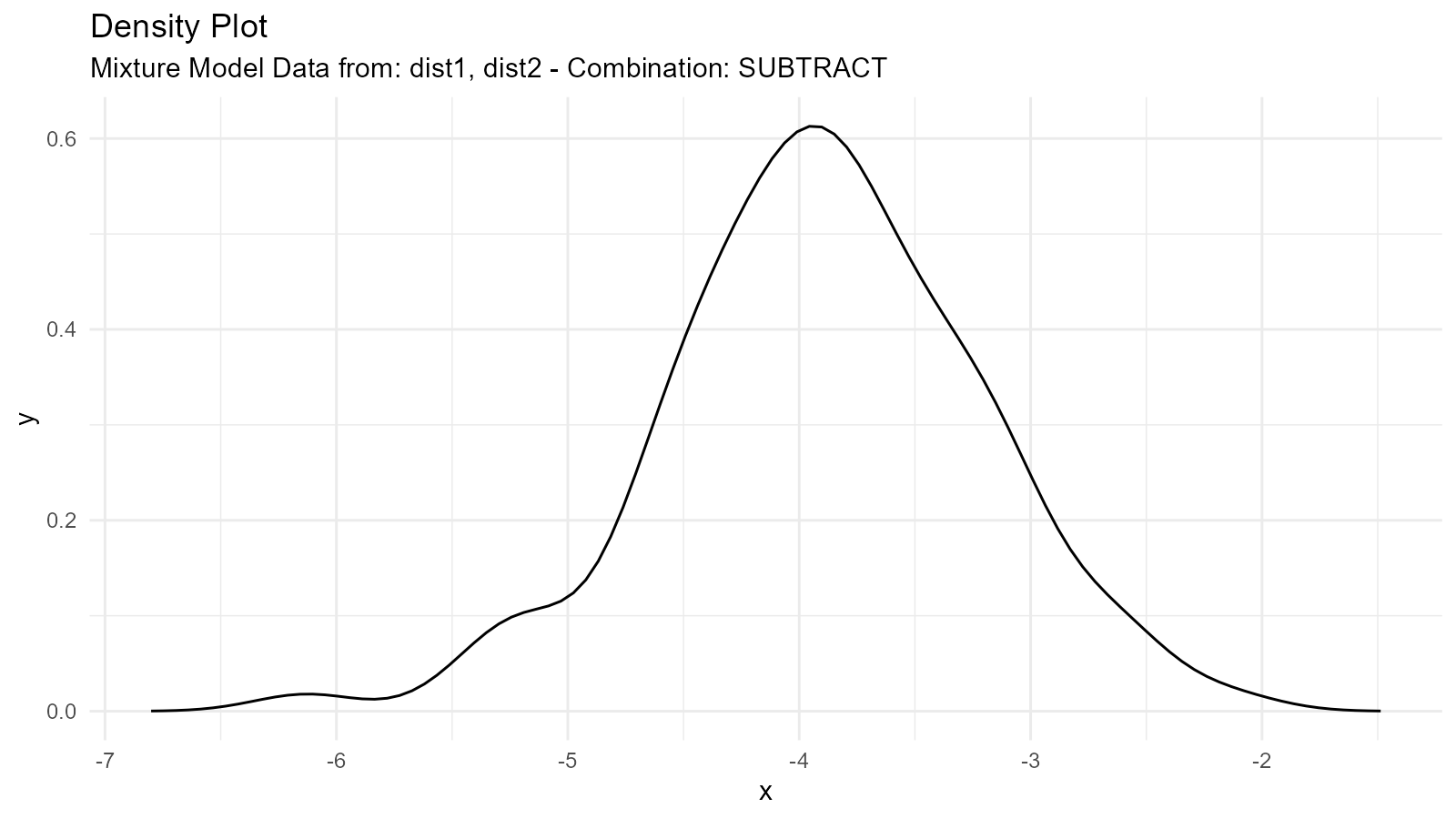
Use Case: Modeling differences between groups
4. Division Mixture ("divide")
Divides first by second:
mixture_div <- tidy_mixture_density(
  dist1, dist2,
  .combination_type = "divide"
)

mixture_div$plots
#> $line_plot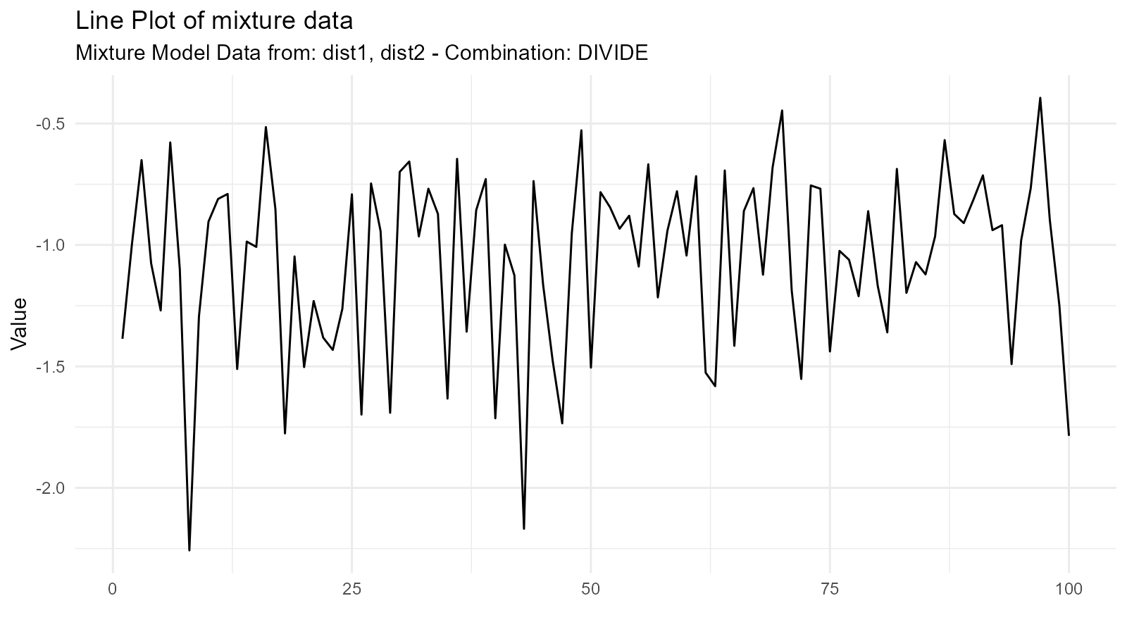
#>
#> $dens_plot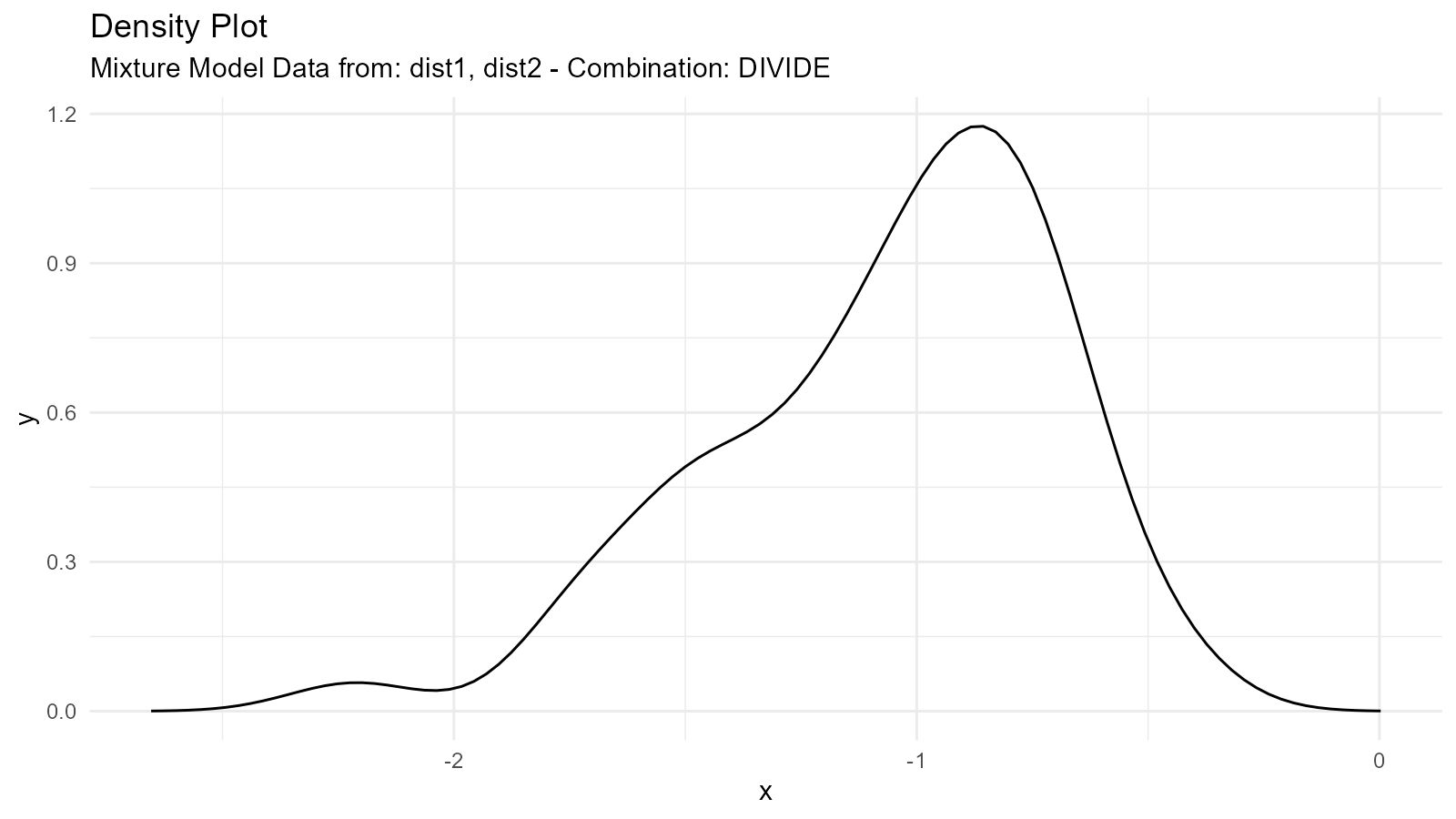
Use Case: Ratios of distributions
Complex Mixture Example
# Three-component mixture
dist_a <- tidy_normal(.n = 100, .mean = -3, .sd = 0.5)
dist_b <- tidy_normal(.n = 100, .mean = 0, .sd = 1)
dist_c <- tidy_normal(.n = 100, .mean = 3, .sd = 0.5)

# Create mixture
complex_mixture <- tidy_mixture_density(
  dist_a, dist_b, dist_c,
  .combination_type = "stack"
)

# Visualize
complex_mixture$plots
#> $line_plot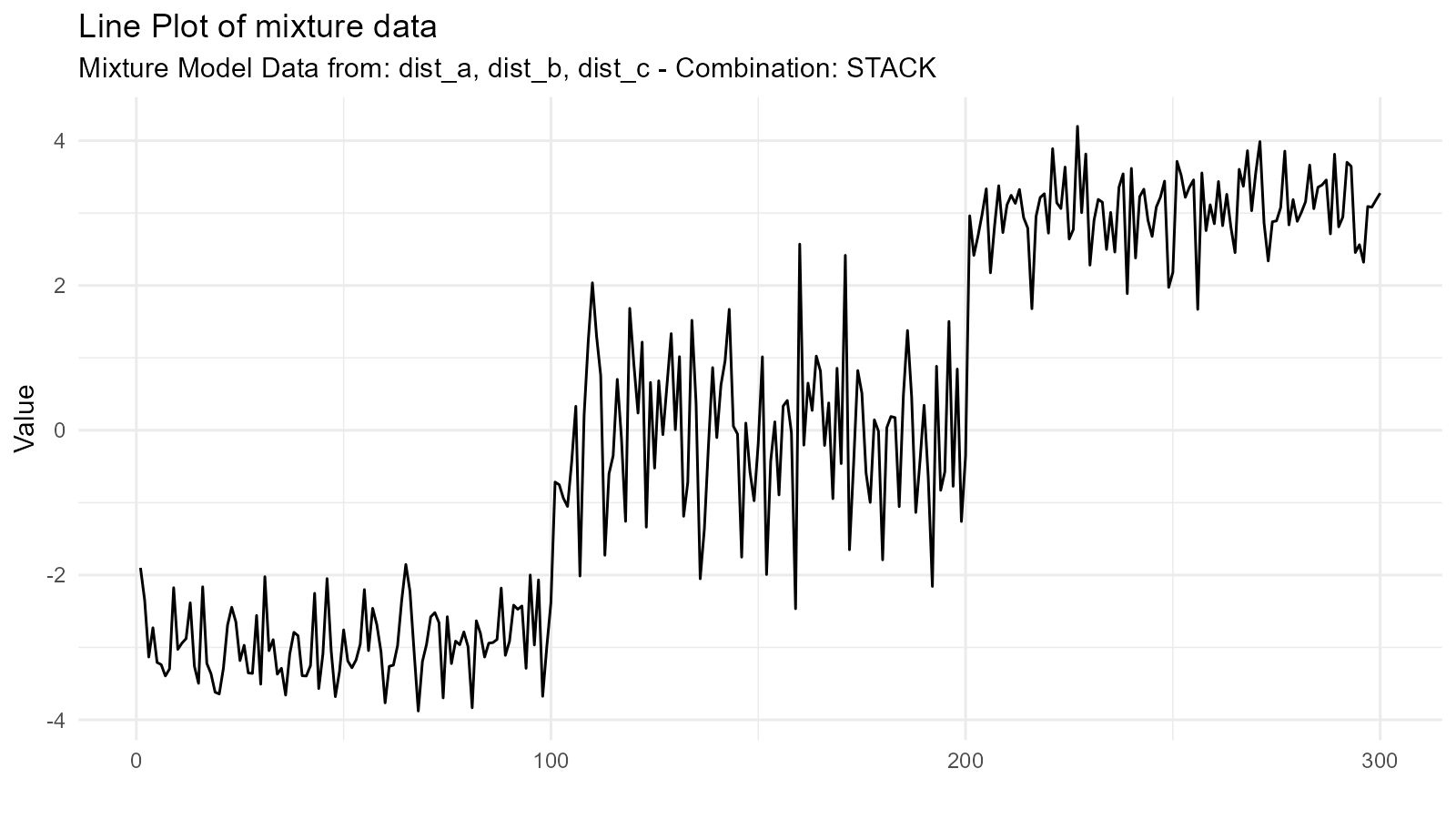
#>
#> $dens_plot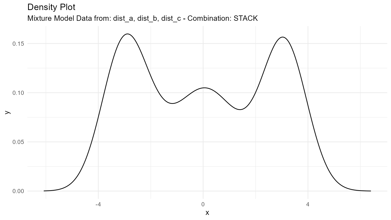
Weighted Mixtures
Create weighted combinations by adjusting the .n
parameter:
# Generate components
dist_heavy <- tidy_normal(.n = 300, .mean = -2, .sd = 0.5)  # 75% weight
dist_light <- tidy_normal(.n = 100, .mean = 2, .sd = 0.5)   # 25% weight

# Scale densities by intended weights
dist_heavy_weighted <- dplyr::mutate(dist_heavy, y = 0.75 * y)
dist_light_weighted <- dplyr::mutate(dist_light, y = 0.25 * y)

# Create weighted mixture
weighted_mixture <- tidy_mixture_density(
  dist_heavy_weighted, dist_light_weighted,
  .combination_type = "stack"
)

weighted_mixture$plots
#> $line_plot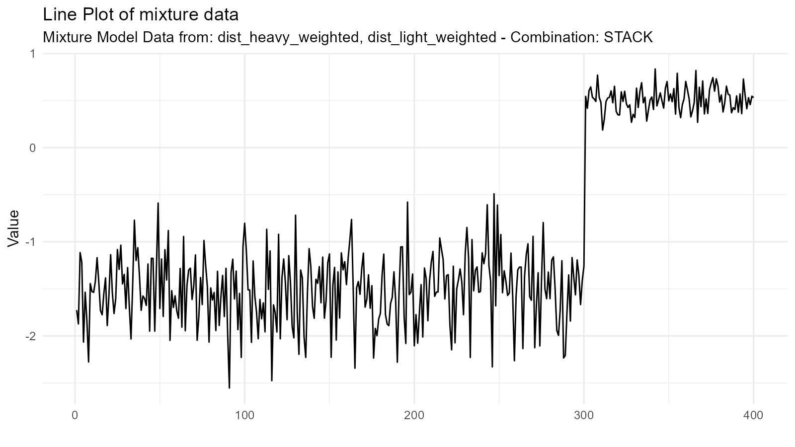
#>
#> $dens_plot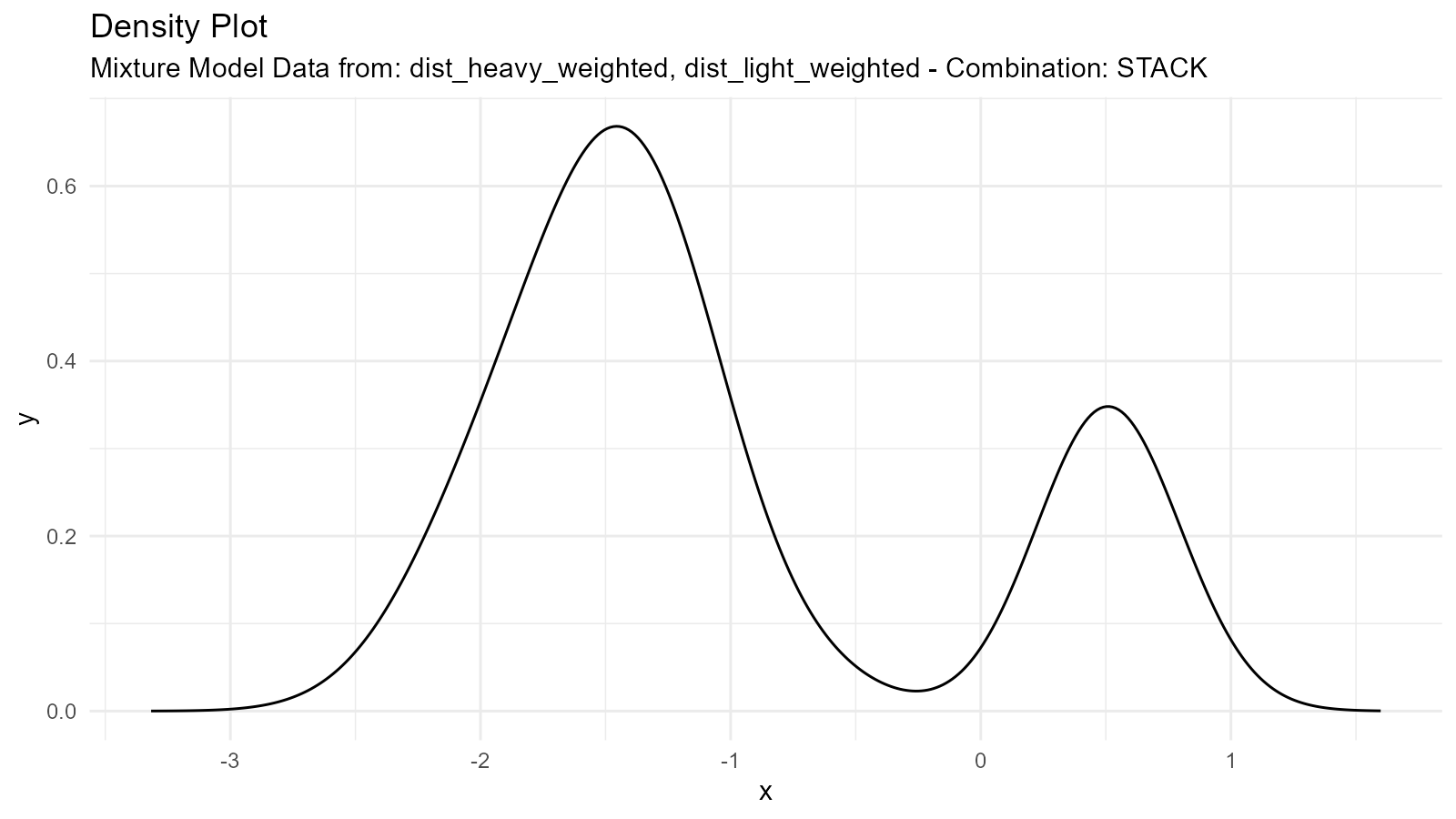
Different Distribution Types
Mix different distribution families:
# Mix normal and gamma
normal <- tidy_normal(.n = 100, .mean = 5, .sd = 1)
gamma <- tidy_gamma(.n = 100, .shape = 2, .scale = 2)

# Create mixture
mixed_family <- tidy_mixture_density(
  normal, gamma,
  .combination_type = "stack"
)

mixed_family$plots
#> $line_plot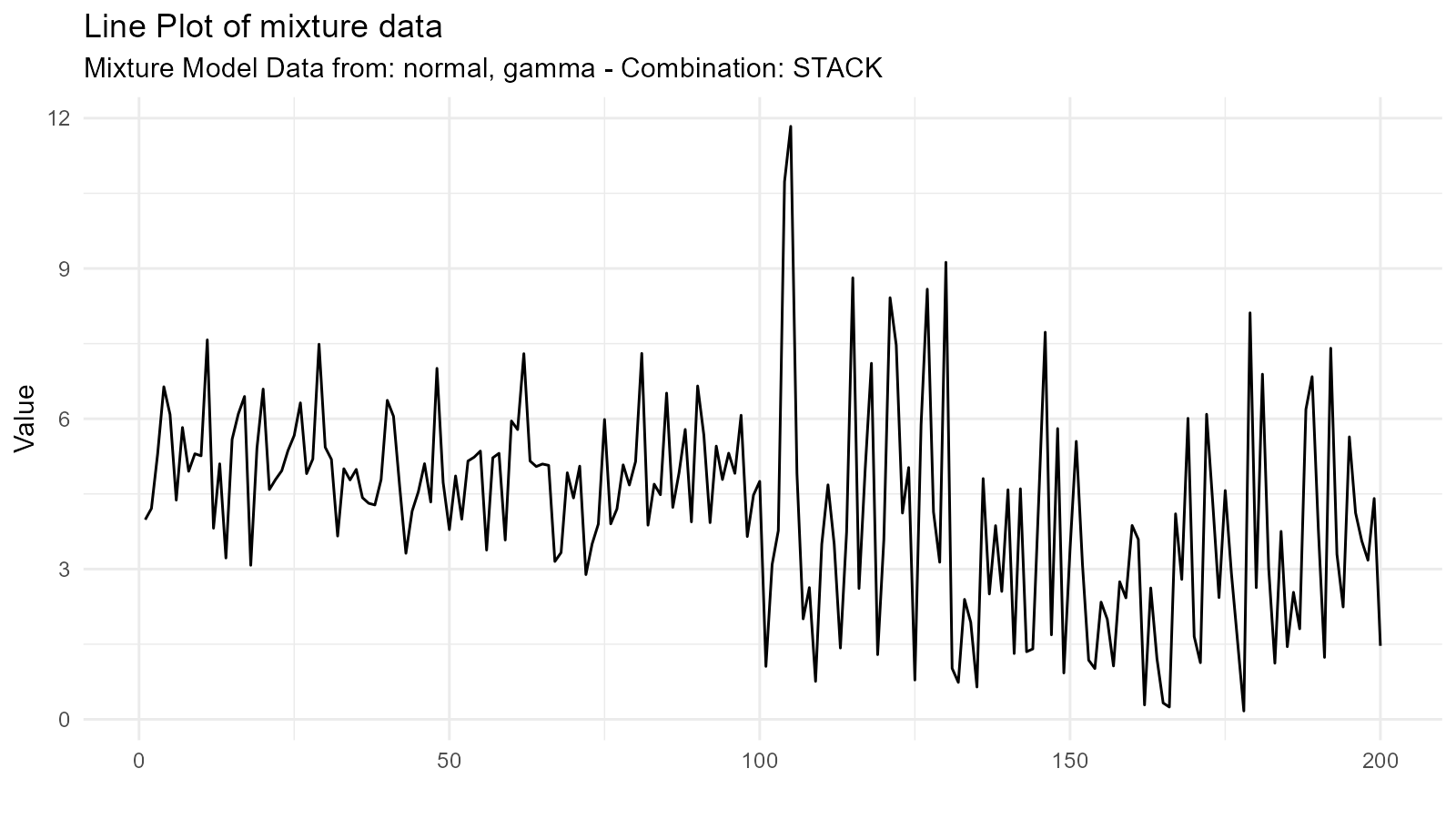
#>
#> $dens_plot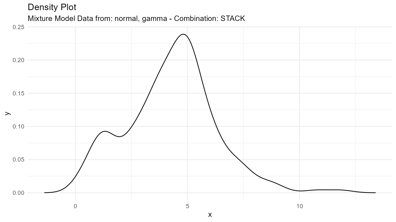
Empirical Distributions
What are Empirical Distributions?
Work directly with your observed data without assuming a distribution:
# Your observed data
observed_data <- mtcars$mpg

# Create empirical distribution
empirical <- tidy_empirical(
  .x = observed_data,
  .num_sims = 1
)

# Visualize
tidy_autoplot(empirical, .plot_type = "density")
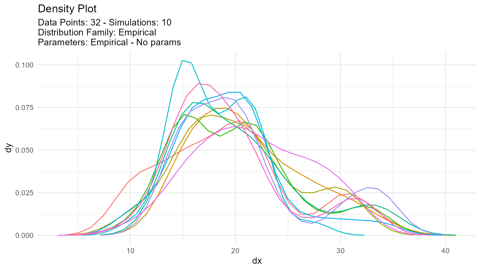
Multiple Empirical Simulations
Generate multiple resamples:
# Multiple bootstrap-like samples
empirical_multi <- tidy_empirical(
  .x = observed_data,
  .num_sims = 5
)

tidy_autoplot(empirical_multi, .plot_type = "density")
Comparing Empirical with Theoretical
# Observed data
data <- mtcars$mpg

# Empirical distribution
empirical <- tidy_empirical(.x = data, .num_sims = 1)

# Fitted theoretical distribution
theoretical <- tidy_normal(
  .n = length(data),
  .mean = mean(data),
  .sd = sd(data)
)

# Combine for comparison
combined <- tidy_combine_distributions(empirical, theoretical)

# Plot
tidy_combined_autoplot(combined)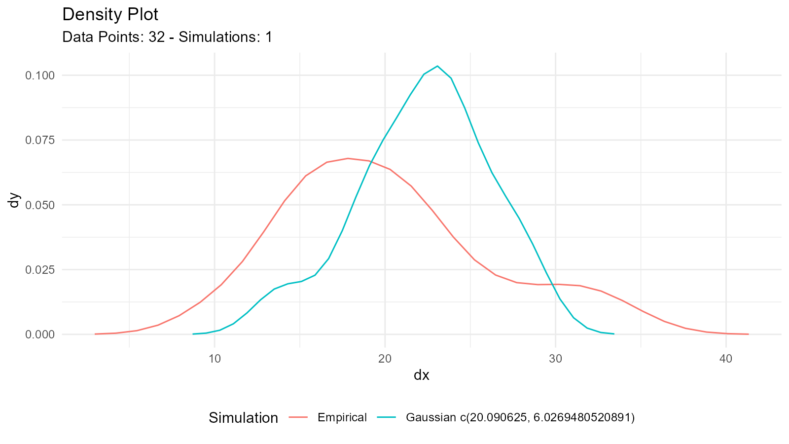
Empirical Bootstrap
Combine empirical with bootstrap:
# Bootstrap from empirical data
boot_empirical <- tidy_bootstrap(
  .x = observed_data,
  .num_sims = 100
)

# Visualize bootstrap distribution
bootstrap_stat_plot(boot_empirical, .value = y, .stat = "cmean")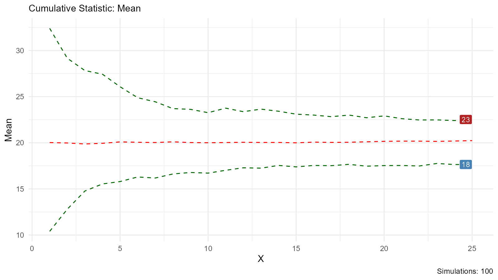
Multi-Distribution Comparison
Compare Same Distribution with Different Parameters
# Compare normal distributions with different parameters
comparison <- tidy_multi_single_dist(
  .tidy_dist = "tidy_normal",
  .param_list = list(
    .n = 100,
    .mean = c(-2, 0, 2),
    .sd = 1,
    .num_sims = 5,
    .return_tibble = TRUE
  )
)

# Visualize
tidy_multi_dist_autoplot(comparison)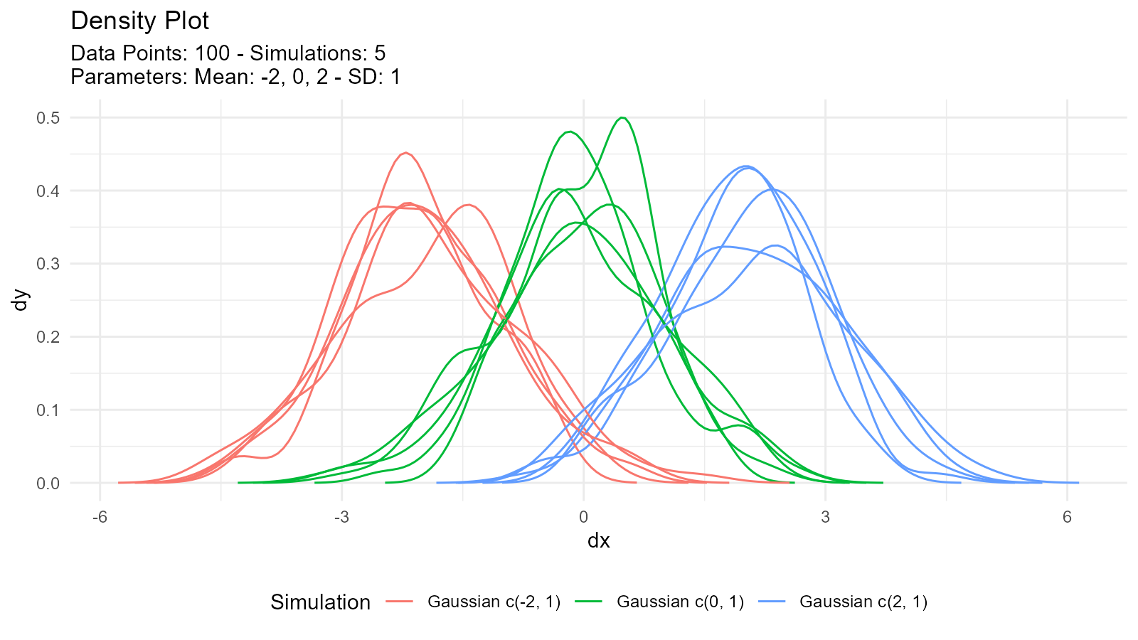
Compare Different Distributions
# Generate different distributions
normal <- tidy_normal(.n = 100, .mean = 0, .sd = 1)
cauchy <- tidy_cauchy(.n = 100, .location = 0, .scale = 1)
logistic <- tidy_logistic(.n = 100, .location = 0, .scale = 1)

# Combine
combined <- tidy_combine_distributions(normal, cauchy, logistic)

# Visualize
tidy_combined_autoplot(combined)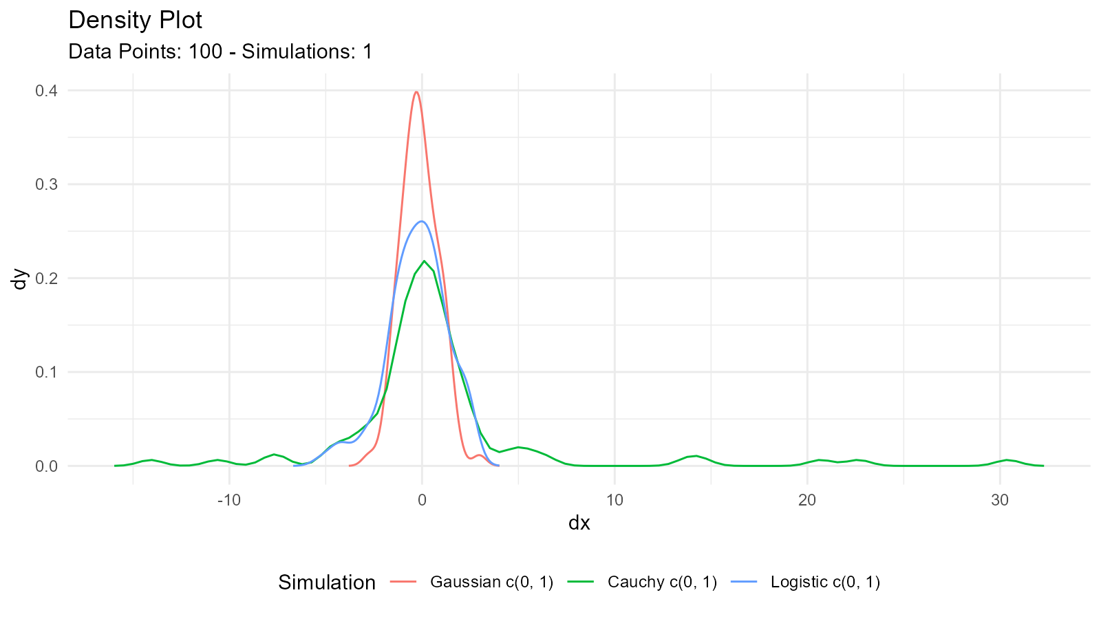
Random Walk Generation
Basic Random Walk
# Generate random walk
rw <- tidy_normal(.sd = .1, .num_sims = 25) |>
  tidy_random_walk(.value_type = "cum_sum")

head(rw)
#> # A tibble: 6 × 8
#>   sim_number     x        y     dx      dy     p        q random_walk_value
#>   <fct>      <int>    <dbl>  <dbl>   <dbl> <dbl>    <dbl>             <dbl>
#> 1 1              1 -0.0637  -0.400 0.00242 0.262 -0.0637            -0.0637
#> 2 1              2  0.00175 -0.384 0.00762 0.507  0.00175           -0.0619
#> 3 1              3  0.130   -0.369 0.0204  0.903  0.130              0.0680
#> 4 1              4 -0.0794  -0.354 0.0463  0.214 -0.0794            -0.0113
#> 5 1              5 -0.0123  -0.339 0.0897  0.451 -0.0123            -0.0236
#> 6 1              6  0.00993 -0.324 0.149   0.540  0.00993           -0.0136
Random Walk Visualization
ggplot(rw, aes(x = x, y = random_walk_value, color = sim_number, group = sim_number)) +
  geom_line() +
  labs(
    title = "Random Walk Simulations",
    x = "Step",
    y = "Cumulative Value",
    color = "Simulation"
  ) +
  theme_minimal() +
  theme(legend.position = "none")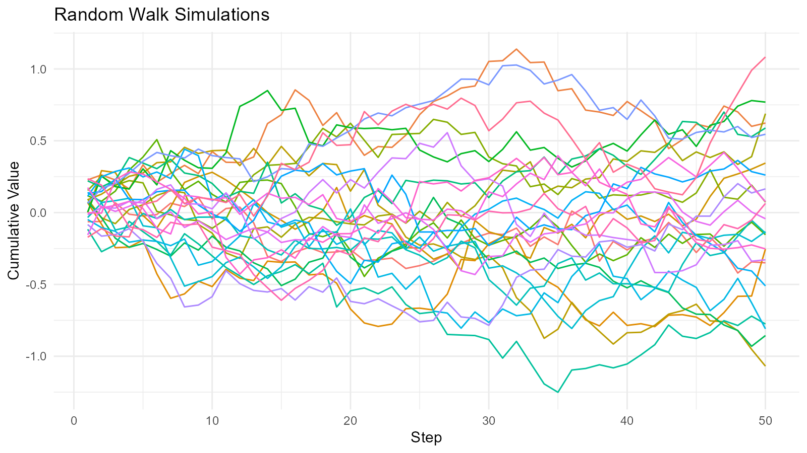
Random Walk Analysis
# Analyze random walk endpoints
rw_analysis <- rw |>
  group_by(sim_number) |>
  summarise(
    final_position = last(random_walk_value),
    max_position = max(random_walk_value),
    min_position = min(random_walk_value),
    range = max(random_walk_value) - min(random_walk_value)
  )

rw_analysis
#> # A tibble: 25 × 5
#>    sim_number final_position max_position min_position range
#>    <fct>               <dbl>        <dbl>        <dbl> <dbl>
#>  1 1                 -0.349        0.106      -0.421   0.527
#>  2 2                  0.623        1.14        0.164   0.974
#>  3 3                 -0.254        0.0686     -0.794   0.863
#>  4 4                  0.345        0.345      -0.400   0.745
#>  5 5                 -1.07         0.461      -1.07    1.53
#>  6 6                  0.689        0.689      -0.319   1.01
#>  7 7                  0.0732       0.649      -0.110   0.758
#>  8 8                 -0.154        0.508      -0.445   0.953
#>  9 9                  0.769        0.850       0.00377 0.846
#> 10 10                -0.856        0.106      -0.931   1.04
#> # ℹ 15 more rows
Distribution Combinations
Combining Multiple Distributions
# Create several distributions
dist_norm <- tidy_normal(.n = 100, .mean = 0, .sd = 1)
dist_gamma <- tidy_gamma(.n = 100, .shape = 2, .scale = 1)
dist_beta <- tidy_beta(.n = 100, .shape1 = 2, .shape2 = 5)

# Combine into one tibble
combined_dists <- tidy_combine_distributions(dist_norm, dist_gamma, dist_beta)

# Visualize all together
tidy_combined_autoplot(combined_dists)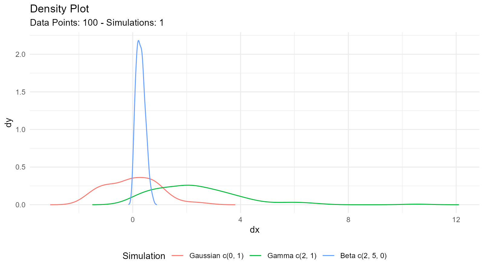
Multi-Single Distribution Table
Create comparison table for same distribution with varying parameters:
# Generate multiple parameter sets
multi_beta <- tidy_multi_single_dist(
  .tidy_dist = "tidy_beta",
  .param_list = list(
    .n = 100,
    .shape1 = c(1, 2, 5, 5),
    .shape2 = c(1, 5, 2, 5),
    .ncp = 0,
    .num_sims = 1,
    .return_tibble = TRUE
  )
)

# Visualize
tidy_multi_dist_autoplot(multi_beta)
Quantile Normalization
What is Quantile Normalization?
Transform data to have a specific distribution while preserving ranks:
# Your data
data_mat <- matrix(c(5, 2, 8, 3, 9, 1, 7, 4, 6), 3, 3)

# Normalize to range [0, 1]
normalized <- quantile_normalize(data.frame(data_mat))

# Compare original and normalized
cat("Original Data: \n")
#> Original Data:
print(data_mat)
#>      [,1] [,2] [,3]
#> [1,]    5    3    7
#> [2,]    2    9    4
#> [3,]    8    1    6
cat("\n")

cat("Normalized Data: \n")
#> Normalized Data:
print(normalized)
#>            X1       X2       X3
#> [1,] 4.666667 4.666667 8.000000
#> [2,] 2.333333 8.000000 2.333333
#> [3,] 8.000000 2.333333 4.666667
cat("\n")
Advanced Plotting
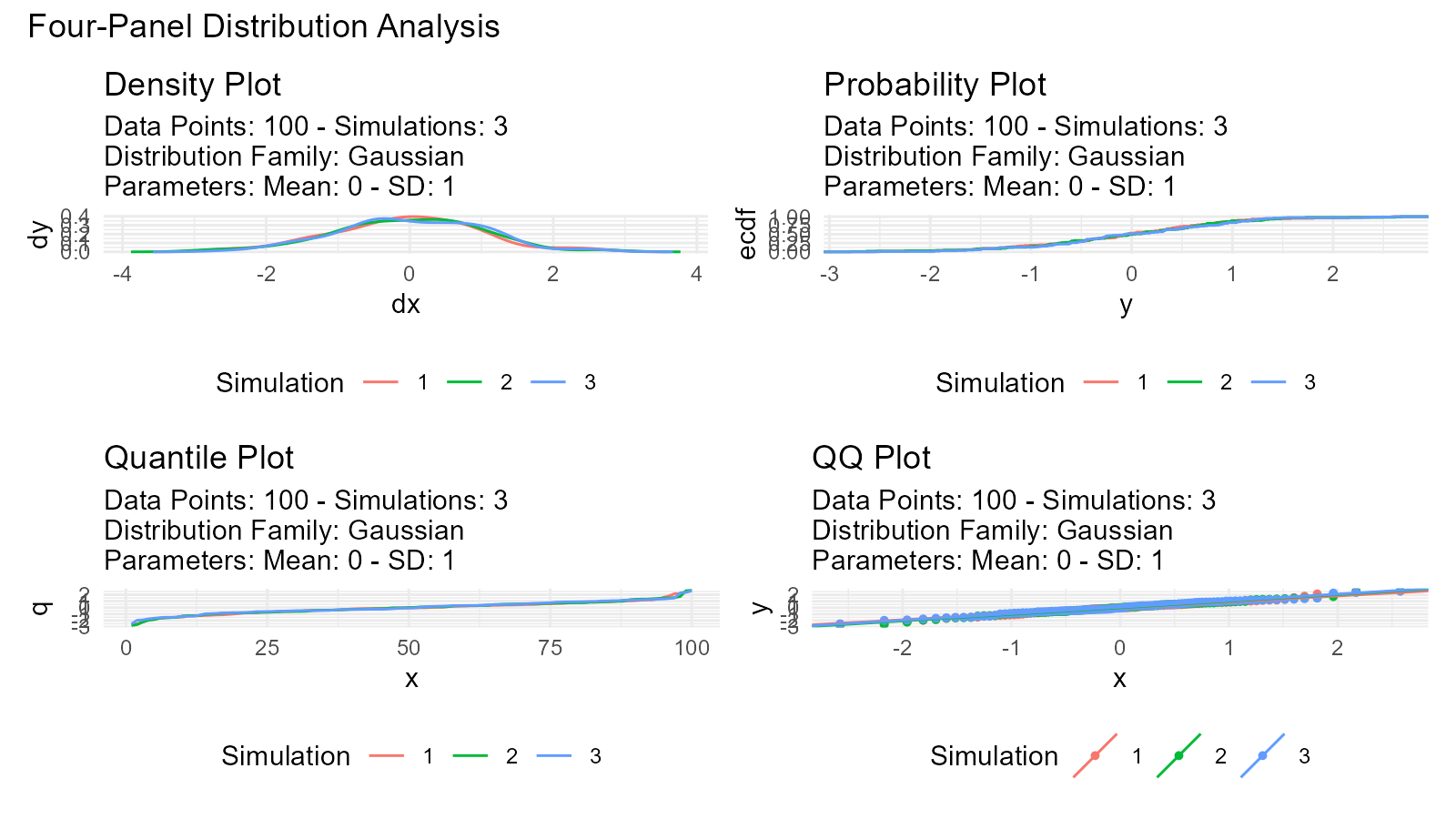
Four-Panel Plots
View multiple plot types simultaneously:
data <- tidy_normal(.n = 100, .num_sims = 3)

# Create all plot types
p1 <- tidy_autoplot(data, .plot_type = "density")
p2 <- tidy_autoplot(data, .plot_type = "probability")
p3 <- tidy_autoplot(data, .plot_type = "quantile")
p4 <- tidy_autoplot(data, .plot_type = "qq")

# Combine in 2x2 grid
(p1 | p2) / (p3 | p4) +
  plot_annotation(
    title = "Four-Panel Distribution Analysis"
  )
Triangular Distribution Plots
# Triangular distribution
tri <- tidy_triangular(
  .n = 100,
  .min = 0,
  .max = 10,
  .mode = 7
)

# Visualize
tidy_autoplot(tri, .plot_type = "density")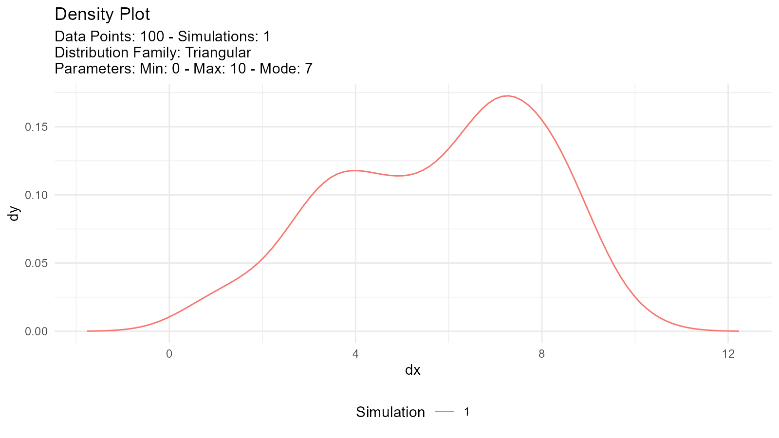
Real-World Examples
Example 1: Modeling Bimodal Data
# Simulate bimodal data (two age groups)
young <- tidy_normal(.n = 200, .mean = 25, .sd = 3)
old <- tidy_normal(.n = 150, .mean = 65, .sd = 5)

# Create mixture model
age_distribution <- tidy_mixture_density(
  young, old,
  .combination_type = "stack"
)

age_distribution$plots
#> $line_plot
#>
#> $dens_plot
Example 2: Quality Control
# Good products (tight distribution)
# Defective products (wider distribution)
good <- tidy_normal(.n = 95, .mean = 100, .sd = 2)
defective <- tidy_normal(.n = 5, .mean = 100, .sd = 10)

# Mixture model
qc_distribution <- tidy_mixture_density(
  good, defective,
  .combination_type = "stack"
)

qc_distribution$plots
#> $line_plot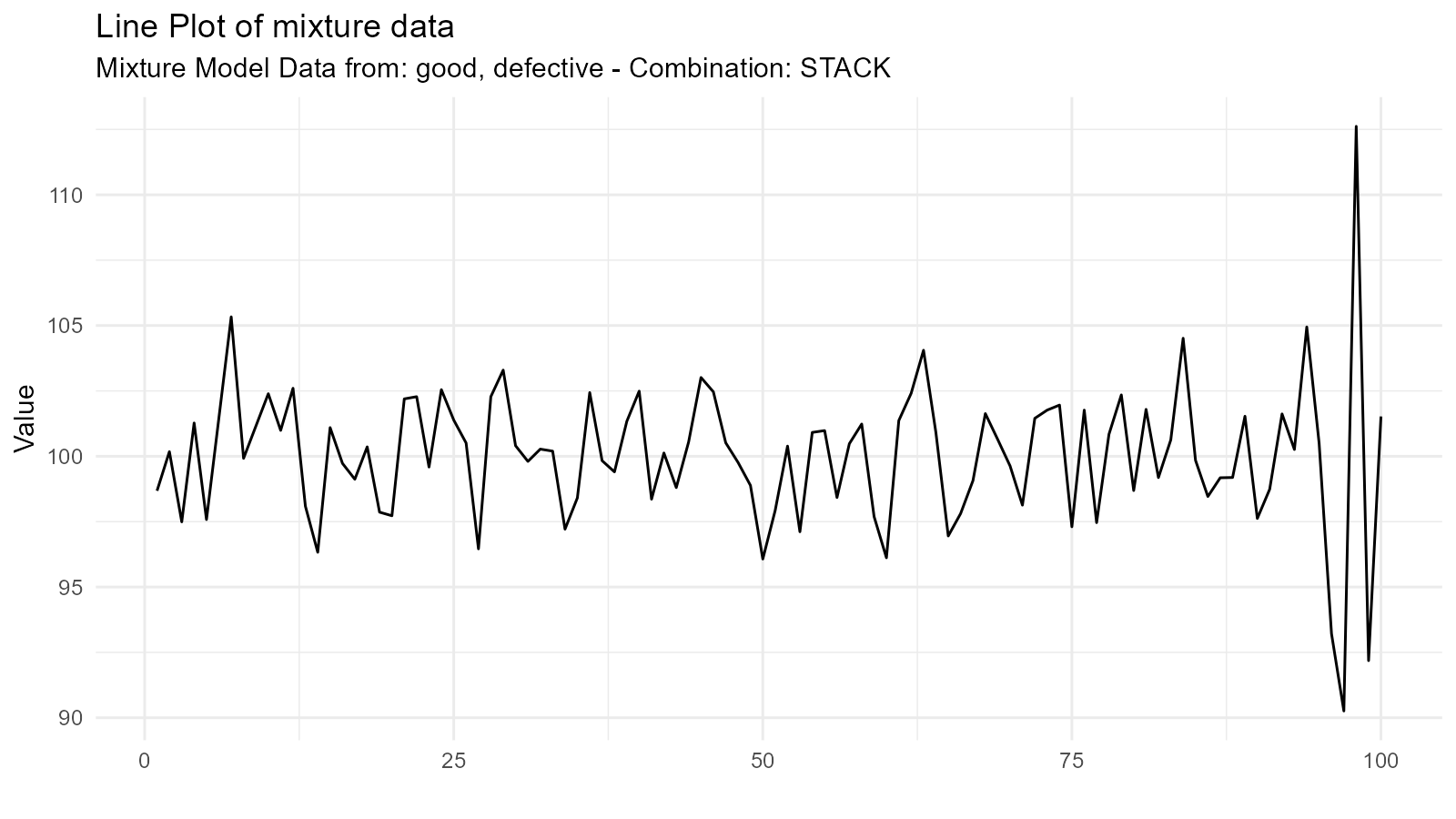
#>
#> $dens_plot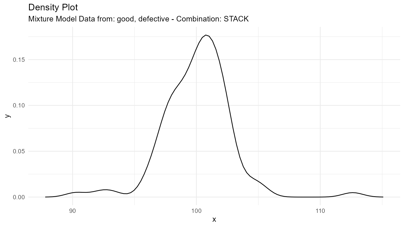
Tips and Tricks
Tip 1: Validate Mixture Models
# Create mixture
mixture <- tidy_mixture_density(
  rnorm(50, -2, 1), rnorm(50, 2, 1),
  .combination_type = "stack"
)

# Extract key statistics from the mixture density data
mixture_stats <- mixture$data$dens_tbl |>
  dplyr::summarise(
    mean_x = mean(x, na.rm = TRUE),
    sd_x = sd(x, na.rm = TRUE),
    median_x = median(x, na.rm = TRUE)
  )

mixture_stats
#> # A tibble: 1 × 3
#>   mean_x  sd_x median_x
#>    <dbl> <dbl>    <dbl>
#> 1  0.134  4.19    0.134
Tip 2: Debug by Plotting Components Separately
If a mixture doesn’t look right, plot the components individually:
# Debug by plotting components separately
dist1 <- tidy_normal(.mean = -2)
dist2 <- tidy_normal(.mean = 2)
p1 <- tidy_autoplot(dist1, .plot_type = "density") +
  ggtitle("Component 1")
p2 <- tidy_autoplot(dist2, .plot_type = "density") +
  ggtitle("Component 2")

p1 | p2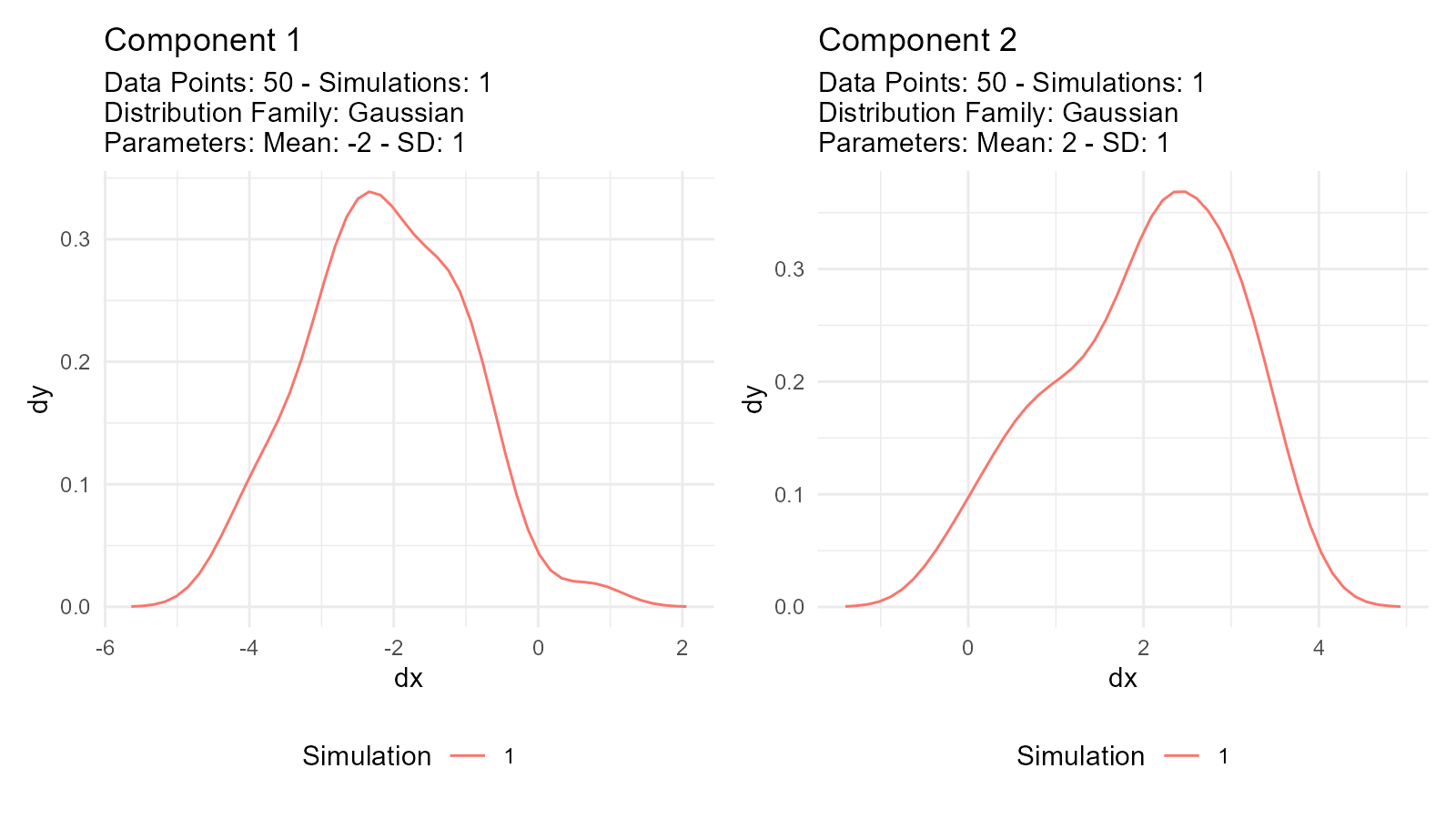
Troubleshooting
Issue: Mixture Doesn’t Look Right
Check:
- Are component distributions on appropriate scales?
- Are mixture weights (via
.n) appropriate? - Is the mixture type correct?
Issue: Empirical Distribution Too Noisy
Solution: Use multiple simulations for smoothing:
# Increase sample size via resampling
empirical_smooth <- tidy_empirical(.x = mtcars$mpg, .num_sims = 10)
tidy_autoplot(empirical_smooth, .plot_type = "density")